
Introduction
Data helps us tell compelling stories, data visualization is the graphical representation of information and data using graphic elements such as charts, graphs, and so on. There are a few libraries out there that can help us produce beautiful outcomes with relatively little work and Chart.js is one of them.
In this guide, we will look at how to construct charts in JavaScript using Chart.js, as well as the numerous customization and styles that Chart.js provides to enable us to make beautiful charts.

Getting Started
Chart.js is a popular community-maintained open-source data visualization framework. It enables us to generate responsive bar charts, pie charts, line plots, donut charts, scatter plots, etc. All we have to do is simply indicate where on your page you want a graph to be displayed, what sort of graph you want to plot, and then supply Chart.js with data, labels, and other settings. The library does all the heavy lifting after that!
Installation
To get started with Chart.js, we must first install it as it's a third-party library. Chart.js may be installed via npm, GitHub releases, or the Chart.js CDN, which is the quickest and easiest method.
For this guide, we will make use of the Chart.js CDN. You may do so by getting the most recent CDN link and adding it in your project.
Note: Please use the URL with Chart.min.js at the end, as this is the minified version.
As of the time of writing, the most recent version is 3.7.1. All you have to do is add the following to the head element of your HTML file:
<script src="https://cdnjs.cloudflare.com/ajax/libs/Chart.js/3.7.1/chart.min.js"></script>
Once this is completed successfully, we can use the library.
Creating Charts With Chart.JS
For this guide, we will create several sorts of charts, highlighting the most popular JavaScript frameworks based on the amount of GitHub Stars they currently have. Here is the information we will be using:
| JavaScript Framework | GitHub Stars |
|---|---|
| React | 185,134 |
| Vue | 195,514 |
| Angular | 80,460 |
| Svelte | 57,022 |
| Ember.js | 22,165 |
| Backbone.js | 27,862 |
Create a Canvas to Render the Charts
The first step would be to provide a location in our HTML for the chart to be rendered. Chart.js relies on the availability of the HTML5 Canvas tag (used to draw lines, circles, and so on) to generate and render the charts. More information regarding the Canvas API may be found here.
All we have to do is construct the canvas tag within the body tag and provide an ID that we will need to call fetch the element and reference our specified graph element in JavaScript:
<canvas id="myChart" width="1000" height="600"></canvas>
Note: We may call the ID whatever we wish, however it is advised that we pick a descriptive name that represents the type of charts we want to generate. If we're adding many graphs to a page, it is important we make sure that each ID is distinct (we could for example give our graphs more specific names, like studentsChart or productChart, etc.).
Here is what our HTML file should look like now:
<!DOCTYPE html>
<html lang="en">
    <head>
        <meta charset="UTF-8" />
        <meta http-equiv="X-UA-Compatible" content="IE=edge" />
        <meta name="viewport" content="width=device-width, initial-scale=1.0" />
        <script src="https://cdnjs.cloudflare.com/ajax/libs/Chart.js/3.7.1/chart.min.js"></script>
        <title>Programming Lang. Chart</title>
    </head>
    <body>
        <canvas id="myChart" width="1000" height="600"></canvas>

        <script src="./App.js"></script>
    </body>
</html>
Prepare and Organize Our Data
We have to save the previously supplied information (frameworks and stars). The most convenient format for us is to save it in an object, where the keys represent frameworks and values represent stars. In our App.js, let's define our data:
const data = {
    'React': 185134,
    'Vue': 195514,
    'Angular': 80460,
    'Svelte': 57022,
    'Ember.js': 22165,
    'Backbone.js': 27862
};
Creating a Bar Chart
Let's get started with the core logic; we'll see how to make a bar chart and, later, how to make additional charts by easily altering our parameters. The great thing about Chart.js is that once you create a Chart object - to alter it, you just change the type attribute and leave everything else as it was!
The first step is to take the canvas element from HTML with the ID myChart and assign it to a context variable - typically named ctx:
const ctx = document.getElementById('myChart').getContext('2d');
Note: We may name the variable whatever we like; ctx is simply a pattern that most developers prefer, and it's what we'll be using. .getContext('2d') is an optional method that allows us to access the canvas tag's 2D drawing capabilities.
To create a Chart object, we call the new Chart() constructor, which accepts two arguments:
ctx: the context object, referencing the canvas element we're plotting on.- Configuration object: enables us to set the chart type, data, and chart parameters.
const myChart = new Chart(ctx, {});
We will be working with the configuration object to help us create our bar chart. As we said earlier, the configuration object lets us specify the:
- Chart type: The sort of chart we wish to generate. In this scenario, we're making a bar chart. We might provide
type: 'pie'ortype: 'line'if we wanted a pie or line chart. - Chart data: Labels and values that will be utilized to create the charts.
- Chart options: Configuration choices for customizing the charts, such as adjusting the location of the legend, enabling/disabling responsiveness, control style, and so on.
Let's set up a skeleton configuration object:
{
  type: 'bar',
  data: {},
  options: {} // this is optional
}
This object can then be passed into the chart instantiation. Let's add the chart data alongside the type:
const myChart = new Chart(ctx, {
    type: 'bar',
    data: {
        labels: Object.keys(data),
        datasets: [
            {
                label: 'Number of GitHub Stars',
                data: Object.values(data),
            },
        ],
    },
});
Since we're dealing with an object - we can extract its keys and values via the Object.keys() and Object.values() methods. Alternatively, you can procure the labels and values in separate arrays as well!
Understanding the Data Property
Labels and datasets are the two attributes of the data property object. The labels represent an array of components that will be shown on the X-axis:

While, the datasets takes an array of objects which has two basic properties:
label: A string which is usually displayed on top of the chart or when hovering the bars, as seen below:
data: An array of values, which is shown on the Y-axis and reflects the GitHub stars numbers in our example:

Note: You can have many datasets, each with their own unique "subtitle" (label) and data. If you plot several datasets, it helps to have different colors to signify the difference. We'll cover this use case in a moment.
In summary - to plot a bar chart, we prepare the canvas/context and initialize a Chart() with our data and labels:
const data = {
    'React': 185134,
    'Vue': 195514,
    'Angular': 80460,
    'Svelte': 57022,
    'Ember.js': 22165,
    'Backbone.js': 27862
};

const ctx = document.getElementById('myChart').getContext('2d');

const myChart = new Chart(ctx, {
    type: 'bar',
    data: {
        labels: Object.keys(data),
        datasets: [
            {
                label: 'Number of GitHub Stars',
                data: Object.values(data),
            },
        ],
    },
});
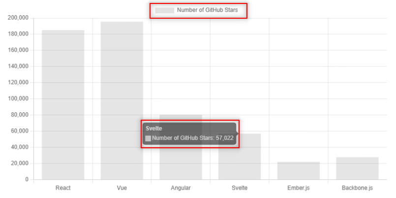
When you refresh your browser - the page should contain something along the lines of:

Horizontal Bar Chart
To flip the bar chart to a horizontal one - you set the indexAxis property yo y in the options object:
const myChart = new Chart(ctx, {
  type: 'bar',
  data: {
    ...
  },
  options: {
    indexAxis: 'y',
  }
});
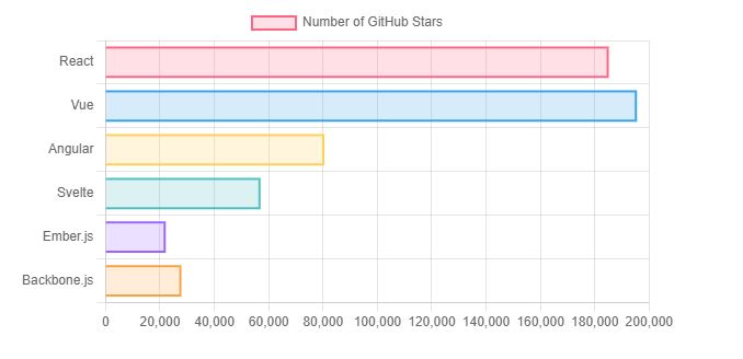
Note: In previous versions of Chart.js, you'd replace type:bar with type:horizontalBar, though this has been deprecated since.
Styling the Bar Chart
At this point, we have successfully created a bar chart! Though, data visualization is about storytelling - not just data. We usually want to make the chart more visually appealing! Additionally, not styling the chart can not only make it dull - but unreadable. For instance, if a pie chart has all wedges of the same color, you wouldn't really be able to differentiate between different classes, unless you add borders to each wedge.
We can alter some of these options via: backgroundColor, borderColor and borderWidth .
Check out our hands-on, practical guide to learning Git, with best-practices, industry-accepted standards, and included cheat sheet. Stop Googling Git commands and actually learn it!
backgroundColor - Takes an array of Hexadecimal or RGBA color values (strings) to be used to color the chart's bars. This may also be done with a single color because it will be applied to all the bars:
backgroundColor: 'red' // Setting all bars to red

// Or

backgroundColor: [
  'rgba(255, 99, 132, 0.2)',  // Bar 1
  'rgba(54, 162, 235, 0.2)',  // Bar 2
  'rgba(255, 206, 86, 0.2)',  // Bar 3
  'rgba(75, 192, 192, 0.2)',  // Bar 4
  'rgba(153, 102, 255, 0.2)', // Bar 5
  'rgba(255, 159, 64, 0.2)'   // Bar 6
],
borderWidth - It takes an Integer or a float value, and it specifies how wide a border should be:
borderWidth: 2
borderColor - The same as the backgroundColor property, it accepts an array of color value strings. It will colorize the bar's borders:
borderColor: 'green' // Setting all borders to green

// Or

borderColor: [
  'rgba(255, 99, 132, 1)',    // Bar 1
  'rgba(54, 162, 235, 1)',    // Bar 2
  'rgba(255, 206, 86, 1)',    // Bar 3
  'rgba(75, 192, 192, 1)',    // Bar 4
  'rgba(153, 102, 255, 1)',   // Bar 5
  'rgba(255, 159, 64, 1)'     // Bar 6
],
Note: All these properties and their values are part of the data object, right after datasets.
Combining these together, you can make a nicely stylized bar chart as:
const myChart = new Chart(ctx, {
    type: 'bar',
    data: {
        labels: Object.keys(data),
        datasets: [{
            label: 'Number of GitHub Stars',
            data: Object.values(data),
        }, ],
    },
    options: {
        backgroundColor: [
            'rgba(255, 99, 132, 0.2)',  // Bar 1
            'rgba(54, 162, 235, 0.2)',  // Bar 2
            'rgba(255, 206, 86, 0.2)',  // Bar 3
            'rgba(75, 192, 192, 0.2)',  // Bar 4
            'rgba(153, 102, 255, 0.2)', // Bar 5
            'rgba(255, 159, 64, 0.2)'   // Bar 6
        ],
        borderWidth: 2,
        borderColor: 'black'
    }
});

How to Control Charts Width and Height
So far, if you've been viewing the chart in your browser, you've probably noticed that the browser is displaying the chart full screen and isn't respecting the width and height we previously set on the canvas element:
<canvas id="myChart" width="800" height="400"></canvas>
To resolve this, we must add configurations to our bar chart instance by passing some options in the options object. These are the options:
maintainAspectRation: this is set tofalseto respect the height we previously added to the canvas. This means that my chart would be 400 pixels tall.responsive: This is set tofalseto gain complete control over the canvas's width.
const myChart = new Chart(ctx, {
  type: 'bar',
  data: {
    // Data...
  },
  options: {
    // ... Other options
    maintainAspectRatio: false,
    responsive: false
  }
});
It would be helpful to explain how this could be accomplished using CSS, which is another method for controlling the width and height of your chart. This option necessitates additional markup, but is more flexible because our chart will still be responsive!
Note: We must remove the options object, as well as the canvas tag's height and width.
Let’s now wrap the canvas tag in a div which we would use to style the chart:
<div class="container">
    <canvas id="myChart"></canvas>
</div>
In our CSS, all we need to do is apply a max-width and set its margin to 0 auto, so it resizes and appears in the middle:
.container {
    max-width: 800px;
    margin: 0 auto;
}
When you now reload your browser, you will notice it's responsive, and it also respects the max-width set!
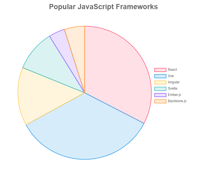
Plotting Line Charts, Donut Charts, Polar Areas and Radar Plots with Chart.js
Creating charts is very simple, all we have to do is to change the type from type: "bar" to the specific type you want. This could be pie, horizontalBar, line, doughnut, radar, polarArea, scatter etc.
Adding/Updating and Removing Datasets from Charts
So far, we've seen how to make various types of charts in Chart.js. Let's see how we can add and remove data from our existing chart now.
To update a chart - you'll want to update the
dataobject property of theChartobject, and re-render it.
The data object has a labels property (which would correspond to framework names in our case) and a datasets property, where each dataset within it can be plotted. Let's take a look at how we can add new instances to data!
Adding Data
Generally speaking, a generic approach to updating a chart consists of accessing the data property, and pushing new labels and data to its datasets, before calling chart.update():
function addData(chart, label, data) {
    chart.data.labels.push(label);
    chart.data.datasets.forEach((dataset) => {
        dataset.data.push(data);
    });

    chart.update();
}

addData(myChart, 'SolidJS', 18200)
The update() method is meant to be called after altering the data object, and safely updates the chart. It re-renders the scales, legend and the entire chart, so any changes made will be present without additional calls.
Let's go ahead and update our own data object (not to be misunderstood as the chart's own data property) and take a look at how we can update the chart with the new values.
Adding New Data to Existing Charts
Say we get a request, deserialized into a JavaScript object that should get added to the chart. We can pass this dataObj to our data (mock database) and add the new dataObj to the chart:
function updateChart(chart, dataObj) {
    // Saving the new incoming object into the mock database
    Object.assign(data, dataObj);

    // Push changes to the chart
    chart.data.labels.push(Object.keys(dataObj));
    chart.data.datasets.forEach((dataset) => {
        dataset.data.push(Object.values(dataObj));
    });
    // Update chart
    chart.update();
}

const newData = {'SolidJS': 18200};
updateChart(myChart, newData);
Adding Multiple Data Points to Existing Charts
If we try to add multiple data points using this method, we will notice that they all stack up on one spot, since the passed dataObj is directly added to the chart. To add multiple data points, we'll want to loop through the data and push each property (framework name) as a separate entity in the array:
function updateChart(chart, dataObj) {
    Object.assign(data, dataObj);

    for (const property in dataObj) {
        chart.data.labels.push(property);
        chart.data.datasets.forEach((dataset) => {
            dataset.data.push(dataObj[property]);
        });
    }

    chart.update();
}
Replacing All Data with New Data
Since our data acts as a database - let's update the example from before to first store the incoming data object into the database, and then pull the data from the database, instead of adding the data from the request.
This is much more along the lines of what you'll work with in practical development environments. As earlier, we'll assign() the new dataObj to the data, but instead of pushing the values to the existing arrays - we'll replace the arrays with all of the fetched data from the database:
function updateChart(chart, dataObj) {
    // Store data into the database
    Object.assign(data, dataObj);

    // Fetch data from the database and replace old data
    chart.data.labels = Object.keys(data);
    chart.data.datasets.forEach((dataset) => {
        dataset.data = Object.values(data);
    });

    chart.update();
}

const newData = {'SolidJS': 18200};
updateChart(myChart, newData);
This natively works when inserting multiple objects as well:
const newData = {'SolidJS': 18200, 'SemanticUI': 50000 };
Removing Data from Charts
Removing data is the opposite of adding it. pop() is the opposite of push():
function removeData(chart) {
    chart.data.labels.pop();
    chart.data.datasets.forEach((dataset) => {
        dataset.data.pop();
    });

    chart.update();
}

removeData(myChart);
pop() removes the last entry in the arrays, so only the last item will be removed. Similarly, shift() removes the first. This doesn't give you much power over what's being removed though.
Typically, you'll want to aim for a removal, in which case, a value to be removed will be passed on. Thankfully, it's really easy to remove a value from an object:
function removeData(chart, val) {
    // Delete entry from the database
    delete data[val];

    // Re-populate and re-render the chart
    chart.data.labels = Object.keys(data);
    chart.data.datasets.forEach((dataset) => {
        dataset.data = Object.values(data);
    });

    chart.update();
}

removeData(myChart, "React");
More Stylings
Let's now take a look at a few more styling options that can be performed with Chart.js easily.
Global Stylings/Configurations
Chart.js allows us to declare some global configurations, defined in Chart.defaults.
Let's use this to adjust the font-family, font-size, font-style and font-weight of our chat globally, so it applies to every text on the chart. These options can be found in Chart.defaults.font.
Chart.defaults.font.size = 10;
Chart.defaults.font.weight = 'bold';
Chart.defaults.font.family = 'Lato';
Chart.defaults.font.style = 'italic';
Note: The global font settings only apply when more specific options are not included in the config of an individual chart.
For example, in this chart the text will have a font size of 16px except for the title text which has a specific size assigned to it:
Chart.defaults.font.size = 16;
let chart = new Chart(ctx, {
    type: 'line',
    data: data,
    options: {
        plugins: {
            title: {
                text: 'Popular JavaScript Frameworks',
                font: {
                    size: 25,
                },
            },
        },
    },
});
Note: We can also add global color for all texts in our chat by using Chart.defaults.color.
Setting Titles
A plugin within the options object can be added to specify the title:
options: {
  ...
  plugins: {
    title: {
      display: true,
      text: 'Popular JavaScript Frameworks',
      font: {
        size: 25
      }
    },
  }
}
Note: This accepts more styles like position, padding, font, etc. More details are in the Chart.js official documentation.
Adding Legends
Legends are a great way to help users connect classes and their labels to their colors. Legends can also be declared/styled globally using Chart.defaults.plugins.legend in case you have multiple charts and don't want to repeat the same code:
plugins: {
  ...
  legend: {
    display: true,
    position: 'right'
  }
}
Note: For other charts aside from the ones mentioned earlier, it's best to set display to false.
Conclusion
So far in this tutorial, we have been able to learn how to make use of Chart.js to create all forms of graphs and also see how we could apply styling which can become very tricky if you don’t understand how it works properly.

