
In my previous article, I explained how the Seaborn Library can be used for advanced data visualization in Python. Seaborn is an excellent library and I always prefer to work with it, however, it is a bit of an advanced library and needs a bit of time and practice to get used to.
In this article, we will see how Pandas, which is another very useful Python library, can be used for data visualization in Python. Pandas is primarily used for importing and managing dataset in a variety of formats as explained in the article Beginner's Tutorial on the Pandas Python Library. The data visualization capabilities of Pandas are lesser known. In this article, you will focus on the data visualization capabilities of Pandas.
It is pertinent to mention that like Seaborn, the Pandas data visualization capabilities are also based on the Matplotlib Library. But with Pandas, you can directly plot different types of visualizations directly from the Pandas dataframe which we will see in this article.
Basic Plots
In this section, we will see how Pandas dataframes can be used to plot simple plots such as histograms, count plot, scatter plots, etc.
The Dataset
The dataset that we are going to use to plot these graphs is the famous Titanic dataset. The dataset can be downloaded from Kaggle. In this article, we will be using the train.csv file.
Before we import the dataset into our application, we need to import the required libraries. Execute the following script
import numpy as np
import matplotlib.pyplot as plt
import pandas as pd
The following script imports the dataset;
titanic_data = pd.read_csv(r"E:\Datasets\train.csv")
Let's see how our dataset actually looks like. Run the following script:
titanic_data.head()
The output looks like this:
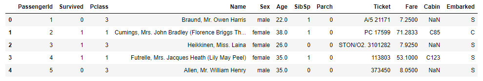
You can see that the dataset contains the information about the passengers of the unfortunate titanic ship that sank in the North Atlantic Ocean in 1912. The dataset includes information such as the name, age, the passenger class, whether the passenger survived or not etc.
Let's plot some basic graphs using this information.
Histogram
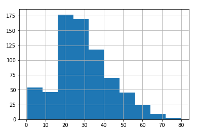
To draw a histogram for any column, you have to specify the column name followed by the method hist()method shown below:
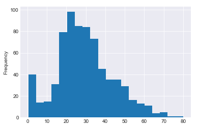
titanic_data['Age'].hist()
You can see how easy it is to plot a histogram for the age column using Pandas dataframe. The output of the script above looks like this:
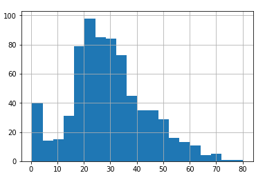
You can pass Matplotlib-based parameters to the hist() method since behind the scene Pandas uses Matplotlib library. So for instance, you can increase the number of bins for your histogram using bin attribute, as follows:
titanic_data['Age'].hist(bins=20)
In the above script, we set the number of bins for our histogram to 20. The output looks like this:
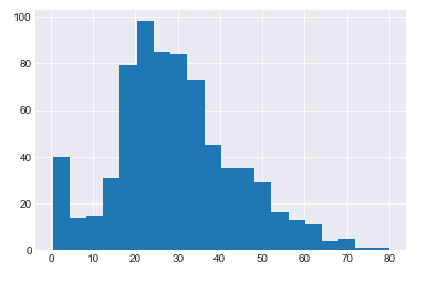
You can improve the styling of the plots by importing the Seaborn library and setting a value for its set_style attribute. For instance, let's set the style of the grid to dark gray. Execute the following script:
import seaborn as sns
sns.set_style('darkgrid')
Now again plot the histogram using the following script:
titanic_data['Age'].hist(bins=20)
In the output, you will see dark gray grids in the background of our plot:
There are two ways you can use dataframe to plot graphs. One of the ways is to pass the value for the kind parameter of the plot function as shown below:
titanic_data['Age'].plot(kind='hist', bins=20)
The output looks like this:
The other way is to directly call the method name for the plot using the plot function without passing the function name to the kind attribute. We will use the second (calling the method name for the plot using the plot function) method from here on.
Line Plots
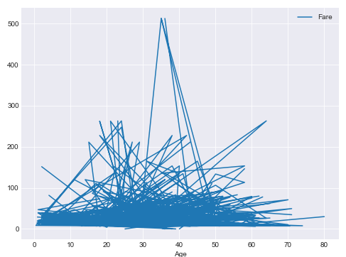
To plot line plots with Pandas dataframe, you have to call the line() method using the plot function and pass the value for x-index and y-axis, as shown below:
titanic_data.plot.line(x='Age', y='Fare', figsize=(8,6))
The script above plots a line plot where the x-axis contains passengers' age and the y-axis contains the fares paid by the passengers. You can see that we can use the figsize attribute to change the size of the plot. The output looks like this:
Scatter Plots
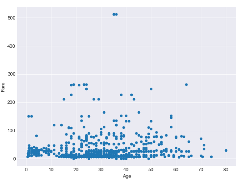
To plot line plots with Pandas dataframe, you have to call the scatter() method using the plot function and pass the value for x-index and y-axis as shown below:
titanic_data.plot.scatter(x='Age', y='Fare', figsize=(8,6))
The output of the script above looks like this:
Box Plot
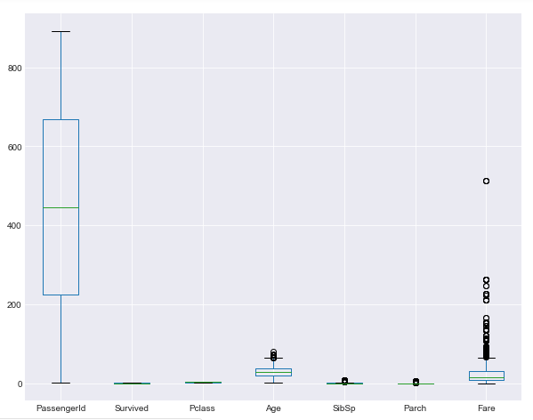
Pandas dataframes can also be used to plot the box plot. All you have to do is call the box() method using the plot function of the pandas dataframe:
titanic_data.plot.box(figsize=(10,8))
In the output, you will see box plots for all the numeric columns in the Titanic dataset:
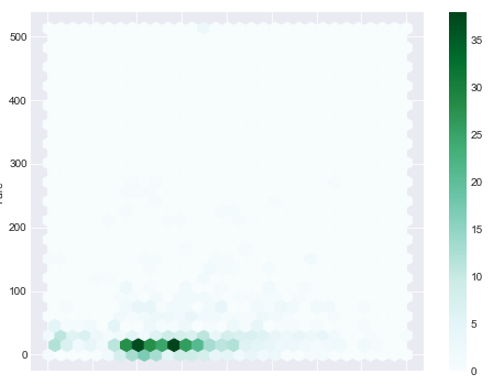
Hexagonal Plots
Hexagonal plots plot the hexagons for intersecting data points on x and y-axis. The more points intersect, the darker is the hexagon. To plot hexagonal plots with Pandas dataframe, you have to call the hexbin() method using the plot function and pass the value for x-index and y-axis as shown below:
titanic_data.plot.hexbin(x='Age', y='Fare', gridsize=30, figsize=(8,6))
In the output, you will see the hexagonal plot with age on x-axis and fare on y-axis.
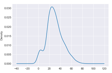
Kernel Density Plots
Like Seaborn and Matplotlib, we can also draw kernel density plots with the Pandas library. To plot kernel density plots with Pandas dataframe, you have to call the kde() method using the plot function:
titanic_data['Age'].plot.kde()
The output of the script above looks like this:
In this section, we saw how Pandas library can be used to draw some of the most basic plots. However, the application of Pandas library for data visualization is not limited to such basic plots. Rather, Pandas can also be used to visualize time series data which we will see in the next section.
Pandas for Visualizing Time Series
Time series data is the type of data where attributes or features are dependent upon time index which is also a feature of the dataset. Some of the most common examples of time series data include the number of items sold per hour, the daily temperature, and the daily stock prices. In all these examples, the data is dependent on some time unit and varies according to that time unit. The time unit can be an hour, day, week, year and so on and so forth.
The Pandas library can be used to visualize time series day. The Pandas library comes with built-in functions that can be used to perform a variety of tasks on time series data such as time shifting and time sampling. In this section, we will see, with the help of examples, how the Pandas library is used for time series visualization. But first, we need time series data.
The Dataset
As said earlier, one of the examples of time series data is the stock prices that vary with respect to time. In this section, we will use AAPL stock prices for the 5 years (from 12-11-2013 to 12-11-2018) to visualize time series data. The dataset can be downloaded from this Yahoo Finance link. For other company ticker data, just go to their website, type the company name and the time period that you want your data to be downloaded for. The dataset will be downloaded in the CSV format.
Let's import the libraries that we are going to use for time series data visualization in Pandas. Execute the following script:
import numpy as np
import pandas as pd

%matplotlib inline
import matplotlib.pyplot as plt
Next, to import the dataset, we will use read_csv() method of the Pandas library as follows:
apple_data = pd.read_csv(r'F:/AAPL.csv')
Check out our hands-on, practical guide to learning Git, with best-practices, industry-accepted standards, and included cheat sheet. Stop Googling Git commands and actually learn it!
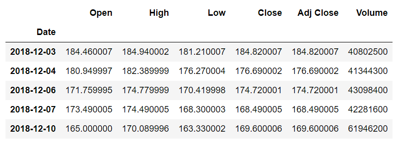
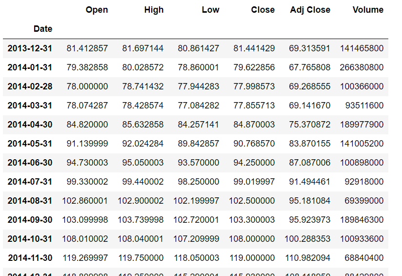
To see how our dataset looks, we can use the head() function. Execute the following script:
apple_data.head()
In the output, you will see the first five rows of the dataset.
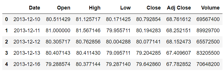
You can see that the dataset contains the Date, the opening and closing price of the stock for the day, the highest and lowest price of the stock for the day, the adjusted close price and the volume of the stock. You can see that all the columns are dependent on the Date. The change in Date column causes the change in all the other columns. Therefore, the Date is the index column in this case. However, in our dataset, by default date is being treated as a string. First, we need to change the type of the Date column from string to DateTime and then we need to set the Date column as an index column.
Execute the following script to change the type of the DateTime column to string.
apple_data['Date'] = apple_data['Date'].apply(pd.to_datetime)
In the script above we applied the to_datetime method to the Date column of our dataset in order to change its type.
Next, we need to set the Date column as the index column. The following script does that:
apple_data.set_index('Date', inplace=True)
In the script above, we use the set_index method of the Pandas dataframe and pass it the 'Date' column as a parameter. The attribute inplace=True means that the conversion will take place and you do not need to store the result in another variable.
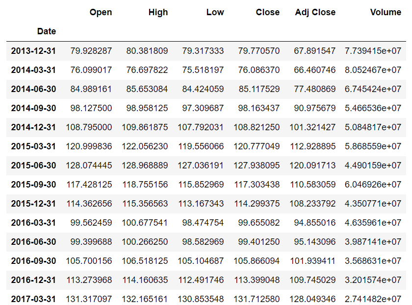
Now, let's print the first five rows of our dataset again using the head() function:
apple_data.head()
The output of the script above looks like this:
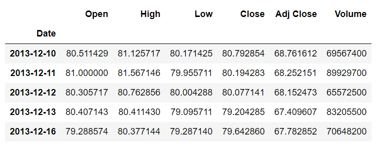
From the output, you can see that now the values in the Date column are bold, which highlights the fact that the Date column is now being used as an index column.
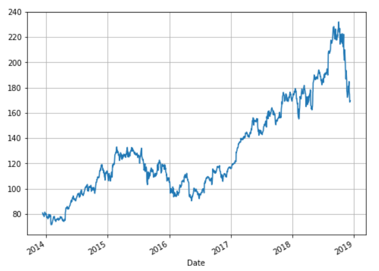
Before we move on to the time shifting section, let's just plot the closing price of the Apple stock. Execute the following script:
plt.rcParams['figure.figsize'] = (8,6)   # Change the plot size
apple_data["Close"].plot(grid=True)
Notice in the above script we simply call the plot method on 'Close' column. We did not specify any information regarding the date, but since the Date column is an index column, the x-axis will contain the values from the Date column while the y-axis will show closing stock price. The output of the script above looks like this:
Pandas can perform a variety of visualization tasks on time series data such as time shifting, time sampling, rolling expanding, time series predictions. In this article, we will see two applications of Pandas time series visualization: Time Shifting and Time sampling.
Time Shifting
Time shifting refers to moving the data a certain number of steps forward or backward. Time series shifting is one of the most important tasks in time series analysis.
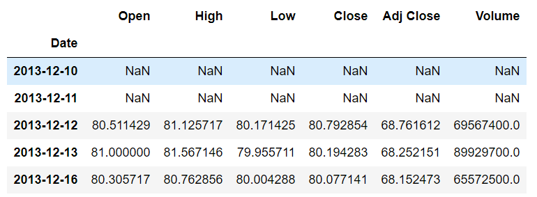
We plotted the head of the dataset earlier, now we will first plot the tail of our dataset. Later we will use these head and tail dataframes to see the effects of time shifting.
To plot the tail of the dataset, we can use the tail() function as follows:
apple_data.tail()
In the output, you will see the last five rows of the dataset as shown below:
Let's first move the data forward to see how time-shifting works in a positive direction. To move data a specific number of time steps forward, you simply need to call the shift() method on the dataset and pass it a positive integer. For instance, the following script shifts the data two steps forward and then prints the head of the data:
apple_data.shift(2).head()
In the output, you will see that no data will be displayed for the first two rows of the head since the data for these rows will be moved two steps forward. In the output you will see that the data that previously belonged to the first index i.e. 2013-12-10, after moving two steps forward, belongs to the third index i.e. 2013-12-12 as shown below:
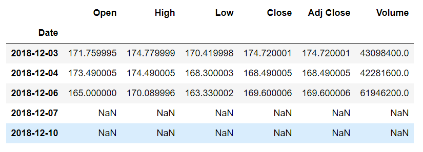
On the other hand, to shift the data backward, you can again use the shift() function but you have to specify a negative value. For instance, to shift the data 2 steps backward you can use the following script:
apple_data.shift(-2).tail()
In the above script, the data is shifted 2 steps backward and then the tail of the data is displayed. In the output, you will see that the last two rows have no records since the data is moved two steps back as shown below:
Time Sampling
Time sampling refers to grouping data features or attributes based on the aggregated value of the index column. For instance, if you want to see the overall maximum opening stock price per year for all the years in the dataset, you can use time sampling.
Implementing time sampling with Pandas is pretty straight-forward. You need to call the resample() method using the Pandas dataframe. You also have to pass the value for the rule attribute. The value is basically the time-offset which specifies the time frame for which we want to group our data.
Finally, you need to call the aggregation function such as mean, max, min, etc. The following script displays the maximum value for all the attribute for each month in the dataset:
apple_data.resample(rule='M').max()
The output of the script above looks like this:
The detailed list of the offset values for the rule attribute is as follows:
B       business day frequency
C       custom business day frequency (experimental)
D       calendar day frequency
W       weekly frequency
M       month end frequency
SM      semi-month end frequency (15th and end of month)
BM      business month end frequency
CBM     custom business month end frequency
MS      month start frequency
SMS     semi-month start frequency (1st and 15th)
BMS     business month start frequency
CBMS    custom business month start frequency
Q       quarter end frequency
BQ      business quarter end frequency
QS      quarter start frequency
BQS     business quarter start frequency
A       year end frequency
BA      business year end frequency
AS      year start frequency
BAS     business year start frequency
BH      business hour frequency
H       hourly frequency
T       minutely frequency
S       secondly frequency
L       milliseconds
U       microseconds
N       nanoseconds
The above list has been taken from the Official Pandas Documentation.
Let's now try to print the average quarterly (every three months) values for the dataset. You can see from the offset list that Q is used for quarterly frequency. Execute the following script:
apple_data.resample(rule='Q').mean()
The output of the script above looks like this:
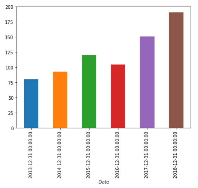
In addition to finding the aggregated values for all the columns in the dataset. You can also re-sample data for a particular column. Let's plot the bar plot that displays the yearly mean value for the 'Close' attribute of our dataset. Execute the following script:
plt.rcParams['figure.figsize'] = (7, 5)
apple_data['Close'].resample('A').mean().plot(kind='bar')
You can see that to plot the bar plot you simply have to call the plot function after the aggregate function and pass it the type of the plot you want to plot. The output of the script above looks like this:
Similarly, to draw a line plot that displays the monthly maximum stock price value for the 'Close' attribute, you can use the following script:
plt.rcParams['figure.figsize'] = (7, 5)
apple_data['Close'].resample('M').max().plot(kind='line')
The output of the script above looks like this:

Conclusion
Pandas is one of the most useful Python libraries for data science. Usually, Pandas is used for importing, manipulating, and cleaning the dataset. However, Pandas can also be used for data visualization, as we showed in this article.
In this article, we saw with the help of different examples how Pandas can be used to plot basic plots. We also studied how Pandas functionalities can be used for time series data visualization. As a rule of thumb, if you really have to plot a simple bar, line or count plots, you should use Pandas.

