
Introduction
In the previous article, we looked at how Python's Matplotlib library can be used for data visualization. In this article we will look at Seaborn which is another extremely useful library for data visualization in Python. The Seaborn library is built on top of Matplotlib and offers many advanced data visualization capabilities.
Though, the Seaborn library can be used to draw a variety of charts such as matrix plots, grid plots, regression plots etc., in this article we will see how the Seaborn library can be used to draw distributional and categorial plots. In the second part of the series, we will see how to draw regression plots, matrix plots, and grid plots.
Downloading the Seaborn Library
The seaborn library can be downloaded in a couple of ways. If you are using pip installer for Python libraries, you can execute the following command to download the library:
pip install seaborn
Alternatively, if you are using the Anaconda distribution of Python, you can use execute the following command to download the seaborn library:
conda install seaborn
The Dataset
The dataset that we are going to use to draw our plots will be the Titanic dataset, which is downloaded by default with the Seaborn library. All you have to do is use the load_dataset function and pass it the name of the dataset.
Let's see what the Titanic dataset looks like. Execute the following script:
import pandas as pd
import numpy as np

import matplotlib.pyplot as plt
import seaborn as sns

dataset = sns.load_dataset('titanic')

dataset.head()
The script above loads the Titanic dataset and displays the first five rows of the dataset using the head function. The output looks like this:
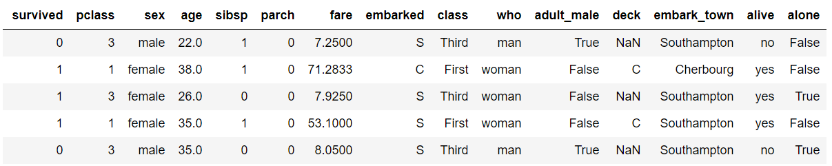
The dataset contains 891 rows and 15 columns and contains information about the passengers who boarded the unfortunate Titanic ship. The original task is to predict whether or not the passenger survived depending upon different features such as their age, ticket, cabin they boarded, the class of the ticket, etc. We will use the Seaborn library to see if we can find any patterns in the data.
Distributional Plots
Distributional plots, as the name suggests are type of plots that show the statistical distribution of data. In this section we will see some of the most commonly used distribution plots in Seaborn.
The Dist Plot
The distplot() shows the histogram distribution of data for a single column. The column name is passed as a parameter to the distplot() function. Let's see how the price of the ticket for each passenger is distributed. Execute the following script:
sns.distplot(dataset['fare'])
Output:
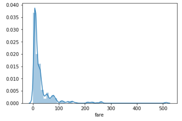
You can see that most of the tickets have been solved between 0-50 dollars. The line that you see represents the kernel density estimation. You can remove this line by passing False as the parameter for the kde attribute as shown below:
sns.distplot(dataset['fare'], kde=False)
Output:
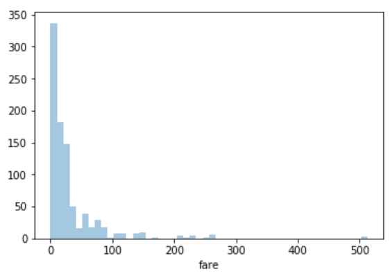
Now you can see there is no line for the kernel density estimation on the plot.
You can also pass the value for the bins parameter in order to see more or less details in the graph. Take a look at he following script:
sns.distplot(dataset['fare'], kde=False, bins=10)
Here we set the number of bins to 10. In the output, you will see data distributed in 10 bins as shown below:
Output:
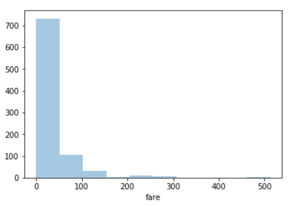
You can clearly see that for more than 700 passengers, the ticket price is between 0 and 50.
The Joint Plot
The jointplot()is used to display the mutual distribution of each column. You need to pass three parameters to jointplot. The first parameter is the column name for which you want to display the distribution of data on x-axis. The second parameter is the column name for which you want to display the distribution of data on y-axis. Finally, the third parameter is the name of the data frame.
Let's plot a joint plot of age and fare columns to see if we can find any relationship between the two.
sns.jointplot(x='age', y='fare', data=dataset)
Output:
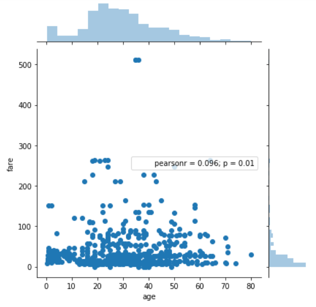
From the output, you can see that a joint plot has three parts. A distribution plot at the top for the column on the x-axis, a distribution plot on the right for the column on the y-axis and a scatter plot in between that shows the mutual distribution of data for both the columns. You can see that there is no correlation observed between prices and the fares.
You can change the type of the joint plot by passing a value for the kind parameter. For instance, if instead of scatter plot, you want to display the distribution of data in the form of a hexagonal plot, you can pass the value hex for the kind parameter. Look at the following script:
sns.jointplot(x='age', y='fare', data=dataset, kind='hex')
Output:
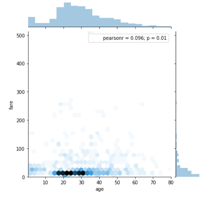
In the hexagonal plot, the hexagon with most number of points gets darker color. So if you look at the above plot, you can see that most of the passengers are between age 20 and 30 and most of them paid between 10-50 for the tickets.
The Pair Plot
The paitplot() is a type of distribution plot that basically plots a joint plot for all the possible combination of numeric and Boolean columns in your dataset. You only need to pass the name of your dataset as the parameter to the pairplot() function as shown below:
sns.pairplot(dataset)
A snapshot of the portion of the output is shown below:
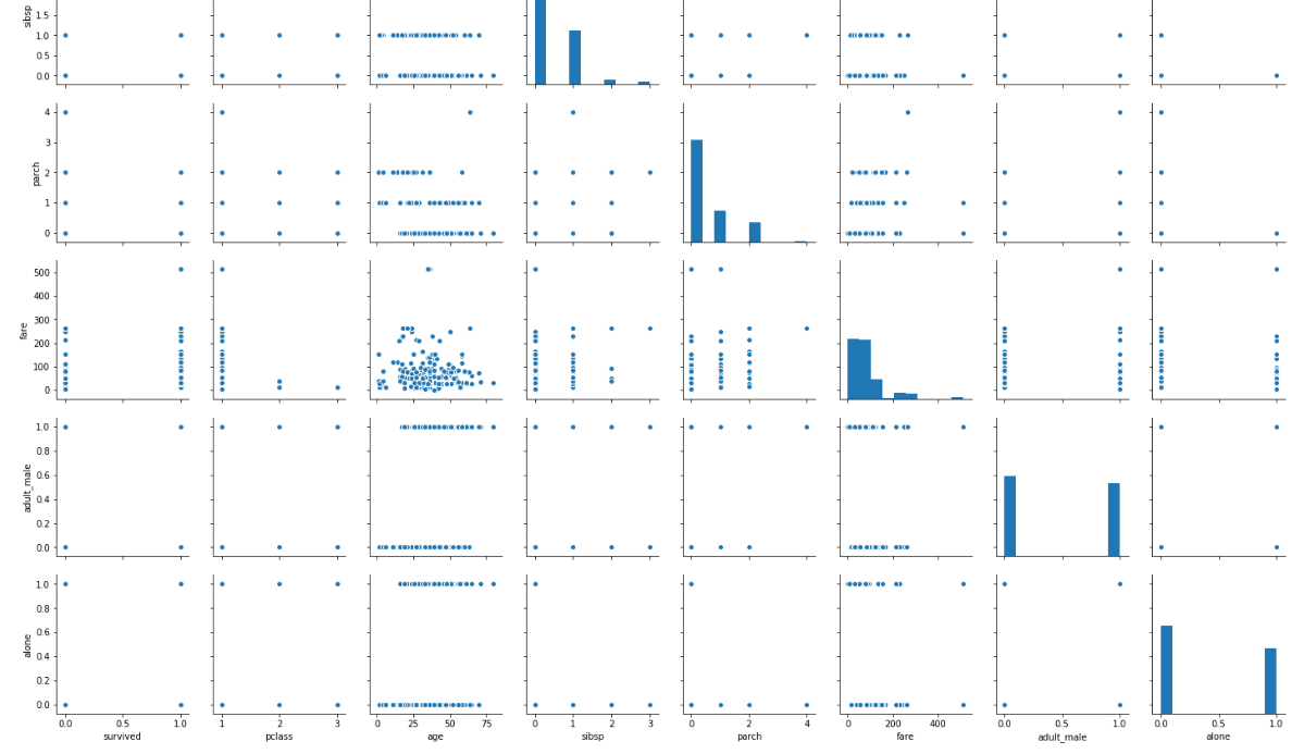
Note: Before executing the script above, remove all null values from the dataset using the following command:
dataset = dataset.dropna()
From the output of the pair plot you can see the joint plots for all the numeric and Boolean columns in the Titanic dataset.
To add information from the categorical column to the pair plot, you can pass the name of the categorical column to the hue parameter. For instance, if we want to plot the gender information on the pair plot, we can execute the following script:
sns.pairplot(dataset, hue='sex')
Output:
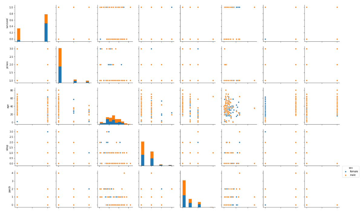
In the output you can see the information about the males in orange and the information about the female in blue (as shown in the legend). From the joint plot on the top left, you can clearly see that among the surviving passengers, the majority were female.
The Rug Plot
The rugplot() is used to draw small bars along x-axis for each point in the dataset. To plot a rug plot, you need to pass the name of the column. Let's plot a rug plot for fare.
sns.rugplot(dataset['fare'])
Output:
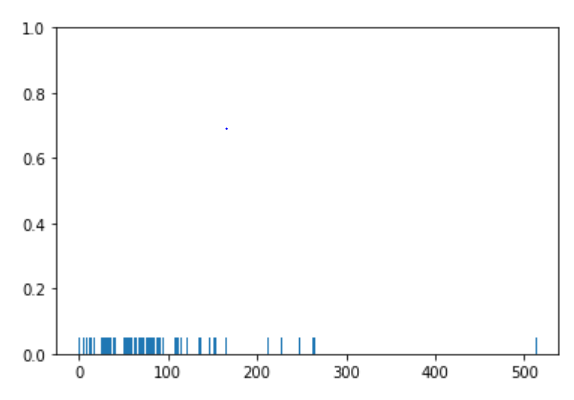
From the output, you can see that as was the case with the distplot(), most of the instances for the fares have values between 0 and 100.
These are some of the most commonly used distribution plots offered by the Python's Seaborn Library. Let's see some of categorical plots in the Seaborn library.
Categorical Plots
Categorical plots, as the name suggests are normally used to plot categorical data. The categorical plots plot the values in the categorical column against another categorical column or a numeric column. Let's see some of the most commonly used categorical data.
The Bar Plot
The barplot() is used to display the mean value for each value in a categorical column, against a numeric column. The first parameter is the categorical column, the second parameter is the numeric column while the third parameter is the dataset. For instance, if you want to know the mean value of the age of the male and female passengers, you can use the bar plot as follows.
sns.barplot(x='sex', y='age', data=dataset)
Output:
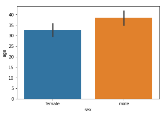
From the output, you can clearly see that the average age of male passengers is just less than 40 while the average age of female passengers is around 33.
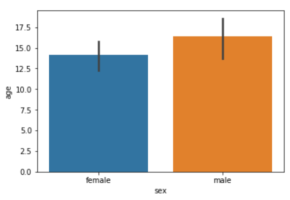
In addition to finding the average, the bar plot can also be used to calculate other aggregate values for each category. To do so, you need to pass the aggregate function to the estimator. For instance, you can calculate the standard deviation for the age of each gender as follows:
import numpy as np

import matplotlib.pyplot as plt
import seaborn as sns

sns.barplot(x='sex', y='age', data=dataset, estimator=np.std)
Notice, in the above script we use the std aggregate function from the numpy library to calculate the standard deviation for the ages of male and female passengers. The output looks like this:
The Count Plot
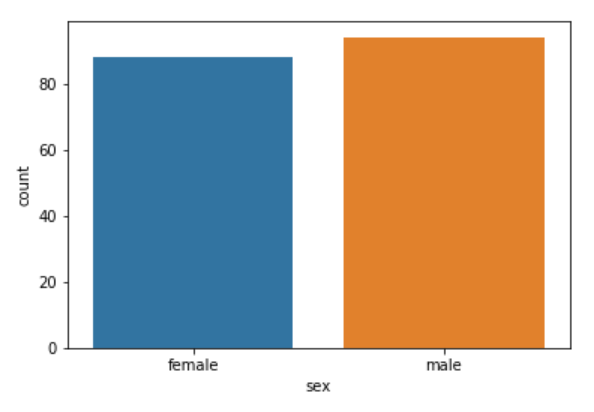
The count plot is similar to the bar plot, however it displays the count of the categories in a specific column. For instance, if we want to count the number of males and women passenger we can do so using count plot as follows:
sns.countplot(x='sex', data=dataset)
The output shows the count as follows:
Output:
Check out our hands-on, practical guide to learning Git, with best-practices, industry-accepted standards, and included cheat sheet. Stop Googling Git commands and actually learn it!
The Box Plot
The box plot is used to display the distribution of the categorical data in the form of quartiles. The center of the box shows the median value. The value from the lower whisker to the bottom of the box shows the first quartile. From the bottom of the box to the middle of the box lies the second quartile. From the middle of the box to the top of the box lies the third quartile and finally from the top of the box to the top whisker lies the last quartile.
You can study more about quartiles and box plots at this link.
Now let's plot a box plot that displays the distribution for the age with respect to each gender. You need to pass the categorical column as the first parameter (which is sex in our case) and the numeric column (age in our case) as the second parameter. Finally, the dataset is passed as the third parameter, take a look at the following script:
sns.boxplot(x='sex', y='age', data=dataset)
Output:
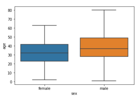
Let's try to understand the box plot for female. The first quartile starts at around 5 and ends at 22 which means that 25% of the passengers are aged between 5 and 25. The second quartile starts at around 23 and ends at around 32 which means that 25% of the passengers are aged between 23 and 32. Similarly, the third quartile starts and ends between 34 and 42, hence 25% passengers are aged within this range and finally the fourth or last quartile starts at 43 and ends around 65.
If there are any outliers or the passengers that do not belong to any of the quartiles, they are called outliers and are represented by dots on the box plot.
You can make your box plots more fancy by adding another layer of distribution. For instance, if you want to see the box plots of forage of passengers of both genders, along with the information about whether or not they survived, you can pass the survived as value to the hue parameter as shown below:
sns.boxplot(x='sex', y='age', data=dataset, hue="survived")
Output:
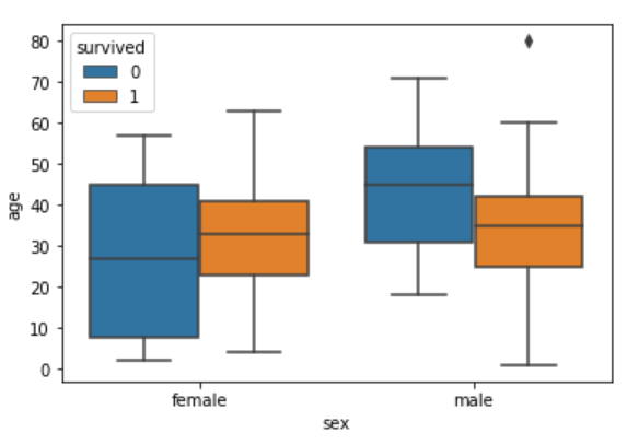
Now in addition to the information about the age of each gender, you can also see the distribution of the passengers who survived. For instance, you can see that among the male passengers, on average more younger people survived as compared to the older ones. Similarly, you can see that the variation among the age of female passengers who did not survive is much greater than the age of the surviving female passengers.
The Violin Plot
The violin plot is similar to the box plot, however, the violin plot allows us to display all the components that actually correspond to the data point. The violinplot() function is used to plot the violin plot. Like the box plot, the first parameter is the categorical column, the second parameter is the numeric column while the third parameter is the dataset.
Let's plot a violin plot that displays the distribution for the age with respect to each gender.
sns.violinplot(x='sex', y='age', data=dataset)
Output:
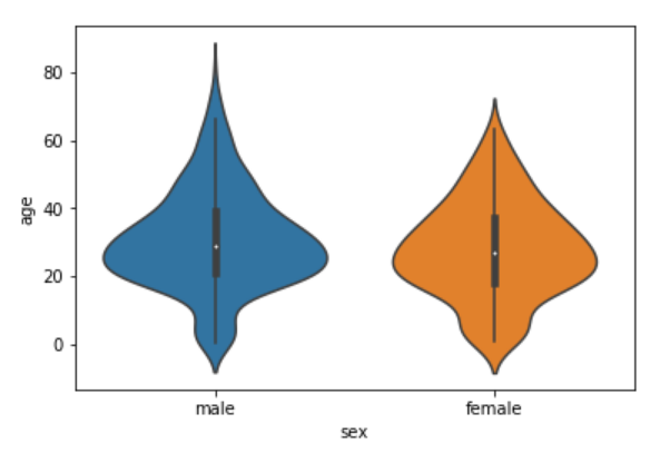
You can see from the figure above that violin plots provide much more information about the data as compared to the box plot. Instead of plotting the quartile, the violin plot allows us to see all the components that actually correspond to the data. The area where the violin plot is thicker has a higher number of instances for the age. For instance, from the violin plot for males, it is clearly evident that the number of passengers with age between 20 and 40 is higher than all the rest of the age brackets.
Like box plots, you can also add another categorical variable to the violin plot using the hue parameter as shown below:
sns.violinplot(x='sex', y='age', data=dataset, hue='survived')
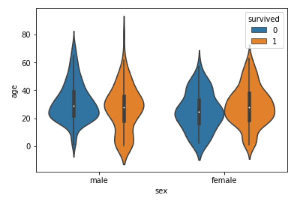
Now you can see a lot of information on the violin plot. For instance, if you look at the bottom of the violin plot for the males who survived (left-orange), you can see that it is thicker than the bottom of the violin plot for the males who didn't survive (left-blue). This means that the number of young male passengers who survived is greater than the number of young male passengers who did not survive. The violin plots convey a lot of information, however, on the downside, it takes a bit of time and effort to understand the violin plots.
Instead of plotting two different graphs for the passengers who survived and those who did not, you can have one violin plot divided into two halves, where one half represents surviving while the other half represents the non-surviving passengers. To do so, you need to pass True as value for the split parameter of the violinplot() function. Let's see how we can do this:
sns.violinplot(x='sex', y='age', data=dataset, hue='survived', split=True)
The output looks like this:
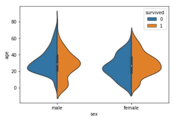
Now you can clearly see the comparison between the age of the passengers who survived and who did not for both males and females.
Both violin and box plots can be extremely useful. However, as a rule of thumb if you are presenting your data to a non-technical audience, box plots should be preferred since they are easy to comprehend. On the other hand, if you are presenting your results to the research community it is more convenient to use violin plot to save space and to convey more information in less time.
The Strip Plot
The strip plot draws a scatter plot where one of the variables is categorical. We have seen scatter plots in the joint plot and the pair plot sections where we had two numeric variables. The strip plot is different in a way that one of the variables is categorical in this case, and for each category in the categorical variable, you will see scatter plot with respect to the numeric column.
The stripplot() function is used to plot the violin plot. Like the box plot, the first parameter is the categorical column, the second parameter is the numeric column while the third parameter is the dataset. Look at the following script:
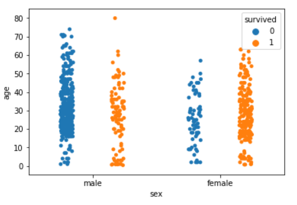
sns.stripplot(x='sex', y='age', data=dataset)
Output:
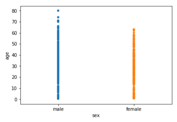
You can see the scattered plots of age for both males and females. The data points look like strips. It is difficult to comprehend the distribution of data in this form. To better comprehend the data, pass True for the jitter parameter which adds some random noise to the data. Look at the following script:
sns.stripplot(x='sex', y='age', data=dataset, jitter=True)
Output:
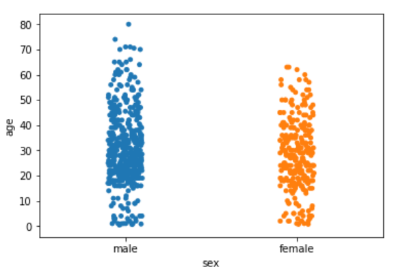
Now you have a better view for the distribution of age across the genders.
Like violin and box plots, you can add an additional categorical column to strip plot using hue parameter as shown below:
sns.stripplot(x='sex', y='age', data=dataset, jitter=True, hue='survived')
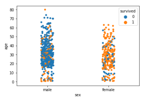
Again you can see there are more points for the males who survived near the bottom of the plot compared to those who did not survive.
Like violin plots, we can also split the strip plots. Execute the following script:
sns.stripplot(x='sex', y='age', data=dataset, jitter=True, hue='survived', split=True)
Output:
Now you can clearly see the difference in the distribution for the age of both male and female passengers who survived and those who did not survive.
The Swarm Plot
The swarm plot is a combination of the strip and the violin plots. In the swarm plots, the points are adjusted in such a way that they don't overlap. Let's plot a swarm plot for the distribution of age against gender. The swarmplot() function is used to plot the violin plot. Like the box plot, the first parameter is the categorical column, the second parameter is the numeric column while the third parameter is the dataset. Look at the following script:
sns.swarmplot(x='sex', y='age', data=dataset)
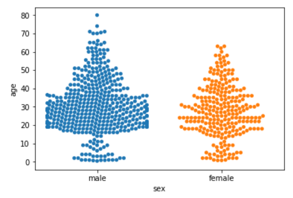
You can clearly see that the above plot contains scattered data points like the strip plot and the data points are not overlapping. Rather they are arranged to give a view similar to that of a violin plot.
Let's add another categorical column to the swarm plot using the hue parameter.
sns.swarmplot(x='sex', y='age', data=dataset, hue='survived')
Output:
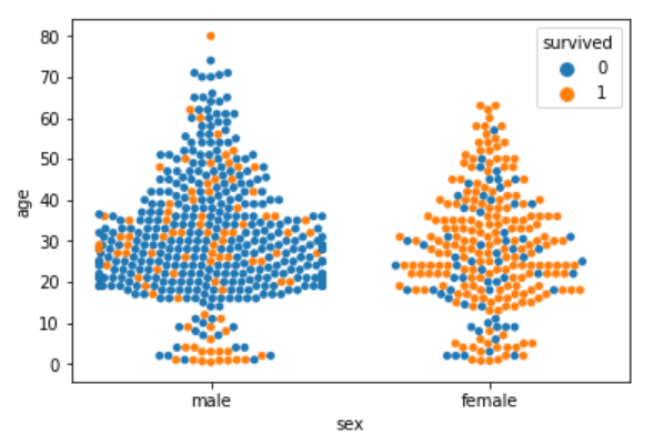
From the output, it is evident that the ratio of surviving males is less than the ratio of surviving females. Since for the male plot, there are more blue points and less orange points. On the other hand, for females, there are more orange points (surviving) than the blue points (not surviving). Another observation is that amongst males of age less than 10, more passengers survived as compared to those who didn't.
We can also split swarm plots as we did in the case of strip and box plots. Execute the following script to do so:
sns.swarmplot(x='sex', y='age', data=dataset, hue='survived', split=True)
Output:
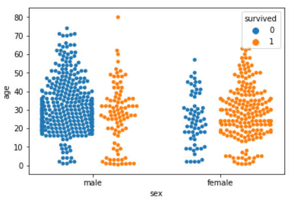
Now you can clearly see that more women survived, as compared to men.
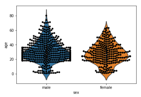
Combining Swarm and Violin Plots
Swarm plots are not recommended if you have a huge dataset since they do not scale well because they have to plot each data point. If you really like swarm plots, a better way is to combine two plots. For instance, to combine a violin plot with swarm plot, you need to execute the following script:
sns.violinplot(x='sex', y='age', data=dataset)
sns.swarmplot(x='sex', y='age', data=dataset, color='black')
Output:
While this series aims to be a detailed resource on using Seaborn, there are a lot of details we won't be able to cover in a few blog posts. There are also a lot of other visualization libraries for Python that have features that go beyond what Seaborn can do. For a more in-depth guide to visualizing data in Python using Seabor, as well as 8 other libraries, check out Data Visualization in Python.
Conclusion
Seaborn is an advanced data visualization library built on top of Matplotlib library. In this article, we looked at how we can draw distributional and categorical plots using Seaborn library. This is Part 1 of the series of article on Seaborn. In the second article of the series, we will see how we play around with grid functionalities in Seaborn and how we can draw Matrix and Regression plots in Seaborn.

