Introduction
Python has a wide variety of useful packages for machine learning and statistical analysis such as TensorFlow, NumPy, scikit-learn, Pandas, and more. One package that is essential to most data science projects is matplotlib.
Available for any Python distribution, it can be installed on Python 3 with pip. Other methods are also available, check https://matplotlib.org/ for more details.
Installation
If you use an OS with a terminal, the following command would install matplotlib with pip:
$ python3 -m pip install matplotlib
Importing & Environment
In a Python file, we want to import the pyplot function that allows us to interface with a MATLAB-like plotting environment. We also import a lines function that lets us add lines to plots:
import matplotlib.pyplot as plt
import matplotlib.lines as mlines
Essentially, this plotting environment lets us save figures and their attributes as variables. These plots can then be printed and viewed with a simple command. For an example, we can look at the stock price of Google: specifically the date, open, close, volume, and adjusted close price (date is stored as an np.datetime64) for the most recent 250 days:
import numpy as np
import matplotlib.pyplot as plt
import matplotlib.cbook as cbook

with cbook.get_sample_data('goog.npz') as datafile:
    price_data = np.load(datafile)['price_data'].view(np.recarray)
price_data = price_data[-250:] # get the most recent 250 trading days
We then transform the data in a way that is done quite often for time series, etc. We find the difference, $d_i$, between each observation and the one before it:
$$d_i = y_i - y_{i - 1} $$
delta1 = np.diff(price_data.adj_close) / price_data.adj_close[:-1]
We can also look at the transformations of different variables, such as volume and closing price:
# Marker size in units of points^2
volume = (15 * price_data.volume[:-2] / price_data.volume[0])**2
close = 0.003 * price_data.close[:-2] / 0.003 * price_data.open[:-2]
Plotting a Scatter Plot
To actually plot this data, you can use the subplots() functions from plt (matplotlib.pyplot). By default this generates the area for the figure and the axes of a plot.
Here we will make a scatter plot of the differences between successive days. To elaborate, x is the difference between day i and the previous day. y is the difference between day i+1 and the previous day (i):
fig, ax = plt.subplots()
ax.scatter(delta1[:-1], delta1[1:], c=close, s=volume, alpha=0.5)

ax.set_xlabel(r'$\Delta_i$', fontsize=15)
ax.set_ylabel(r'$\Delta_{i+1}$', fontsize=15)
ax.set_title('Volume and percent change')

ax.grid(True)
fig.tight_layout()

plt.show()
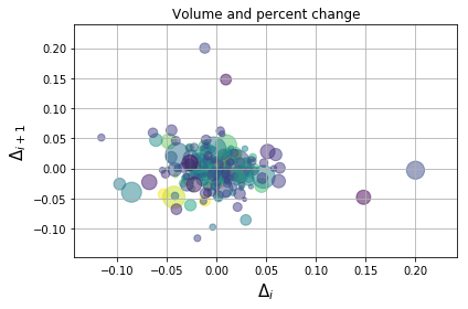
We then create labels for the x and y axes, as well as a title for the plot. We choose to plot this data with grids and a tight layout.
plt.show() displays the plot for us.
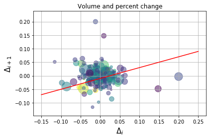
Adding a Line
We can add a line to this plot by providing x and y coordinates as lists to a Line2D instance:
import matplotlib.lines as mlines

fig, ax = plt.subplots()
line = mlines.Line2D([-.15,0.25], [-.07,0.09], color='red')
ax.add_line(line)

# reusing scatterplot code
ax.scatter(delta1[:-1], delta1[1:], c=close, s=volume, alpha=0.5)

ax.set_xlabel(r'$\Delta_i$', fontsize=15)
ax.set_ylabel(r'$\Delta_{i+1}$', fontsize=15)
ax.set_title('Volume and percent change')

ax.grid(True)
fig.tight_layout()

plt.show()
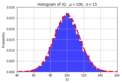
Plotting Histograms
To plot a histogram, we follow a similar process and use the hist() function from pyplot. We will generate 10000 random data points, x, with a mean of 100 and standard deviation of 15.
The hist function takes the data, x, number of bins, and other arguments such as density, which normalizes the data to a probability density, or alpha, which sets the transparency of the histogram.
We will also use the library mlab to add a line representing a normal density function with the same mean and standard deviation:
import numpy as np
import matplotlib.mlab as mlab
import matplotlib.pyplot as plt

mu, sigma = 100, 15
x = mu + sigma*np.random.randn(10000)

# the histogram of the data
n, bins, patches = plt.hist(x, 30, density=1, facecolor='blue', alpha=0.75)

# add a 'best fit' line
y = mlab.normpdf( bins, mu, sigma)
l = plt.plot(bins, y, 'r--', linewidth=4)

plt.xlabel('IQ')
plt.ylabel('Probability')
plt.title(r'$\mathrm{Histogram\ of\ IQ:}\ \mu=100,\ \sigma=15$')
plt.axis([40, 160, 0, 0.03])
plt.grid(True)

plt.show()
Check out our hands-on, practical guide to learning Git, with best-practices, industry-accepted standards, and included cheat sheet. Stop Googling Git commands and actually learn it!
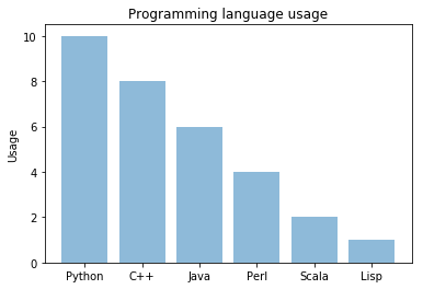
Bar Charts
While histograms helped us with visual densities, bar charts help us view counts of data. To plot a bar chart with matplotlib, we use the bar() function. This takes the counts and data labels as x and y, along with other arguments.
As an example, we could look at a sample of the number of programmers that use different languages:
import numpy as np
import matplotlib.pyplot as plt

objects = ('Python', 'C++', 'Java', 'Perl', 'Scala', 'Lisp')
y_pos = np.arange(len(objects))
performance = [10,8,6,4,2,1]

plt.bar(y_pos, performance, align='center', alpha=0.5)
plt.xticks(y_pos, objects)
plt.ylabel('Usage')
plt.title('Programming language usage')

plt.show()
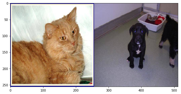
Plotting Images
Analyzing images is very common in Python. Not surprisingly, we can use matplotlib to view images. We use the cv2 library to read in images.
The read_image() function summary is below:
- reads the image file
- splits the color channels
- changes them to RGB
- resizes the image
- returns a matrix of RGB values
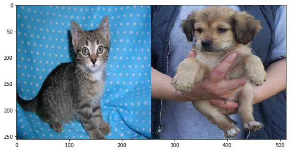
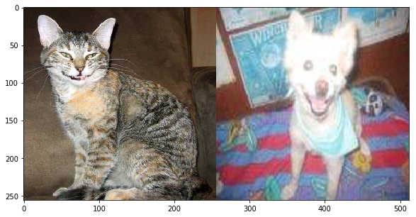
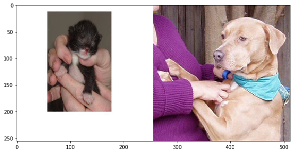
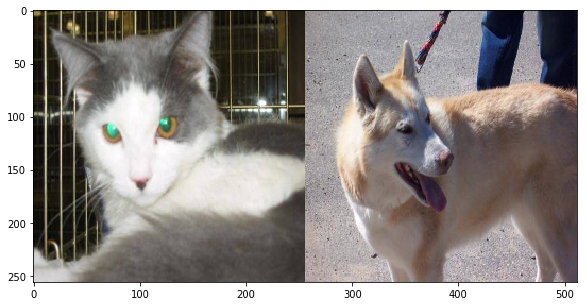
The rest of the code reads in the first five images of cats and dogs from data used in an image recognition CNN. The pictures are concatenated and printed on the same axis:
import matplotlib.pyplot as plt
import numpy as np
import os, cv2

cwd = os.getcwd()
TRAIN_DIR = cwd + '/data/train/'

ROWS = 256
COLS = 256
CHANNELS = 3

train_images = [TRAIN_DIR+i for i in os.listdir(TRAIN_DIR)] # use this for full dataset
train_dogs =   [TRAIN_DIR+i for i in os.listdir(TRAIN_DIR) if 'dog' in i]
train_cats =   [TRAIN_DIR+i for i in os.listdir(TRAIN_DIR) if 'cat' in i]

def read_image(file_path):
    img = cv2.imread(file_path, cv2.IMREAD_COLOR) #cv2.IMREAD_GRAYSCALE
    b,g,r = cv2.split(img)
    img2 = cv2.merge([r,g,b])
    return cv2.resize(img2, (ROWS, COLS), interpolation=cv2.INTER_CUBIC)

for a in range(0,5):
    cat = read_image(train_cats[a])
    dog = read_image(train_dogs[a])
    pair = np.concatenate((cat, dog), axis=1)
    plt.figure(figsize=(10,5))
    plt.imshow(pair)
    plt.show()
Conclusion
In this post we saw a brief introduction of how to use matplotlib to plot data in scatter plots, histograms, and bar charts. We also added lines to these plots. Finally, we saw how to read in images using the cv2 library and used matplotlib to plot the images.

