
Introduction
Matplotlib is one of the most widely used data visualization libraries in Python. Typically, when visualizing more than one variable, you'll want to add a legend to the plot, explaining what each variable represents.
In this article, we'll take a look at how to add a legend to a Matplotlib plot.
Creating a Plot
Let's first create a simple plot with two variables:
import matplotlib.pyplot as plt
import numpy as np

fig, ax = plt.subplots()

x = np.arange(0, 10, 0.1)
y = np.sin(x)
z = np.cos(x)

ax.plot(y, color='blue')
ax.plot(z, color='black')

plt.show()
Here, we've plotted a sine function, starting at 0 and ending at 10 with a step of 0.1, as well as a cosine function in the same interval and step. Running this code yields:
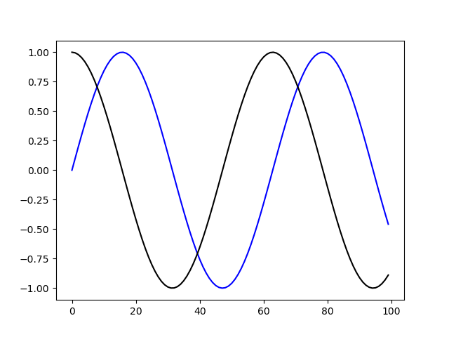
Now, it would be very useful to label these and add a legend so that someone who didn't write this code can more easily discern which is which.
Add Legend to a Figure in Matplotlib
Let's add a legend to this plot. Firstly, we'll want to label these variables, so that we can refer to those labels in the legend. Then, we can simply call legend() on the ax object for the legend to be added:
import matplotlib.pyplot as plt
import numpy as np
fig, ax = plt.subplots()
x = np.arange(0, 10, 0.1)
y = np.sin(x)
z = np.cos(x)
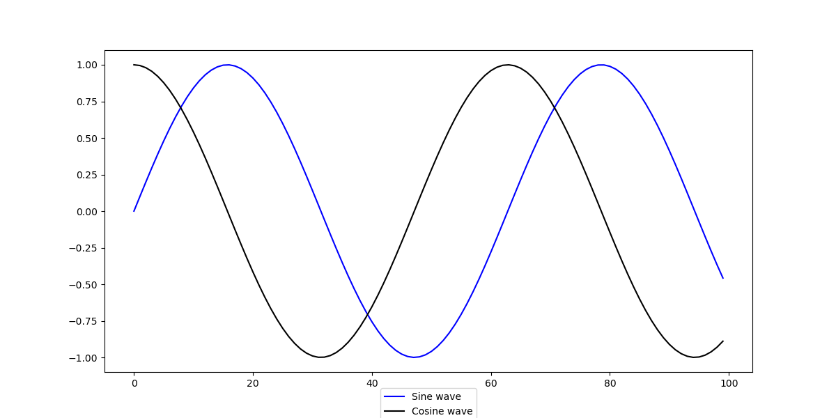
ax.plot(y, color='blue', label='Sine wave')
ax.plot(z, color='black', label='Cosine wave')
leg = ax.legend()
plt.show()
Now, if we run the code, the plot will have a legend:
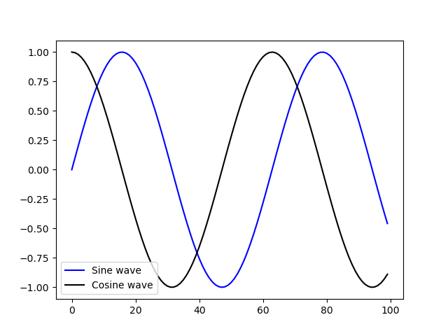
Notice how the legend was automatically placed in the only free space where the waves won't run over it.
Customize Legend in Matplotlib
The legend is added, but it's a little bit cluttered. Let's remove the border around it and move it to another location, as well as change the plot's size:
import matplotlib.pyplot as plt
import numpy as np

fig, ax = plt.subplots(figsize=(12, 6))

x = np.arange(0, 10, 0.1)
y = np.sin(x)
z = np.cos(x)

ax.plot(y, color='blue', label='Sine wave')
ax.plot(z, color='black', label='Cosine wave')
leg = ax.legend(loc='upper right', frameon=False)

plt.show()
This results in:
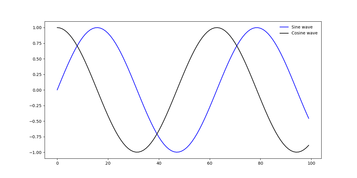
Here, we've used the loc argument to specify that we'd like to put the legend in the top right corner. Other values that are accepted are upper left, lower left, upper right, lower right, upper center, lower center, center left and center right.
Additionally, you can use center to put it in the dead center, or best to place the legend at the "best" free spot so that it doesn't overlap with any of the other elements. By default, best is selected.
Add Legend Outside of Axes
Sometimes, it's tricky to place the legend within the border box of a plot. Perhaps, there are many elements going on and the entire box is filled with important data.
In such cases, you can place the legend outside of the axes, and away from the elements that constitute it. This is done via the bbox_to_anchor argument, which specifies where we want to anchor the legend to:
import matplotlib.pyplot as plt
import numpy as np

fig, ax = plt.subplots(figsize=(12, 6))

x = np.arange(0, 10, 0.1)
y = np.sin(x)
z = np.cos(x)

ax.plot(y, color='blue', label='Sine wave')
ax.plot(z, color='black', label='Cosine wave')
leg = ax.legend(loc='center', bbox_to_anchor=(0.5, -0.10), shadow=False, ncol=2)

plt.show()
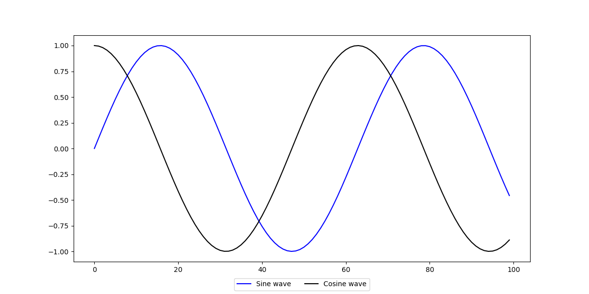
This results in:
Check out our hands-on, practical guide to learning Git, with best-practices, industry-accepted standards, and included cheat sheet. Stop Googling Git commands and actually learn it!
The bbox_to_anchor argument accepts a few arguments itself. Firstly, it accepts a tuple, which allows up to 4 elements. Here, we can specify the x, y, width and height of the legend.
We've only set the x and y values, to displace it -0.10 below the axes, and 0.5 from the left side (0 being the left hand of the box and 1 the right hand side).
By tweaking these, you can set the legend at any place. Within or outside of the box.
Then, we've set the shadow to False. This is used to specify whether we want a small shadow rendered below the legend or not.
Finally, we've set the ncol argument to 2. This specifies the number of labels in a column. Since we have two labels and want them to be in one column, we've set it to 2. If we changed this argument to 1, they'd be placed one above the other:
Note: The bbox_to_anchor argument is used alongside the loc argument. The loc argument will put the legend based on the bbox_to_anchor. In our case, we've put it in the center of the new, displaced, location of the border box.
Conclusion
In this tutorial, we've gone over how to add a legend to your Matplotlib plots. Firstly, we've let Matplotlib figure out where the legend should be located, after which we've used the bbox_to_anchor argument to specify our own location, outside of the axes.
If you're interested in Data Visualization and don't know where to start, make sure to check out our bundle of books on Data Visualization in Python:

Data Visualization in Python with Matplotlib and Pandas is a book designed to take absolute beginners to Pandas and Matplotlib, with basic Python knowledge, and allow them to build a strong foundation for advanced work with these libraries - from simple plots to animated 3D plots with interactive buttons.
It serves as an in-depth guide that'll teach you everything you need to know about Pandas and Matplotlib, including how to construct plot types that aren't built into the library itself.
Data Visualization in Python, a book for beginner to intermediate Python developers, guides you through simple data manipulation with Pandas, covers core plotting libraries like Matplotlib and Seaborn, and shows you how to take advantage of declarative and experimental libraries like Altair. More specifically, over the span of 11 chapters this book covers 9 Python libraries: Pandas, Matplotlib, Seaborn, Bokeh, Altair, Plotly, GGPlot, GeoPandas, and VisPy.
It serves as a unique, practical guide to Data Visualization, in a plethora of tools you might use in your career.

