
Introduction
There are a number of different data visualization libraries for Python. Out of all of the libraries, however, Matplotlib is easily the most popular and widely used one. With Matplotlib you can create both simple and complex visualizations.
Jupyter notebooks are one of the most popular methods of sharing data science and data analysis projects, code, and visualization. Although you may know how to visualize data with Matplotlib, you may not know how to use Matplotlib in a Jupyter notebook.
In this article, we'll be covering how to use an IPython notebook to plot Matplotlib plots inline.
It will also cover the purpose of the Matplotlib “inline” and "notebook" magic methods, which are used to set Matplotlib backends.
Setting Up IPython
Jupyter notebooks are Interactive, and if they let you share your work with other programmers and analysts in a reproducible format. Yet before you can work with a Jupyter notebook you need to install it.
The simplest and easiest way to install a Jupyter notebook is with the use of a package manager. If you are using Conda you can install the Jupyter file system with the following command:
$ conda install -c conda-forge notebook
If you are using pip, you can install Jupyter with this command instead:
$ pip install notebook
After the Jupyter lab has been installed, you can launch an instance of a Jupyter notebook by opening up the command line and using the following intuitively named command prompt:
Jupyter Notebook
You can then access your Jupyter notebook by pointing your browser to the following URL:
http://localhost:8888/tree?
Importing Data and Visualizing Data
We'll be making use of the famous Tips dataset.
We'll import Pandas for reading the .csv file, as well as matplotlib.pyplot for visualization. After that, we can construct a simple scatter plot:
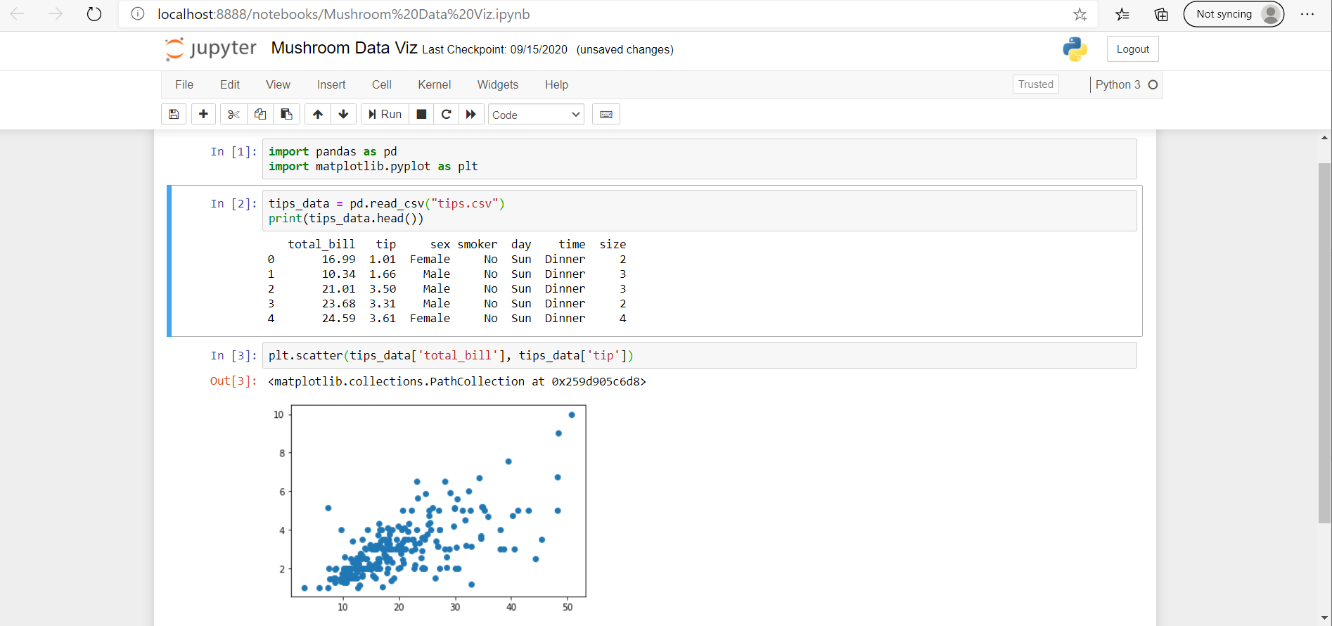
This is how you'd usually visualize data in a Jupyter notebook. However, if you shared this notebook with someone in its current form - they'd have to run the code themselves to see the visualizations.
If you would like the visualizations themselves to be included in the notebook body, you make use of the inline command, which refers to a Matplotlib backend.
Matplotlib Backends
Usually, displaying plots involves using the show() function from PyPlot. With Jupyter notebooks, this isn't necessary as the plots are displayed after running the cells containing the code that generates them. These plots are by default, displayed inline, which means, they're displayed in the notebook itself.
However, you can also display the plot outside of the notebook, which can be done by changing the Matplotlib backend. Jupyter automatically sets a Matplotlib backend, though, this can be overridden using magic functions, which are called with the % character.
Matplotlib Plot On External Window using IPython/Jupyter
Let's start off with trying to plot on an external window from the notebook:
%matplotlib qt
Here, we've told the Jupyter notebook to use Qt to generate the frame on our local machine instead. This function call is situated before the Matplotlib import:

Matplotlib Plot Inline using IPython/Jupyter (inline)
Certain versions of Jupyter may not correctly set the backend for Matplotlib and fail to render graphs inline. In that case, the inline plotting can be forced in one of two ways.
You can set the inline function, instead of qt to force Jupyter to display the plots inline:
Check out our hands-on, practical guide to learning Git, with best-practices, industry-accepted standards, and included cheat sheet. Stop Googling Git commands and actually learn it!
%matplotlib inline
This helps make sure that anyone who opens the notebook can see the visualizations, without needing to rerun the code cells:

Matplotlib Plot Inline using IPython/Jupyter (notebook)
The second method of rendering a Matplotlib plot within a notebook is to use the notebook backend:
%matplotlib notebook
Using %matplotlib notebook creates interactive plots that are embedded within the notebook itself, allowing those viewing the notebook to do things like resize the figure or zoom in on the figure:

Conclusion
In this tutorial, we've gone over how to plot externally (using Qt) and inline (using inline and notebook magic functions) in IPython/Jupyter notebooks.
If you're interested in Data Visualization and don't know where to start, make sure to check out our bundle of books on Data Visualization in Python:

Data Visualization in Python with Matplotlib and Pandas is a book designed to take absolute beginners to Pandas and Matplotlib, with basic Python knowledge, and allow them to build a strong foundation for advanced work with these libraries - from simple plots to animated 3D plots with interactive buttons.
It serves as an in-depth guide that'll teach you everything you need to know about Pandas and Matplotlib, including how to construct plot types that aren't built into the library itself.
Data Visualization in Python, a book for beginner to intermediate Python developers, guides you through simple data manipulation with Pandas, covers core plotting libraries like Matplotlib and Seaborn, and shows you how to take advantage of declarative and experimental libraries like Altair. More specifically, over the span of 11 chapters this book covers 9 Python libraries: Pandas, Matplotlib, Seaborn, Bokeh, Altair, Plotly, GGPlot, GeoPandas, and VisPy.
It serves as a unique, practical guide to Data Visualization, in a plethora of tools you might use in your career.

