
Introduction
Matplotlib is one of the most widely used data visualization libraries in Python. From simple to complex visualizations, it's the go-to library for most.
In this guide, we'll take a look at how to plot a Scatter Plot with Matplotlib.
Scatter Plots explore the relationship between two numerical variables (features) of a dataset.
Import Data
We'll be using the Ames Housing dataset and visualizing correlations between features from it.
Let's import Pandas and load in the dataset:
import pandas as pd

df = pd.read_csv('AmesHousing.csv')
Plot a Scatter Plot in Matplotlib
Now, with the dataset loaded, let's import Matplotlib, decide on the features we want to visualize, and construct a scatter plot:
import matplotlib.pyplot as plt
import pandas as pd

df = pd.read_csv('AmesHousing.csv')

fig, ax = plt.subplots(figsize=(10, 6))
ax.scatter(x = df['Gr Liv Area'], y = df['SalePrice'])
plt.xlabel("Living Area Above Ground")
plt.ylabel("House Price")

plt.show()
Here, we've created a plot, using the PyPlot instance, and set the figure size. Using the returned Axes object, which is returned from the subplots() function, we've called the scatter() function.
We need to supply the x and y arguments as the features we'd like to use to populate the plot. Running this code results in:

We've also set the x and y labels to indicate what the variables represent. There's a clear positive correlation between these two variables. The more area there is above ground-level, the higher the price of the house was.
There are a few outliers, but the vast majority follows this hypothesis.
Plotting Multiple Scatter Plots in Matplotlib
If you'd like to compare more than one variable against another, such as - check the correlation between the overall quality of the house against the sale price, as well as the area above ground level - there's no need to make a 3D plot for this.
While 2D plots that visualize correlations between more than two variables exist, some of them aren't fully beginner friendly.
An easy way to do this is to plot two plots - in one, we'll plot the area above ground level against the sale price, in the other, we'll plot the overall quality against the sale price.
Let's take a look at how to do that:
import matplotlib.pyplot as plt
import pandas as pd
df = pd.read_csv('AmesHousing.csv')
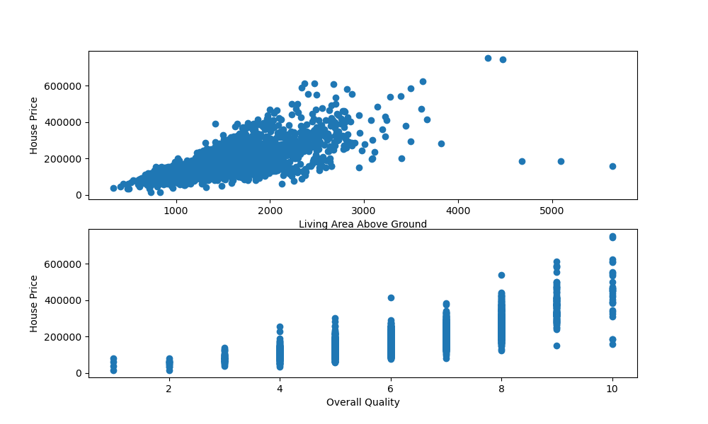
fig, ax = plt.subplots(2, figsize=(10, 6))
ax[0].scatter(x = df['Gr Liv Area'], y = df['SalePrice'])
ax[0].set_xlabel("Living Area Above Ground")
ax[0].set_ylabel("House Price")
ax[1].scatter(x = df['Overall Qual'], y = df['SalePrice'])
ax[1].set_xlabel("Overall Quality")
ax[1].set_ylabel("House Price")
plt.show()
Here, we've called plt.subplots(), passing 2 to indicate that we'd like to instantiate two subplots in the figure.
We can access these via the Axes instance - ax. ax[0] refers to the first subplot's axes, while ax[1] refers to the second subplot's axes.
Here, we've called the scatter() function on each of them, providing them with labels. Running this code results in:
Plotting a 3D Scatter Plot in Matplotlib
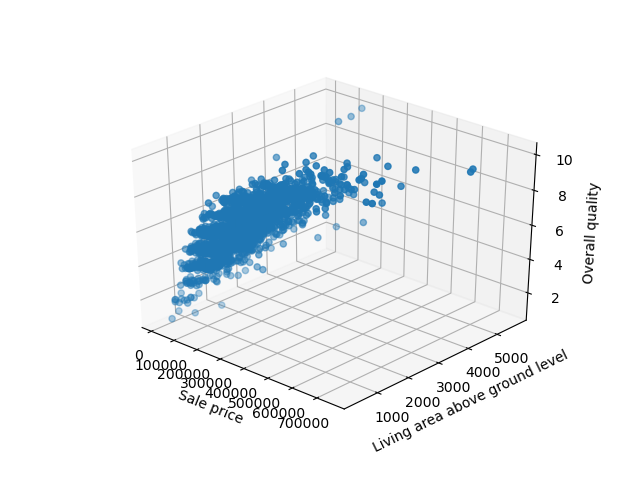
If you don't want to visualize this in two separate subplots, you can plot the correlation between these variables in 3D. Matplotlib has built-in 3D plotting functionality, so doing this is a breeze.
First, we'll need to import the Axes3D class from mpl_toolkits.mplot3d. This special type of Axes is needed for 3D visualizations. With it, we can pass in another argument - z, which is the third feature we'd like to visualize.
Let's go ahead and import the Axes3D object and plot a scatter plot against the previous three features:
import matplotlib.pyplot as plt
import pandas as pd
from mpl_toolkits.mplot3d import Axes3D

df = pd.read_csv('AmesHousing.csv')

fig = plt.figure()
ax = fig.add_subplot(111, projection = '3d')

x = df['SalePrice']
y = df['Gr Liv Area']
z = df['Overall Qual']

ax.scatter(x, y, z)
ax.set_xlabel("Sale price")
ax.set_ylabel("Living area above ground level")
ax.set_zlabel("Overall quality")

plt.show()
Check out our hands-on, practical guide to learning Git, with best-practices, industry-accepted standards, and included cheat sheet. Stop Googling Git commands and actually learn it!
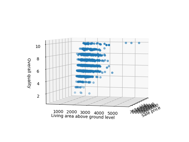
Running this code results in an interactive 3D visualization that we can pan and inspect in three-dimensional space:
Customizing Scatter Plot in Matplotlib
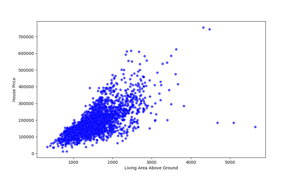
You can change how the plot looks like by supplying the scatter() function with additional arguments, such as color, alpha, etc:
ax.scatter(x = df['Gr Liv Area'], y = df['SalePrice'], color = "blue", edgecolors = "white", linewidths = 0.1, alpha = 0.7)
Running this code would result in:
Conclusion
In this tutorial, we've gone over several ways to plot a scatter plot using Matplotlib and Python.
If you're interested in Data Visualization and don't know where to start, make sure to check out our bundle of books on Data Visualization in Python:

Data Visualization in Python with Matplotlib and Pandas is a book designed to take absolute beginners to Pandas and Matplotlib, with basic Python knowledge, and allow them to build a strong foundation for advanced work with theses libraries - from simple plots to animated 3D plots with interactive buttons.
It serves as an in-depth, guide that'll teach you everything you need to know about Pandas and Matplotlib, including how to construct plot types that aren't built into the library itself.
Data Visualization in Python, a book for beginner to intermediate Python developers, guides you through simple data manipulation with Pandas, cover core plotting libraries like Matplotlib and Seaborn, and show you how to take advantage of declarative and experimental libraries like Altair. More specifically, over the span of 11 chapters this book covers 9 Python libraries: Pandas, Matplotlib, Seaborn, Bokeh, Altair, Plotly, GGPlot, GeoPandas, and VisPy.
It serves as a unique, practical guide to Data Visualization, in a plethora of tools you might use in your career.

