
Introduction
Matplotlib is one of the most widely used data visualization libraries in Python. Much of Matplotlib's popularity comes from its customization options - you can tweak just about any element from its hierarchy of objects.
In this tutorial, we'll take a look at how to set the axis range (
xlim,ylim) in Matplotlib, to truncate or expand the view to specific limits. This can be useful when you want to focus on a particular portion of your data or to ensure consistency across multiple plots.
Creating a Plot
Let's first create a simple plot to work with:
import matplotlib.pyplot as plt
import numpy as np

fig, ax = plt.subplots(figsize=(12, 6))

x = np.arange(0, 10, 0.1)
y = np.sin(x)
z = np.cos(x)

ax.plot(y, color='blue', label='Sine wave')
ax.plot(z, color='black', label='Cosine wave')

plt.show()
In the above code, we create a figure and axis object with plt.subplots(), generate x, y, and z data points using NumPy, and then plot the sine and cosine waves on the same axis. Optionally, you could add ax.legend() to display the labels for each wave.
In this example, we've plotted the values created by applying a sine and cosine function to the sequence generated using NumPy's arange() Function. The sequence starts at 0 and ends at 10 with a step of 0.1. Running this code produces the following plot:

The x-axis currently ranges from 0 to 100, and the y-axis ranges from -1 to 1. However, you might want to modify the axis range for better visualization or to focus on a specific region of the plot.
Setting Axis Range in Matplotlib
To adjust the axis range, you can use the xlim and ylim functions. These functions can be accessed either through the PyPlot instance or the Axes instance.
How to Set X-Limit (xlim) in Matplotlib
To set the x-axis range, you can use the xlim function, which takes two arguments: the lower and upper limits of the x-axis. For example, if you want to focus on the range from 2 to 8, you can set the x-axis limits as follows:
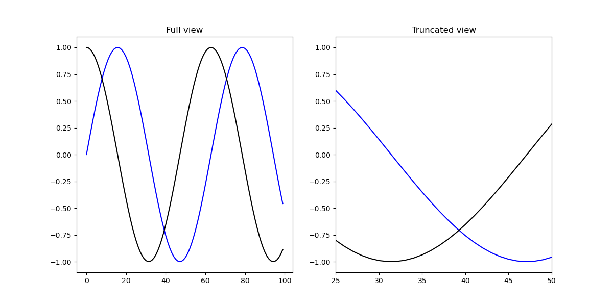
Let's first set the X-limit using both the PyPlot and Axes instances. Both of these methods accept a tuple containing the left and right limits. For example, if we wanted to truncate the view to only show the data in the range of 25-50 on the X-axis, we'd use xlim([25, 50]):
import matplotlib.pyplot as plt
import numpy as np

fig, ax = plt.subplots(figsize=(12, 6))

x = np.arange(0, 10, 0.1)
y = np.sin(x)
z = np.cos(x)

ax.plot(y, color='blue', label='Sine wave')
ax.plot(z, color='black', label='Cosine wave')

plt.xlim([25, 50])
plt.show()
This code limits the view on the X-axis to the data between 25 and 50, as shown in the resulting plot:

The same effect can be achieved by setting the limit via the ax object. This way, if we have multiple Axes, we can set the limit for them separately:
import matplotlib.pyplot as plt
import numpy as np

fig = plt.figure(figsize=(12, 6))

x = np.arange(0, 10, 0.1)
y = np.sin(x)
z = np.cos(x)

ax = fig.add_subplot(121)
ax2 = fig.add_subplot(122)

ax.set_title('Full view')
ax.plot(y, color='blue', label='Sine wave')
ax.plot(z, color='black', label='Cosine wave')

ax2.set_title('Truncated view')
ax2.plot(y, color='blue', label='Sine wave')
ax2.plot(z, color='black', label='Cosine wave')

ax2.set_xlim([25, 50])

plt.show()
In this example, the first subplot (ax) displays the full range of data, while the second subplot (ax2) has a truncated view of the data between 25 and 50 on the X-axis.
How to Set Y-Limit (ylim) in Matplotlib
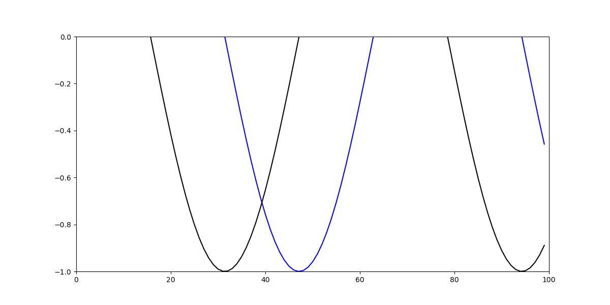
Now, let's set the Y-limit for better visualization and understanding of the data. This can be achieved with the same two approaches as we used for setting the X-limit:
- Using
plt.ylim()function:
ax.plot(y, color='blue', label='Sine wave')
ax.plot(z, color='black', label='Cosine wave')

plt.ylim([-1, 0])
- Using
ax.set_ylim()method:
ax.plot(y, color='blue', label='Sine wave')
ax.plot(z, color='black', label='Cosine wave')

ax.set_ylim([-1, 0])
Both of these approaches result in the following graph with a customized Y-axis range:
Conclusion
In this tutorial, we've gone over how to set the axis range (i.e., the X and Y limits) using Matplotlib in Python. Setting axis ranges can help improve the readability and understanding of your plots by focusing on the relevant data. Remember, you can use either the plt.xlim() and plt.ylim() functions or the ax.set_xlim() and ax.set_ylim() methods to achieve this customization.
If you're interested in Data Visualization and are unsure where to begin, we highly recommend our bundle of books on Data Visualization in Python:

Data Visualization in Python with Matplotlib and Pandas is a comprehensive book designed to guide absolute beginners with basic Python knowledge in mastering Pandas and Matplotlib. It builds a strong foundation for advanced work with these libraries, covering a wide range of plotting techniques - from simple 2D plots to animated 3D plots with interactive buttons.
This in-depth guide will teach you everything you need to know about Pandas and Matplotlib, including how to create custom plot types that aren't readily available within the library itself.
Data Visualization in Python, a book designed for beginner to intermediate Python developers, provides comprehensive guidance on data manipulation using Pandas and thoroughly explains core plotting libraries such as Matplotlib and Seaborn. Additionally, it delves into declarative and experimental libraries like Altair. Spanning 11 chapters, this book covers a total of 9 essential Python libraries: Pandas, Matplotlib, Seaborn, Bokeh, Altair, Plotly, GGPlot, GeoPandas, and VisPy.
This book serves as a unique, practical guide to Data Visualization, offering in-depth knowledge of a wide range of tools that you may encounter and utilize throughout your career. By learning how to effectively set axis ranges (
xlim,ylim) in Matplotlib, you will be able to create visually appealing and informative plots, enhancing your data analysis and presentation skills.

