
Introduction
Matplotlib is one of the most widely used data visualization libraries in Python. From simple to complex visualizations, it's the go-to library for most.
In this tutorial, we'll take a look at how to plot a bar plot in Matplotlib.
Bar graphs display numerical quantities on one axis and categorical variables on the other, letting you see how many occurrences there are for the different categories.
Bar charts can be used for visualizing a time series, as well as just categorical data.
Plot a Bar Plot in Matplotlib
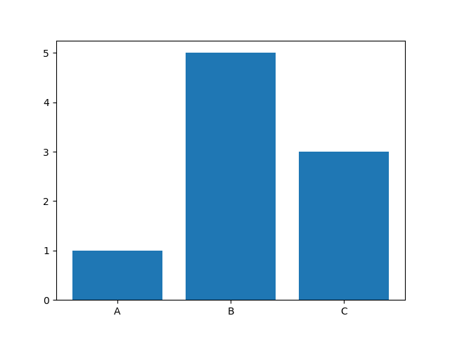
Plotting a Bar Plot in Matplotlib is as easy as calling the bar() function on the PyPlot instance, and passing in the categorical and numerical variables that we'd like to visualize.
import matplotlib.pyplot as plt

x = ['A', 'B', 'C']
y = [1, 5, 3]

plt.bar(x, y)
plt.show()
Here, we've got a few categorical variables in a list - A, B and C. We've also got a couple of continuous variables in another list - 1, 5 and 3. The relationship between these two is then visualized in a Bar Plot by passing these two lists to plt.bar().
This results in a clean and simple bar graph:
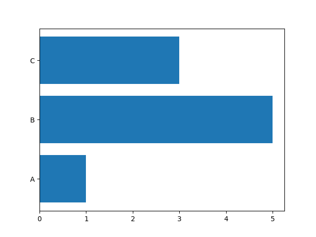
Plot a Horizontal Bar Plot in Matplotlib
Oftentimes, we might want to plot a Bar Plot horizontally, instead of vertically. This is easily achievable by switching the plt.bar() call with the plt.barh() call:
import matplotlib.pyplot as plt

x = ['A', 'B', 'C']
y = [1, 5, 3]

plt.barh(x, y)
plt.show()
This results in a horizontally-oriented Bar Plot:
Change Bar Plot Color in Matplotlib
Changing the color of the bars themselves is as easy as setting the color argument with a list of colors. If you have more bars than colors in the list, they'll start being applied from the first color again:
import matplotlib.pyplot as plt

x = ['A', 'B', 'C']
y = [1, 5, 3]

plt.bar(x, y, color=['red', 'blue', 'green'])
plt.show()
Now, we've got a nicely colored Bar Plot:
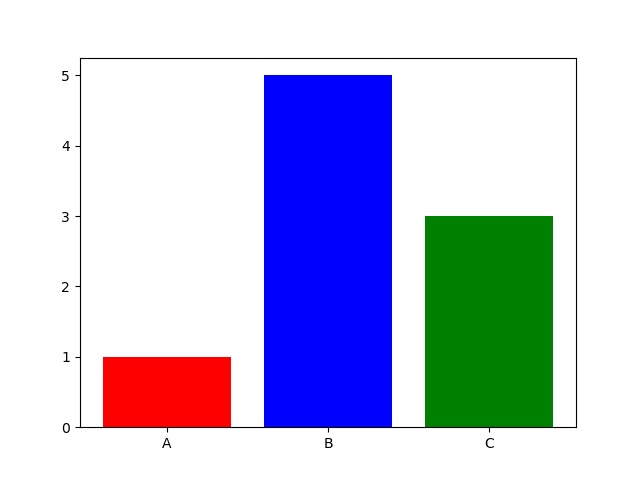
Of course, you can also use the shorthand versions or even HTML codes:
plt.bar(x, y, color=['red', 'blue', 'green'])
plt.bar(x, y, color=['r', 'b', 'g'])
plt.bar(x, y, color=['#ff0000', '#00ff00', '#0000ff'])
plt.show()
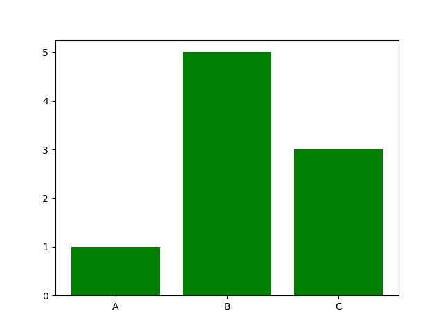
Or you can even put a single scalar value, to apply it to all bars:
plt.bar(x, y, color='green')
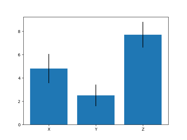
Bar Plot with Error Bars in Matplotlib
When you're plotting mean values of lists, which is a common application for Bar Plots, you'll have some error space. It's very useful to plot error bars to let other observers, and yourself, know how truthful these means are and which deviation is expected.
For this, let's make a dataset with some values, calculate their means and standard deviations with NumPy and plot them with error bars:
Check out our hands-on, practical guide to learning Git, with best-practices, industry-accepted standards, and included cheat sheet. Stop Googling Git commands and actually learn it!
import matplotlib.pyplot as plt
import numpy as np

x = np.array([4, 5, 6, 3, 6, 5, 7, 3, 4, 5])
y = np.array([3, 4, 1, 3, 2, 3, 3, 1, 2, 3])
z = np.array([6, 9, 8, 7, 9, 8, 9, 6, 8, 7])

x_mean = np.mean(x)
y_mean = np.mean(y)
z_mean = np.mean(z)

x_deviation = np.std(x)
y_deviation = np.std(y)
z_deviation = np.std(z)

bars = [x_mean, y_mean, z_mean]
bar_categories = ['X', 'Y', 'Z']
error_bars = [x_deviation, y_deviation, z_deviation]

plt.bar(bar_categories, bars, yerr=error_bars)
plt.show()
Here, we've created three fake datasets with several values each. We'll visualize the mean values of each of these lists. However, since means, as well as averages can give the false sense of accuracy, we'll also calculate the standard deviation of these datasets so that we can add those as error bars.
Using NumPy's mean() and std() functions, this is a breeze. Then, we've packed the bar values into a bars list, the bar names for a nice user experience into bar_categories and finally - the standard deviation values into an error_bars list.
To visualize this, we call the regular bar() function, passing in the bar_categories (categorical values) and bars (continuous values), alongside the yerr argument.
Since we're plotting vertically, we're using the yerr argument. If we were plotting horizontally, we'd use the xerr argument. Here, we've provided the information about the error bars.
This ultimately results in:
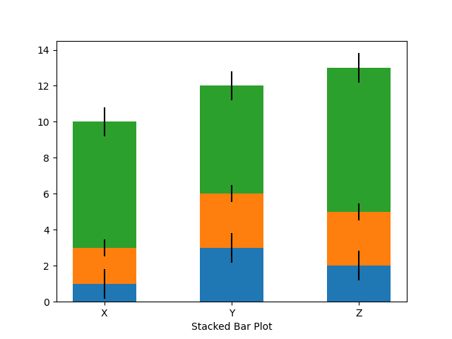
Plot Stacked Bar Plot in Matplotlib
Finally, let's plot a Stacked Bar Plot. Stacked Bar Plots are really useful if you have groups of variables, but instead of plotting them one next to the other, you'd like to plot them one on top of the other.
For this, we'll again have groups of data. Then, we'll calculate their standard deviation for error bars.
Finally, we'll need an index range to plot these variables on top of each other, while maintaining their relative order. This index will essentially be a range of numbers the length of all the groups we've got.
To stack a bar on another one, you use the bottom argument. You specify what's on the bottom of that bar. To plot x beneath y, you'd set x as the bottom of y.
For more than one group, you'll want to add the values together before plotting, otherwise, the Bar Plot won't add up. We'll use NumPy's np.add().tolist() to add the elements of two lists and produce a list back:
import matplotlib.pyplot as plt
import numpy as np

# Groups of data, first values are plotted on top of each other
# Second values are plotted on top of each other, etc
x = [1, 3, 2]
y = [2, 3, 3]
z = [7, 6, 8]

# Standard deviation rates for error bars
x_deviation = np.std(x)
y_deviation = np.std(y)
z_deviation = np.std(z)

bars = [x, y, z]
ind = np.arange(len(bars))
bar_categories = ['X', 'Y', 'Z'];
bar_width = 0.5
bar_padding = np.add(x, y).tolist()

plt.bar(ind, x, yerr=x_deviation, width=bar_width)
plt.bar(ind, y, yerr=y_deviation, bottom=x, width=bar_width)
plt.bar(ind, z, yerr=z_deviation, bottom=bar_padding, width=bar_width)

plt.xticks(ind, bar_categories)
plt.xlabel("Stacked Bar Plot")

plt.show()
Running this code results in:
Conclusion
In this tutorial, we've gone over several ways to plot a bar plot using Matplotlib and Python. We've also covered how to calculate and add error bars, as well as stack bars on top of each other.
If you're interested in Data Visualization and don't know where to start, make sure to check out our bundle of books on Data Visualization in Python:

Data Visualization in Python with Matplotlib and Pandas is a book designed to take absolute beginners to Pandas and Matplotlib, with basic Python knowledge, and allow them to build a strong foundation for advanced work with these libraries - from simple plots to animated 3D plots with interactive buttons.
It serves as an in-depth guide that'll teach you everything you need to know about Pandas and Matplotlib, including how to construct plot types that aren't built into the library itself.
Data Visualization in Python, a book for beginner to intermediate Python developers, guides you through simple data manipulation with Pandas, covers core plotting libraries like Matplotlib and Seaborn, and shows you how to take advantage of declarative and experimental libraries like Altair. More specifically, over the span of 11 chapters this book covers 9 Python libraries: Pandas, Matplotlib, Seaborn, Bokeh, Altair, Plotly, GGPlot, GeoPandas, and VisPy.
It serves as a unique, practical guide to Data Visualization, in a plethora of tools you might use in your career.

