
Introduction
Matplotlib is one of the most widely used data visualization libraries in Python. Much of Matplotlib's popularity comes from its customization options - you can tweak just about any element from its hierarchy of objects.
In this tutorial, we'll take a look at how to change the marker size in a Matplotlib scatter plot.
Import Data
We'll use the World Happiness dataset, and compare the Happiness Score against varying features to see what influences perceived happiness in the world:
import pandas as pd

df = pd.read_csv('worldHappiness2019.csv')
Then, we can easily manipulate the size of the markers used to represent entries in this dataset.
Change Marker Size in Matplotlib Scatter Plot
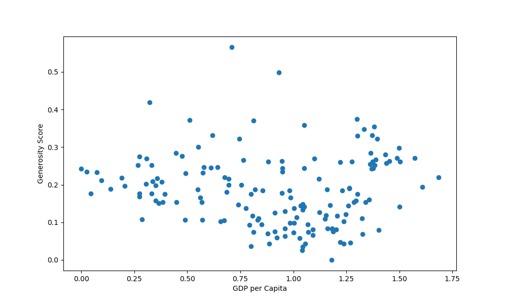
Let's start off by plotting the generosity score against the GDP per capita:
import matplotlib.pyplot as plt
import pandas as pd

df = pd.read_csv('worldHappiness2019.csv')

fig, ax = plt.subplots(figsize=(10, 6))
ax.scatter(x = df['GDP per capita'], y = df['Generosity'])
plt.xlabel("GDP per Capita")
plt.ylabel("Generosity Score")

plt.show()
This results in:
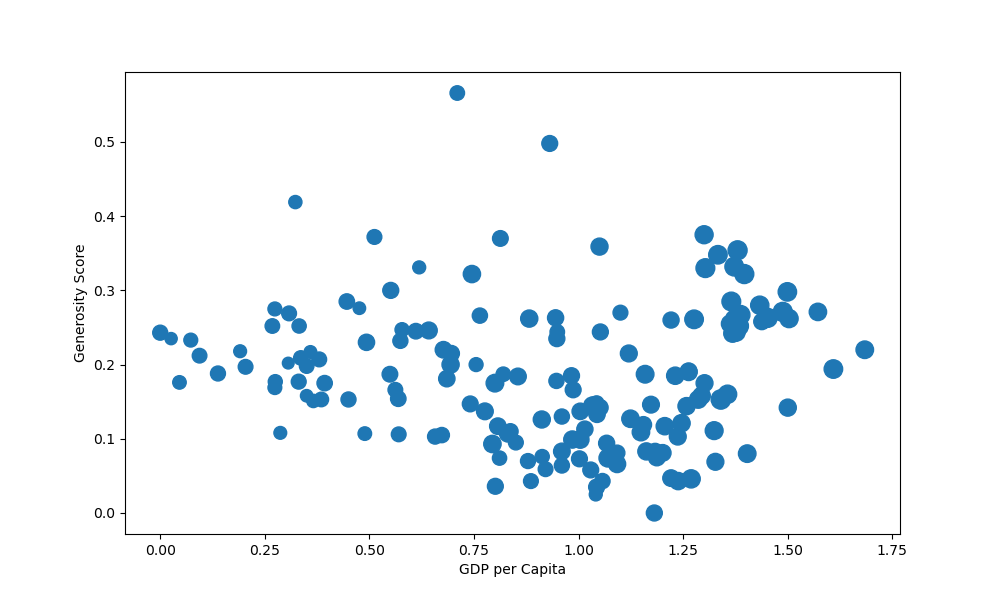
Now, let's say we'd like to increase the size of each marker, based on the perceived happiness of the inhabitants of that country. The happiness score is a list, coming straight from the df, so this can work with other lists as well.
To change the size of the markers, we use the s argument, for the scatter() function. This will be the markersize argument for the plot() function:
import matplotlib.pyplot as plt
import pandas as pd

df = pd.read_csv('worldHappiness2019.csv')

fig, ax = plt.subplots(figsize=(10, 6))
ax.scatter(x = df['GDP per capita'], y = df['Generosity'], s = df['Score']*25)
plt.xlabel("GDP per Capita")
plt.ylabel("Generosity Score")

plt.show()
We've also multiplied the value of each element in the list by an arbitrary number of 25, because they're ranked from 0..1. This will produce really small markers if we use them in their original values.
This now results in:
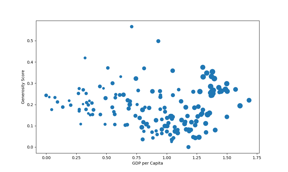
Or better yet, instead of crudely multiplying everything by 25, since the values are similar anyway, we can do something like this:
import matplotlib.pyplot as plt
import pandas as pd

df = pd.read_csv('worldHappiness2019.csv')

size = df['Score'].to_numpy()
s = [3*s**2 for s in size]

fig, ax = plt.subplots(figsize=(10, 6))
ax.scatter(x = df['GDP per capita'], y = df['Generosity'], s = s)
plt.xlabel("GDP per Capita")
plt.ylabel("Generosity Score")

plt.show()
It's important to have the s list the same length as x and y, as each value from s now gets applied to them. If the list is shorter or longer, the code will break.
Here, we've extracted the values from the Score column, scaled them and applied the size back to the scatter plot:
Set Global Marker Size in Matplotlib Scatter Plot
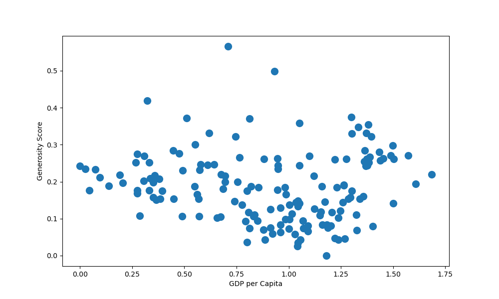
If you'd like to detach the marker size from some variable, and would just like to set a standard, global size of markers in the scatter plot, you can simply pass in a single value for s:
Check out our hands-on, practical guide to learning Git, with best-practices, industry-accepted standards, and included cheat sheet. Stop Googling Git commands and actually learn it!
import matplotlib.pyplot as plt
import pandas as pd

df = pd.read_csv('worldHappiness2019.csv')

fig, ax = plt.subplots(figsize=(10, 6))
ax.scatter(x = df['GDP per capita'], y = df['Generosity'], s = 100)
plt.xlabel("GDP per Capita")
plt.ylabel("Generosity Score")

plt.show()
This now results in:
Conclusion
In this tutorial, we've gone over how to change the marker size in a Matplotlib Scatter Plot.
If you're interested in Data Visualization and don't know where to start, make sure to check out our bundle of books on Data Visualization in Python:

Data Visualization in Python with Matplotlib and Pandas is a book designed to take absolute beginners to Pandas and Matplotlib, with basic Python knowledge, and allow them to build a strong foundation for advanced work with theses libraries - from simple plots to animated 3D plots with interactive buttons.
It serves as an in-depth, guide that'll teach you everything you need to know about Pandas and Matplotlib, including how to construct plot types that aren't built into the library itself.
Data Visualization in Python, a book for beginner to intermediate Python developers, guides you through simple data manipulation with Pandas, cover core plotting libraries like Matplotlib and Seaborn, and show you how to take advantage of declarative and experimental libraries like Altair. More specifically, over the span of 11 chapters this book covers 9 Python libraries: Pandas, Matplotlib, Seaborn, Bokeh, Altair, Plotly, GGPlot, GeoPandas, and VisPy.
It serves as a unique, practical guide to Data Visualization, in a plethora of tools you might use in your career.

