
Introduction
Matplotlib is one of the most widely used data visualization libraries in Python. From simple to complex visualizations, it's the go-to library for most.
In this tutorial, we'll take a look at how to plot a histogram plot in Matplotlib. Histogram plots are a great way to visualize distributions of data - In a histogram, each bar groups numbers into ranges. Taller bars show that more data falls in that range.
A histogram displays the shape and spread of continuous sample data.
Import Data
We'll be using the Netflix Shows dataset and visualizing the distributions from there.
Let's import Pandas and load in the dataset:
import pandas as pd

df = pd.read_csv('netflix_titles.csv')
Plot a Histogram Plot in Matplotlib
Now, with the dataset loaded in, let's import Matplotlib's PyPlot module and visualize the distribution of release_years of the shows that are live on Netflix:
import matplotlib.pyplot as plt
import pandas as pd

df = pd.read_csv('netflix_titles.csv')
plt.hist(df['release_year'])

plt.show()
Here, we've got a minimum-setup scenario. We load the data into a DataFrame (df), then, we use the PyPlot instance and call the hist() function to plot a histogram for the release_year feature. By default, this'll count the number of occurrences of these years, populate bars in ranges and plot the histogram.
Running this code results in:
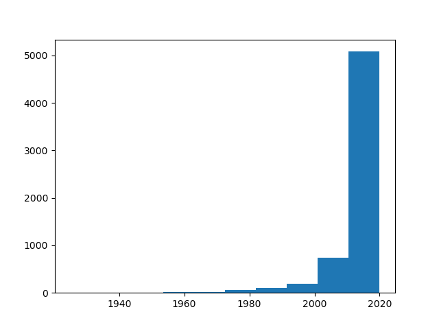
Here, the movie bins (ranges) are set to 10 years. Each bar here includes all shows/movies in batches of 10 years. For example, we can see that around ~750 shows were released between 2000. and 2010. At the same time, ~5000 were released between 2010. and 2020.
These are pretty big ranges for the movie industry, it makes more sense to visualize this for ranges smaller than 10 years.
Change Histogram Bin Size in Matplotlib
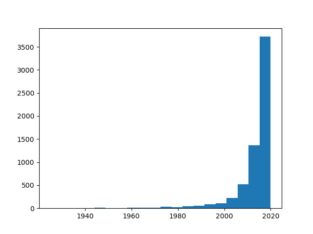
Say, let's visualize a histogram (distribution) plot in batches of 1 year, since this is a much more realistic time-frame for movie and show releases.
We'll import numpy, as it'll help us calculate the size of the bins:
import matplotlib.pyplot as plt
import pandas as pd
import numpy as np

df = pd.read_csv('netflix_titles.csv')
data = df['release_year']

plt.hist(data, bins=np.arange(min(data), max(data) + 1, 1))

plt.show()
This time around, we've extracted the DataFrame column into a data variable, just to make it a bit easier to work with.
We've passed the data to the hist() function, and set the bins argument. It accepts a list, which you can set manually, if you'd like, especially if you want a non-uniform bin distribution.
Since we'd like to pool these entries each in the same time-span (1 year), we'll create a NumPy array, that starts with the lowest value (min(data)), ends at the highest value (max(data)) and goes in increments of 1.
This time around, running this code results in:

Instead of a list, you can give a single bins value. This will be the total number of bins in the plot. Using 1 will result in 1 bar for the entire plot.
Say, we want to have 20 bins, we'd use:
import matplotlib.pyplot as plt
import pandas as pd
import numpy as np

df = pd.read_csv('netflix_titles.csv')
data = df['release_year']

plt.hist(data, bins=20)

plt.show()
This results in 20 equal bins, with data within those bins pooled and visualized in their respective bars:
Check out our hands-on, practical guide to learning Git, with best-practices, industry-accepted standards, and included cheat sheet. Stop Googling Git commands and actually learn it!
This results in 5-year intervals, considering we've got ~100 years worth of data. Splitting it up in 20 bins means that each will include 5 years worth of data.
Plot Histogram with Density
Sometimes, instead of the count of the features, we'd want to check what the density of each bar/bin is. That is, how common it is to see a range within a given dataset. Since we're working with 1-year intervals, this'll result in the probability that a movie/show was released in that year.
To do this, we can simply set the density argument to True:
import matplotlib.pyplot as plt
import pandas as pd
import numpy as np

df = pd.read_csv('netflix_titles.csv')
data = df['release_year']
bins = np.arange(min(data), max(data) + 1, 1)

plt.hist(data, bins=bins, density=True)
plt.ylabel('Density')
plt.xlabel('Year')

plt.show()
Now, instead of the count we've seen before, we'll be presented with the density of entries:
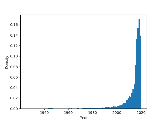
We can see that ~18% of the entries were released in 2018, followed by ~14% in 2019.
Customizing Histogram Plots in Matplotlib
Other than these settings, there's a plethora of various arguments you can set to customize and change the way your plot looks like. Let's change a few of the common options people like to fiddle around with to change plots to their tastes:
import matplotlib.pyplot as plt
import pandas as pd
import numpy as np

df = pd.read_csv('netflix_titles.csv')
data = df['release_year']
bins = np.arange(min(data), max(data) + 1, 1)

plt.hist(data, bins=bins, density=True, histtype='step', alpha=0.5, align='right', orientation='horizontal', log=True)

plt.show()
Here, we've set various arguments:
bins- Number of bins in the plotdensity- Whether PyPlot uses count or density to populate the plothisttype- The type of histogram plot (default isbar, though other values such assteporstepfilledare available)alpha- The alpha/transparency of the linesalign- To which side of the bins the bars are aligned, default ismidorientation- Horizontal/Vertical orientation, default isverticallog- Whether the plot should be put on a logarithmic scale or not
This now results in:
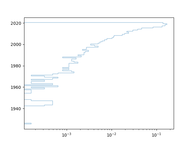
Since we've put the align to right, we can see that the bar is offset a bit, to the vertical right of the 2020 bin.
Conclusion
In this tutorial, we've gone over several ways to plot a histogram using Matplotlib and Python.
If you're interested in Data Visualization and don't know where to start, make sure to check out our bundle of books on Data Visualization in Python:

Data Visualization in Python with Matplotlib and Pandas is a book designed to take absolute beginners to Pandas and Matplotlib, with basic Python knowledge, and allow them to build a strong foundation for advanced work with these libraries - from simple plots to animated 3D plots with interactive buttons.
It serves as an in-depth guide that'll teach you everything you need to know about Pandas and Matplotlib, including how to construct plot types that aren't built into the library itself.
Data Visualization in Python, a book for beginner to intermediate Python developers, guides you through simple data manipulation with Pandas, covers core plotting libraries like Matplotlib and Seaborn, and shows you how to take advantage of declarative and experimental libraries like Altair. More specifically, over the span of 11 chapters this book covers 9 Python libraries: Pandas, Matplotlib, Seaborn, Bokeh, Altair, Plotly, GGPlot, GeoPandas, and VisPy.
It serves as a unique, practical guide to Data Visualization, in a plethora of tools you might use in your career.

