
Introduction
Matplotlib is one of the most widely used data visualization libraries in Python. Much of Matplotlib's popularity comes from its customization options - you can tweak just about any element from its hierarchy of objects.
In this tutorial, we'll take a look at how to rotate tick text/labels in a Matplotlib plot.
Creating a Plot
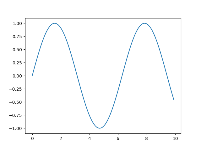
Let's create a simple plot first:
import matplotlib.pyplot as plt
import numpy as np

x = np.arange(0, 10, 0.1)
y = np.sin(x)

plt.plot(x, y)
plt.show()
Rotate X-Axis Tick Labels in Matplotlib
Now, let's take a look at how we can rotate the X-Axis tick labels here. There are two ways to go about it - change it on the Figure-level using plt.xticks() or change it on an Axes-level by using tick.set_rotation() individually, or even by using ax.set_xticklabels() and ax.xtick_params().
Let's start off with the first option:
import matplotlib.pyplot as plt
import numpy as np
x = np.arange(0, 10, 0.1)
y = np.sin(x)
plt.plot(x, y)
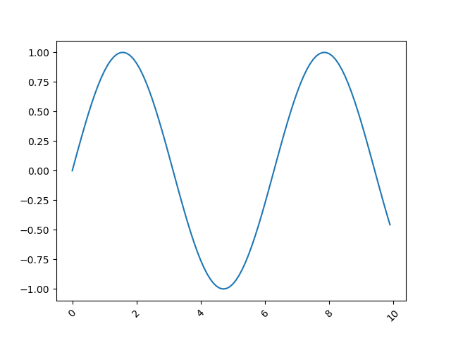
plt.xticks(rotation = 45) # Rotates X-Axis Ticks by 45-degrees
plt.show()
Here, we've set the rotation of xticks to 45, signifying a 45-degree tilt, counterclockwise:
Note: This function, like all others here, should be called after plt.plot(), lest the ticks end up being potentially cropped or misplaced.
Another option would be to get the current Axes object and call ax.set_xticklabels() on it. Here we can set the labels, as well as their rotation:
import matplotlib.pyplot as plt
import numpy as np

x = np.arange(0, 10, 0.1)
y = np.sin(x)

plt.plot(x, y)

ax = plt.gca()
plt.draw()

ax.set_xticklabels(ax.get_xticks(), rotation = 45)

plt.show()
Note: For this approach to work, you'll need to call plt.draw() before accessing or setting the X tick labels. This is because the labels are populated after the plot is drawn, otherwise, they'll return empty text values.

Alternatively, we could've iterated over the ticks in the ax.get_xticklabels() list. Then, we can call tick.set_rotation() on each of them:
import matplotlib.pyplot as plt
import numpy as np

x = np.arange(0, 10, 0.1)
y = np.sin(x)

plt.plot(x, y)

ax = plt.gca()
plt.draw()

for tick in ax.get_xticklabels():
    tick.set_rotation(45)
plt.show()
This also results in:

And finally, you can use the ax.tick_params() function and set the label rotation there:
import matplotlib.pyplot as plt
import numpy as np

x = np.arange(0, 10, 0.1)
y = np.sin(x)

plt.plot(x, y)

ax = plt.gca()
ax.tick_params(axis='x', labelrotation = 45)
plt.show()
This also results in:
Rotate Y-Axis Tick Labels in Matplotlib
The exact same steps can be applied for the Y-Axis tick labels.
Firstly, you can change it on the Figure-level with plt.yticks(), or on the Axes-level by using tick.set_rotation() or by manipulating the ax.set_yticklabels() and ax.tick_params().
Let's start off with the first option:
import matplotlib.pyplot as plt
import numpy as np
x = np.arange(0, 10, 0.1)
y = np.sin(x)
plt.plot(x, y)
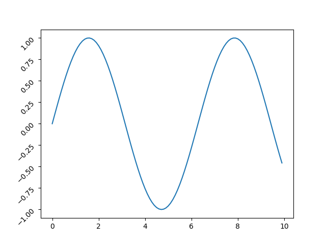
plt.yticks(rotation = 45)
plt.show()
Same as last time, this sets the rotation of yticks by 45-degrees:
Check out our hands-on, practical guide to learning Git, with best-practices, industry-accepted standards, and included cheat sheet. Stop Googling Git commands and actually learn it!
Now, let's work directly with the Axes object:
import matplotlib.pyplot as plt
import numpy as np

x = np.arange(0, 10, 0.1)
y = np.sin(x)

plt.plot(x, y)

ax = plt.gca()
plt.draw()

ax.set_yticklabels(ax.get_yticks(), rotation = 45)

plt.show()
The same note applies here, you have to call plt.draw() before this call to make it work correctly.

Now, let's iterate over the list of ticks and set_rotation() on each of them:
import matplotlib.pyplot as plt
import numpy as np

x = np.arange(0, 10, 0.1)
y = np.sin(x)

plt.plot(x, y)

ax = plt.gca()
plt.draw()

for tick in ax.get_yticklabels():
    tick.set_rotation(45)
plt.show()
This also results in:

And finally, you can use the ax.tick_params() function and set the label rotation there:
import matplotlib.pyplot as plt
import numpy as np

x = np.arange(0, 10, 0.1)
y = np.sin(x)

plt.plot(x, y)

ax = plt.gca()
ax.tick_params(axis='y', labelrotation = 45)
plt.show()
This also results in:
Rotate Dates to Fit in Matplotlib
Most often, the reason people rotate ticks in their plots is because they contain dates. Dates can get long, and even with a small dataset, they'll start overlapping and will quickly become unreadable.
Of course, you can rotate them like we did before, usually, a 45-degree tilt will solve most of the problems, while a 90-degree tilt will free up even more.
Though, there's another option for rotating and fixing dates in Matplotlib, which is even easier than the previous methods - fig.autofmt__date().
This function can be used either as fig.autofmt_xdate() or fig.autofmt_ydate() for the two different axes.
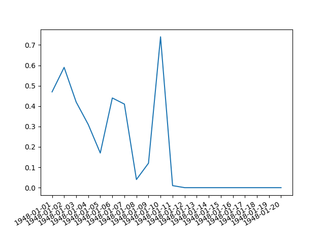
Let's take a look at how we can use it on the Seattle Weather Dataset:
import pandas as pd
import matplotlib.pyplot as plt

weather_data = pd.read_csv("seattleWeather.csv")

fig = plt.figure()
plt.plot(weather_data['DATE'], weather_data['PRCP'])
fig.autofmt_xdate()
plt.show()
This results in:
Conclusion
In this tutorial, we've gone over several ways to rotate Axis text/labels in a Matplotlib plot, including a specific way to format and fit dates .
If you're interested in Data Visualization and don't know where to start, make sure to check out our bundle of books on Data Visualization in Python:

Data Visualization in Python with Matplotlib and Pandas is a book designed to take absolute beginners to Pandas and Matplotlib, with basic Python knowledge, and allow them to build a strong foundation for advanced work with these libraries - from simple plots to animated 3D plots with interactive buttons.
It serves as an in-depth guide that'll teach you everything you need to know about Pandas and Matplotlib, including how to construct plot types that aren't built into the library itself.
Data Visualization in Python, a book for beginner to intermediate Python developers, guides you through simple data manipulation with Pandas, covers core plotting libraries like Matplotlib and Seaborn, and shows you how to take advantage of declarative and experimental libraries like Altair. More specifically, over the span of 11 chapters this book covers 9 Python libraries: Pandas, Matplotlib, Seaborn, Bokeh, Altair, Plotly, GGPlot, GeoPandas, and VisPy.
It serves as a unique, practical guide to Data Visualization, in a plethora of tools you might use in your career.

