
Introduction
Seaborn is one of the most widely used data visualization libraries in Python, as an extension to Matplotlib. It offers a simple, intuitive, yet highly customizable API for data visualization.
In this tutorial, we'll take a look at how to plot a Distribution Plot in Seaborn. We'll cover how to plot a Distribution Plot with Seaborn, how to change a Distribution Plot's bin sizes, as well as plot Kernel Density Estimation plots on top of them and show distribution data instead of count data.
Import Data
We'll be using the Netflix Shows dataset and visualizing the distributions from there.
Let's import Pandas and load in the dataset:
import pandas as pd

df = pd.read_csv('netflix_titles.csv')
How to Plot a Distribution Plot with Seaborn?
Seaborn has different types of distribution plots that you might want to use.
These plot types are: KDE Plots (kdeplot()), and Histogram Plots (histplot()). Both of these can be achieved through the generic displot() function, or through their respective functions.
Note: Since Seaborn 0.11, distplot() has become displot(). If you're using an older version, you'll have to use the older function as well.
Let's start plotting.
Plot Histogram/Distribution Plot (displot) with Seaborn
Let's go ahead and import the required modules and generate a Histogram/Distribution Plot.
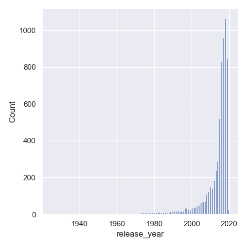
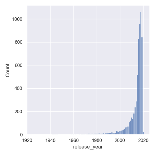
We'll visualize the distribution of the release_year feature, to see when Netflix was the most active with new additions:
import matplotlib.pyplot as plt
import pandas as pd
import numpy as np
import seaborn as sns

# Load the data
df = pd.read_csv('netflix_titles.csv')
# Extract feature we're interested in
data = df['release_year']

# Generate histogram/distribution plot
sns.displot(data)

plt.show()
Now, if we run the code, we'll be greeted with a histogram plot, showing the count of the occurrences of these release_year values:
Plot Distribution Plot with Density Information with Seaborn
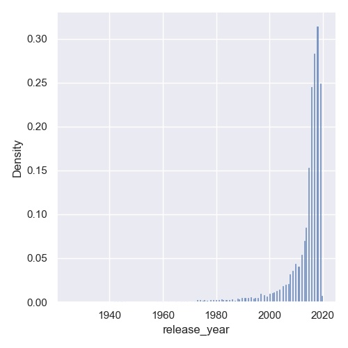
Now, as with Matplotlib, the default histogram approach is to count the number of occurrences. Instead, you can visualize the distribution of each of these release_years in percentages.
Let's modify the displot() call to change that:
# Extract feature we're interested in
data = df['release_year']

# Generate histogram/distribution plot
sns.displot(data, stat = 'density')

plt.show()
The only thing we need to change is to provide the stat argument, and let it know that we'd like to see the density, instead of the 'count'.
Now, instead of the count we've seen before, we'll be presented with the density of entries:
Change Distribution Plot Bin Size with Seaborn
Sometimes, the automatic bin sizes don't work very well for us. They're too big or too small. By default, the size is chosen based on the observed variance in the data, but this sometimes can't be different from what we'd like to bring to light.
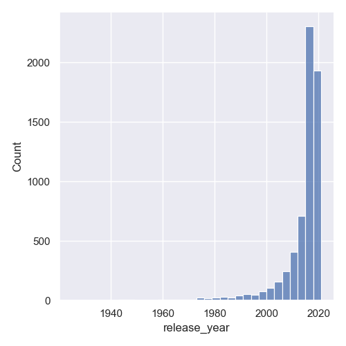
In our plot, they're a bit too small and awkwardly placed with gaps between them. We can change the bin size either by setting the binwidth for each bin, or by setting the number of bins:
data = df['release_year']

sns.displot(data, binwidth = 3)

plt.show()
This will make each bin encompass data in ranges of 3 years:
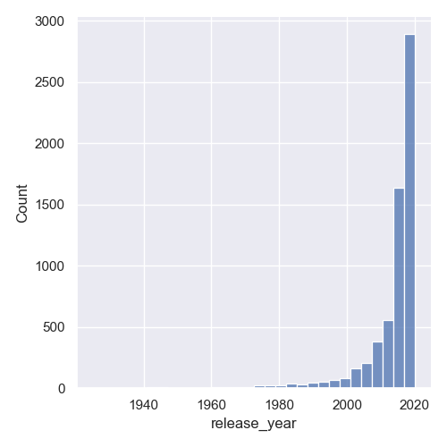
Or, we can set a fixed number of bins:
data = df['release_year']

sns.displot(data, bins = 30)

plt.show()
Now, the data will be packed into 30 bins and depending on the range of your dataset, this will either be a lot of bins, or a really small amount:
Check out our hands-on, practical guide to learning Git, with best-practices, industry-accepted standards, and included cheat sheet. Stop Googling Git commands and actually learn it!
Another great way to get rid of the awkward gaps is to set the discrete argument to True:
data = df['release_year']

sns.displot(data, discrete=True)

plt.show()
This results in:
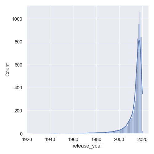
Plot Distribution Plot with KDE
A common plot to plot alongside a Histogram is the Kernel Density Estimation plot. They're smooth and you don't lose any value by snatching ranges of values into bins. You can set a larger bin value, overlay a KDE plot over the Histogram and have all the relevant information on screen.
Thankfully, since this was a really common thing to do, Seaborn lets us plot a KDE plot simply by setting the kde argument to True:
data = df['release_year']

sns.displot(data, discrete = True, kde = True)

plt.show()
This now results in:
Plot Joint Distribution Plot with Seaborn
Sometimes, you might want to visualize multiple features against each other, and their distributions. For example, we might want to visualize the distribution of the show ratings, as well as the year of their addition. If we were looking to see if Netflix started adding more kid-friendly content over the years, this would be a great pairing for a Joint Plot.
Let's make a jointplot():
df = pd.read_csv('netflix_titles.csv')
df.dropna(inplace=True)

sns.jointplot(x = "rating", y = "release_year", data = df)

plt.show()
We've dropped null values here since Seaborn will have trouble converting them to usable values.
Here, we've made a Histogram plot for the rating feature, as well as a Histogram plot for the release_year feature:
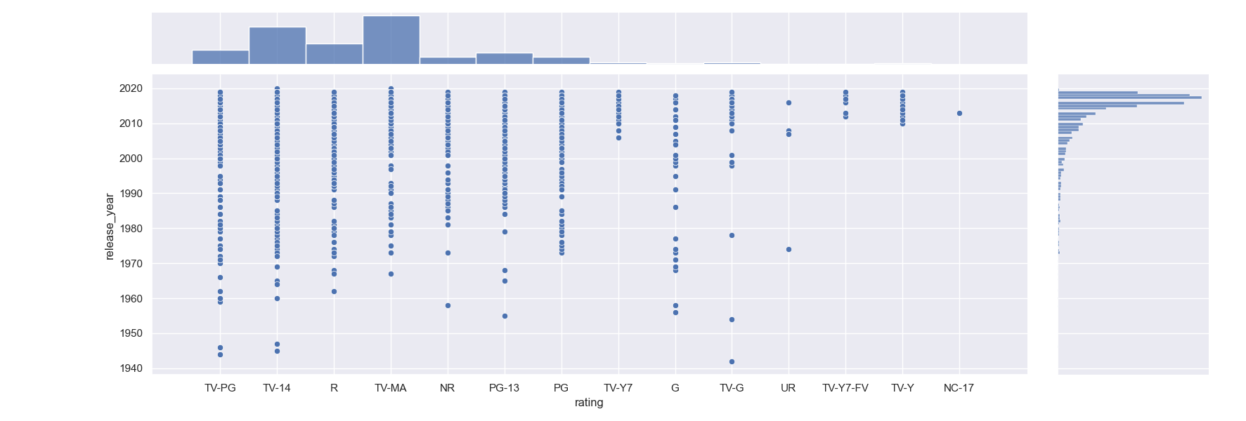
We can see that most of the added entries are TV-MA, however, there's also a lot of TV-14 entries so there's a nice selection of shows for the entire family.
Conclusion
In this tutorial, we've gone over several ways to plot a distribution plot using Seaborn and Python.
If you're interested in Data Visualization and don't know where to start, make sure to check out our bundle of books on Data Visualization in Python:

Data Visualization in Python with Matplotlib and Pandas is a book designed to take absolute beginners to Pandas and Matplotlib, with basic Python knowledge, and allow them to build a strong foundation for advanced work with these libraries - from simple plots to animated 3D plots with interactive buttons.
It serves as an in-depth guide that'll teach you everything you need to know about Pandas and Matplotlib, including how to construct plot types that aren't built into the library itself.
Data Visualization in Python, a book for beginner to intermediate Python developers, guides you through simple data manipulation with Pandas, covers core plotting libraries like Matplotlib and Seaborn, and shows you how to take advantage of declarative and experimental libraries like Altair. More specifically, over the span of 11 chapters this book covers 9 Python libraries: Pandas, Matplotlib, Seaborn, Bokeh, Altair, Plotly, GGPlot, GeoPandas, and VisPy.
It serves as a unique, practical guide to Data Visualization, in a plethora of tools you might use in your career.

