
Introduction
Seaborn is one of the most widely used data visualization libraries in Python, as an extension to Matplotlib. It offers a simple, intuitive, yet highly customizable API for data visualization.
In this tutorial, we'll take a look at how to plot a scatter plot in Seaborn. We'll cover simple scatter plots, multiple scatter plots with FacetGrid as well as 3D scatter plots.
Import Data
We'll use the World Happiness dataset, and compare the Happiness Score against varying features to see what influences perceived happiness in the world:
import pandas as pd

df = pd.read_csv('worldHappiness2016.csv')
Plot a Scatter Plot in Seaborn
Now, with the dataset loaded, let's import PyPlot, which we'll use to show the graph, as well as Seaborn. We'll plot the Happiness Score against the country's Economy (GDP per Capita):
import matplotlib.pyplot as plt
import seaborn as sns
import pandas as pd

df = pd.read_csv('worldHappiness2016.csv')

sns.scatterplot(data = df, x = "Economy (GDP per Capita)", y = "Happiness Score")

plt.show()
Seaborn makes it really easy to plot basic graphs like scatter plots. We don't need to fiddle with the Figure object, Axes instances or set anything up, although, we can if we want to. Here, we've supplied the df as the data argument, and provided the features we want to visualize as the x and y arguments.
These have to match the data present in the dataset and the default labels will be their names. We'll customize this in a later section.
Now, if we run this code, we're greeted with:
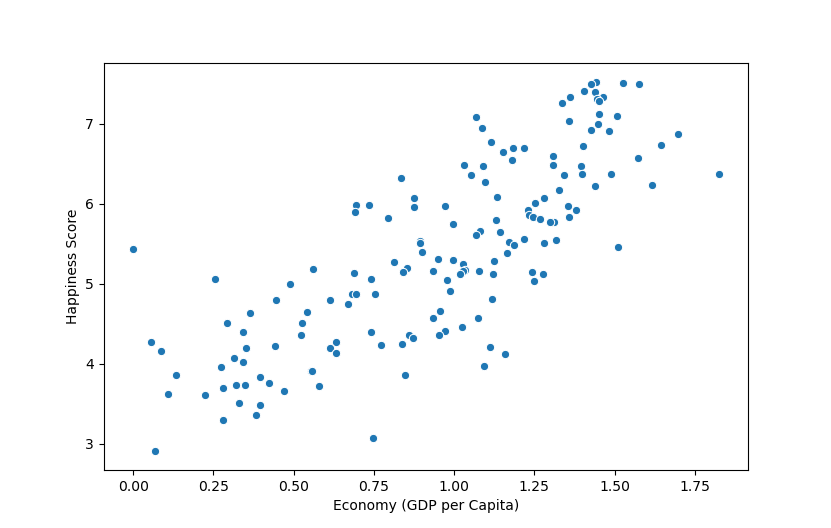
Here, there's a strong positive correlation between the economy (GDP per capita) and the perceived happiness of the inhabitants of a country/region.
Plotting Multiple Scatter Plots in Seaborn with FacetGrid
If you'd like to compare more than one variable against another, such as - the average life expectancy, as well as the happiness score against the economy, or any variation of this, there's no need to create a 3D plot for this.
While 2D plots that visualize correlations between more than two variables exist, some of them aren't fully beginner friendly.
Seaborn allows us to construct a FacetGrid object, which we can use to facet the data and construct multiple, related plots, one next to the other.
Let's take a look at how to do that:
import matplotlib.pyplot as plt
import pandas as pd
import seaborn as sns

df = pd.read_csv('worldHappiness2016.csv')

grid = sns.FacetGrid(df, col = "Region", hue = "Region", col_wrap=5)
grid.map(sns.scatterplot, "Economy (GDP per Capita)", "Health (Life Expectancy)")

grid.add_legend()

plt.show()
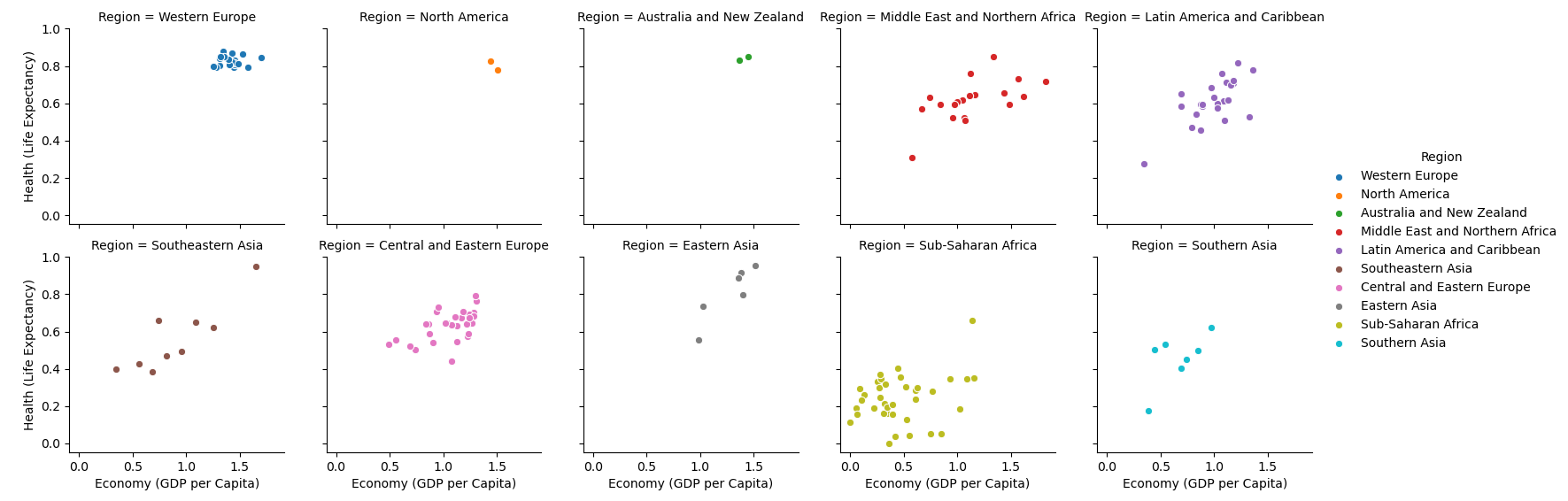
Here, we've created a FacetGrid, passing our data (df) to it. By specifying the col argument as "Region", we've told Seaborn that we'd like to facet the data into regions and plot a scatter plot for each region in the dataset.
We've also assigned the hue to depend on the region, so each region has a different color. Finally, we've set the col_wrap argument to 5 so that the entire figure isn't too wide - it breaks on every 5 columns into a new row.
To this grid object, we map() our arguments. Specifically, we specified a sns.scatterplot as the type of plot we'd like, as well as the x and y variables we want to plot in these scatter plots.
This results in 10 different scatter plots, each with the related x and y data, separated by region.
We've also added a legend in the end, to help identify the colors.
Plotting a 3D Scatter Plot in Seaborn
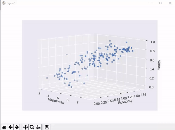
Seaborn doesn't come with any built-in 3D functionality, unfortunately. It's an extension of Matplotlib and relies on it for the heavy lifting in 3D. Though, we can style the 3D Matplotlib plot, using Seaborn.
Check out our hands-on, practical guide to learning Git, with best-practices, industry-accepted standards, and included cheat sheet. Stop Googling Git commands and actually learn it!
Let's set the style using Seaborn, and visualize a 3D scatter plot between happiness, economy and health:
import matplotlib.pyplot as plt
import pandas as pd
import seaborn as sns
from mpl_toolkits.mplot3d import Axes3D

df = pd.read_csv('2016.csv')
sns.set(style = "darkgrid")

fig = plt.figure()
ax = fig.add_subplot(111, projection = '3d')

x = df['Happiness Score']
y = df['Economy (GDP per Capita)']
z = df['Health (Life Expectancy)']

ax.set_xlabel("Happiness")
ax.set_ylabel("Economy")
ax.set_zlabel("Health")

ax.scatter(x, y, z)

plt.show()
Running this code results in an interactive 3D visualization that we can pan and inspect in three-dimensional space, styled as a Seaborn plot:
Customizing Scatter Plots in Seaborn
Using Seaborn, it's easy to customize various elements of the plots you make. For example, you can set the hue and size of each marker on a scatter plot.
Let's change some of the options and see how the plot looks like when altered:
import matplotlib.pyplot as plt
import seaborn as sns
import pandas as pd
df = pd.read_csv('2016.csv')
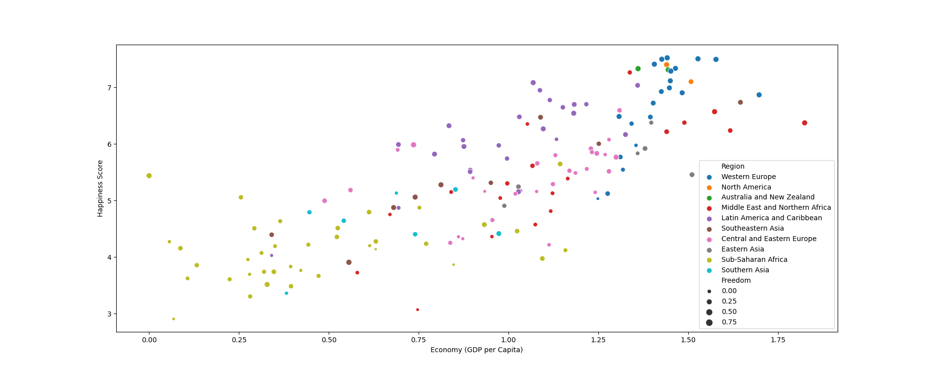
sns.scatterplot(data = df, x = "Economy (GDP per Capita)", y = "Happiness Score", hue = "Region", size = "Freedom")
plt.show()
Here, we've set the hue to Region which means that data from different regions will have different colors. Also, we've set the size to be proportional to the Freedom feature. The higher the freedom factor is, the larger the dots are:
Or you can set a fixed size for all markers, as well as a color:
sns.scatterplot(data = df, x = "Economy (GDP per Capita)", y = "Happiness Score", hue = "red", size = 5)
Conclusion
In this tutorial, we've gone over several ways to plot a scatter plot using Seaborn and Python.
If you're interested in Data Visualization and don't know where to start, make sure to check out our bundle of books on Data Visualization in Python:

Data Visualization in Python with Matplotlib and Pandas is a book designed to take absolute beginners to Pandas and Matplotlib, with basic Python knowledge, and allow them to build a strong foundation for advanced work with theses libraries - from simple plots to animated 3D plots with interactive buttons.
It serves as an in-depth, guide that'll teach you everything you need to know about Pandas and Matplotlib, including how to construct plot types that aren't built into the library itself.
Data Visualization in Python, a book for beginner to intermediate Python developers, guides you through simple data manipulation with Pandas, cover core plotting libraries like Matplotlib and Seaborn, and show you how to take advantage of declarative and experimental libraries like Altair. More specifically, over the span of 11 chapters this book covers 9 Python libraries: Pandas, Matplotlib, Seaborn, Bokeh, Altair, Plotly, GGPlot, GeoPandas, and VisPy.
It serves as a unique, practical guide to Data Visualization, in a plethora of tools you might use in your career.

