
Introduction
Matplotlib is one of the most widely used data visualization libraries in Python. Much of Matplotlib's popularity comes from its customization options - you can tweak just about any element from its hierarchy of objects.
In this tutorial, we'll take a look at how to change the tick frequency in Matplotlib. We'll do this on the figure-level as well as the axis-level.
How to Change Tick Frequency in Matplotlib?
Let's start off with a simple plot. We'll plot two lines, with random values:
import matplotlib.pyplot as plt
import numpy as np

fig = plt.subplots(figsize=(12, 6))

x = np.random.randint(low=0, high=50, size=100)
y = np.random.randint(low=0, high=50, size=100)

plt.plot(x, color='blue')
plt.plot(y, color='black')

plt.show()
x and y range from 0-50, and the length of these arrays is 100. This means, we'll have 100 data points for each of them. Then, we just plot this data onto the Axes object and show it via the PyPlot instance plt:
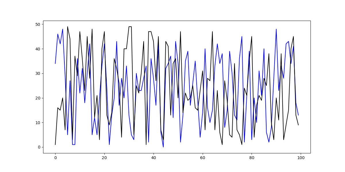
Now, the frequency of the ticks on the X-axis is 20. They're automatically set to a frequency that seems fitting for the dataset we provide.
Sometimes, we'd like to change this. Maybe we want to reduce or increase the frequency. What if we wanted to have a tick on every 5 steps, not 20?
The same goes for the Y-axis. What if the distinction on this axis is even more crucial, and we'd want to have each tick on every step?
Setting Figure-Level Tick Frequency in Matplotlib
Let's change the figure-level tick frequency. This means that if we have multiple Axes, the ticks on all of these will be uniform and will have the same frequency:
import matplotlib.pyplot as plt
import numpy as np
fig = plt.subplots(figsize=(12, 6))
x = np.random.randint(low=0, high=50, size=100)
y = np.random.randint(low=0, high=50, size=100)
plt.plot(x, color='blue')
plt.plot(y, color='black')
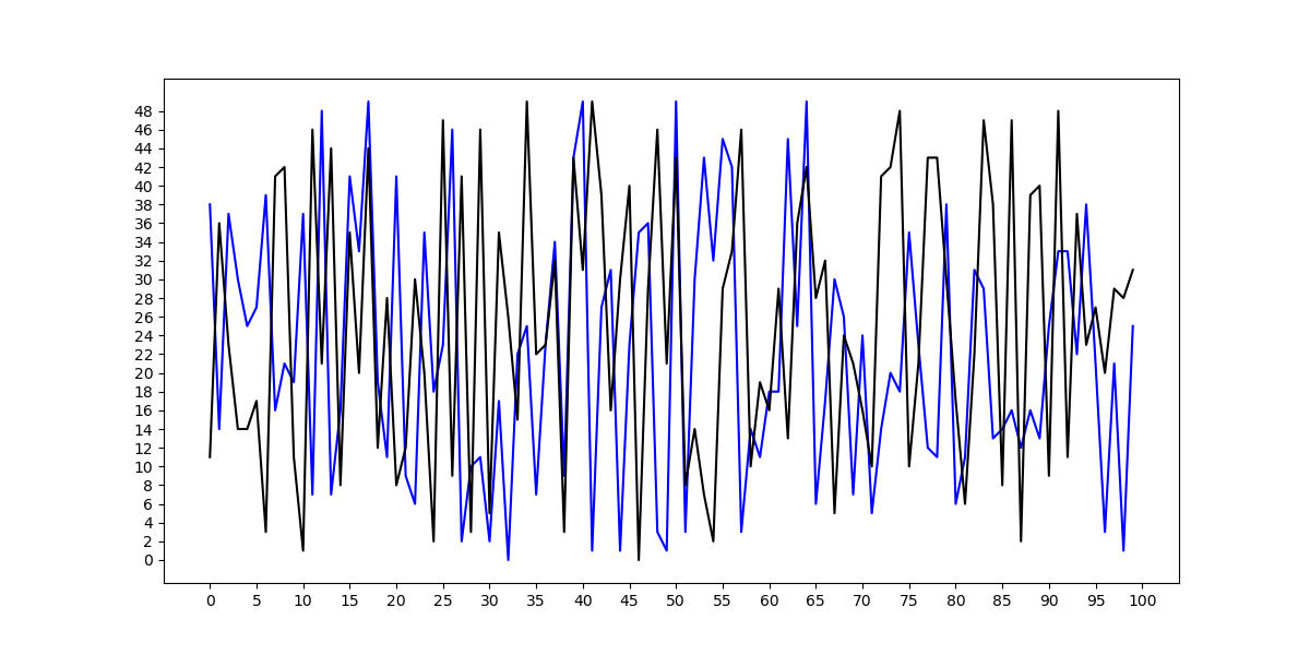
plt.xticks(np.arange(0, len(x)+1, 5))
plt.yticks(np.arange(0, max(y), 2))
plt.show()
You can use the xticks() and yticks() functions and pass in an array denoting the actual ticks. On the X-axis, this array starts on 0 and ends at the length of the x array. On the Y-axis, it starts at 0 and ends at the max value of y. You can hard code the variables in as well.
The final argument is the step. This is where we define how large each step should be. We'll have a tick at every 5 steps on the X-axis and a tick on every 2 steps on the Y-axis:
Setting Axis-Level Tick Frequency in Matplotlib
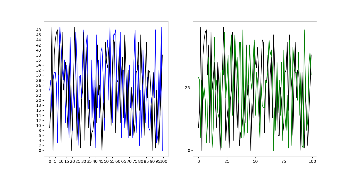
If you have multiple plots going on, you might want to change the tick frequency on the axis-level. For example, you'll want rare ticks on one graph, while you want frequent ticks on the other.
You can use the set_xticks() and set_yticks() functions on the returned Axes instance when adding subplots to a Figure. Let's create a Figure with two axes and change the tick frequency on them separately:
import matplotlib.pyplot as plt
import numpy as np

fig = plt.figure(figsize=(12, 6))

ax = fig.add_subplot(121)
ax2 = fig.add_subplot(122)

x = np.random.randint(low=0, high=50, size=100)
y = np.random.randint(low=0, high=50, size=100)
z = np.random.randint(low=0, high=50, size=100)

ax.plot(x, color='blue')
ax.plot(y, color='black')
ax2.plot(y, color='black')
ax2.plot(z, color='green')

ax.set_xticks(np.arange(0, len(x)+1, 5))
ax.set_yticks(np.arange(0, max(y), 2))
ax2.set_xticks(np.arange(0, len(x)+1, 25))
ax2.set_yticks(np.arange(0, max(y), 25))

plt.show()
Now, this results in:
Conclusion
In this tutorial, we've gone over several ways to change the tick frequency in Matplotlib both on the figure-level as well as the axis-level.
If you're interested in Data Visualization and don't know where to start, make sure to check out our bundle of books on Data Visualization in Python:

Data Visualization in Python with Matplotlib and Pandas is a book designed to take absolute beginners to Pandas and Matplotlib, with basic Python knowledge, and allow them to build a strong foundation for advanced work with these libraries - from simple plots to animated 3D plots with interactive buttons.
It serves as an in-depth guide that'll teach you everything you need to know about Pandas and Matplotlib, including how to construct plot types that aren't built into the library itself.
Data Visualization in Python, a book for beginner to intermediate Python developers, guides you through simple data manipulation with Pandas, covers core plotting libraries like Matplotlib and Seaborn, and shows you how to take advantage of declarative and experimental libraries like Altair. More specifically, over the span of 11 chapters this book covers 9 Python libraries: Pandas, Matplotlib, Seaborn, Bokeh, Altair, Plotly, GGPlot, GeoPandas, and VisPy.
It serves as a unique, practical guide to Data Visualization, in a plethora of tools you might use in your career.

