
Introduction
Matplotlib is one of the most widely used data visualization libraries in Python. From simple to complex visualizations, it's the go-to library for most.
In this tutorial, we'll take a look at how to plot a line plot in Matplotlib - one of the most basic types of plots.
Line Plots display numerical values on one axis, and categorical values on the other. They can typically be used in much the same way Bar Plots can be used, though, they're more commonly used to keep track of changes over time.
Plot a Line Plot in Matplotlib
To plot a line plot in Matplotlib, you use the generic plot() function from the PyPlot instance. There's no specific lineplot() function - the generic one automatically plots using lines or markers.
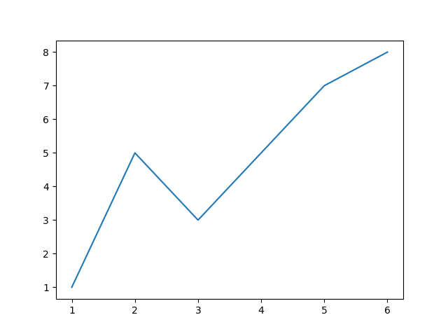
Let's make our own small dataset to work with:
import matplotlib.pyplot as plt

x = [1, 2, 3, 4, 5, 6]
y = [1, 5, 3, 5, 7, 8]

plt.plot(x, y)
plt.show()
This results in a simple line plot:
Alternatively, we could've completely omitted the x axis, and just plotted y. This would result in the X-axis being filled with range(len(y)):
import matplotlib.pyplot as plt
y = [1, 5, 3, 5, 7, 8]

plt.plot(y)
plt.show()
This results in much the same line plot as before, as the values of x are inferred.
This results in much the same line plot as before, as the values of x are inferred. The x values, whether inferred or manually set by us, like in the first example, are meant to be in the same shape as y. If y has 10 values, x should too:

We can, however, change this behavior and go above that range, in which case, the y values will be mapped to those instead:
import matplotlib.pyplot as plt
y = [1, 5, 3, 5, 7, 8]
x = [10, 20, 30, 40, 50, 60]

plt.plot(x, y)
plt.show()
This results in:

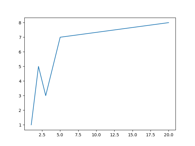
We've been dealing with uniform x values thus far. Let's see what happens if we change the distribution:
import matplotlib.pyplot as plt
y = [1, 5, 3, 5, 7, 8]
x = [1, 2, 3, 4, 5, 20]

plt.plot(x, y)
plt.show()
The first couple of values sets the scale. And 1, 5, 3, 5, 7 are as usual, mapped to 1, 2, 3, 4, 5. However, since 20 jumped in out of nowhere, 8 can't just be mapped to it outright.
The X-axis maintains its uniform scale, and adds a bunch of missing values from 5..20, then, it maps 8 to 20, resulting in a straight line from 7..8 on the Y-axis:
Plot a Line Plot Logarithmically in Matplotlib
When dealing with datasets that have progressively larger numbers, and especially if their distribution leans towards being exponential, it's common to plot a line plot on a logarithmic scale.
Instead of the Y-axis being uniformly linear, this will change each interval to be exponentially larger than the last one.
This results in exponential functions being plotted essentially, as straight lines. When dealing with this type of data, it's hard to wrap your mind around exponential numbers, and you can make it much more intuitive by plotting the data logarithmically.
Let's use NumPy to generate an exponential function and plot it linearly, like we did before:
Check out our hands-on, practical guide to learning Git, with best-practices, industry-accepted standards, and included cheat sheet. Stop Googling Git commands and actually learn it!
import matplotlib.pyplot as plt
import numpy as np

x = np.linspace(0, 5, 10) # [0, 0.55, 1.11, 1.66, 2.22, 2.77, 3.33, 3.88, 4.44, 5]
y = np.exp(x)  # [1, 1.74, 3.03, 5.29, 9.22, 16.08, 28.03, 48.85, 85.15, 148.41]

plt.plot(x, y)
plt.show()
This creates an array that's 10 in length, and contains values between 0..5. We've then used the exp() function from NumPy to calculate the exponential values of these elements, resulting in an exponential function on a linear scale:
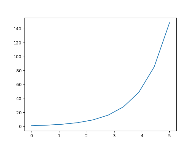
This sort of function, although simple, is hard for humans to conceptualize, and small changes can easily go unnoticed, when dealing with large datasets.
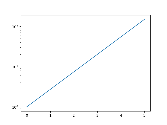
Now, let's change the scale of the Y-axis to logarithmic:
import matplotlib.pyplot as plt
import numpy as np

x = np.linspace(0, 5, 10)
y = np.exp(x)

plt.yscale('log')
plt.plot(x, y)
plt.show()
Using the PyPlot instance, plt, we can set the scale of the X and Y axes. Here, we've set the Y-Axis on a logarithmic scale, via the yscale() function.
Here, we could've also used linear, log, logit and symlog. The default is linear.
Running this code results in:
Customizing Line Plots in Matplotlib
You can easily customize regular Line Plots by passing arguments to the plot() function.
These will typically be arguments such as linewidth, linestyle or color:
import matplotlib.pyplot as plt
import numpy as np
x = np.random.randint(low=1, high=10, size=25)
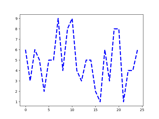
plt.plot(x, color = 'blue', linewidth=3, linestyle='dashed')
plt.show()
This results in:
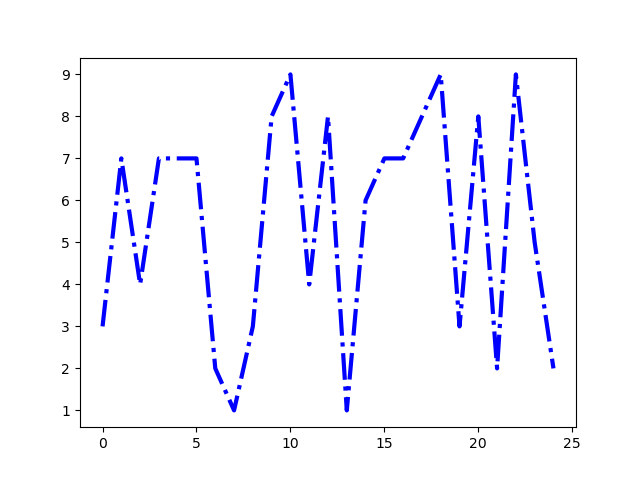
Instead of the dashed value, we could've used dotted, or solid, for example. Though, we could've also used special characters such as :, -, -- and -.:
import matplotlib.pyplot as plt
import numpy as np

x = np.random.randint(low=1, high=10, size=25)

plt.plot(x, color = 'blue', linewidth=3, linestyle='-.')
plt.show()
This results in:
There's a lot of line styles.
Conclusion
In this tutorial, we've gone over several ways to plot a Line Plot using Matplotlib and Python. We've also covered how to plot on a logarithmic scale, as well as how to customize our line plots.
If you're interested in Data Visualization and don't know where to start, make sure to check out our bundle of books on Data Visualization in Python:

Data Visualization in Python with Matplotlib and Pandas is a book designed to take absolute beginners to Pandas and Matplotlib, with basic Python knowledge, and allow them to build a strong foundation for advanced work with these libraries - from simple plots to animated 3D plots with interactive buttons.
It serves as an in-depth guide that'll teach you everything you need to know about Pandas and Matplotlib, including how to construct plot types that aren't built into the library itself.
Data Visualization in Python, a book for beginner to intermediate Python developers, guides you through simple data manipulation with Pandas, covers core plotting libraries like Matplotlib and Seaborn, and shows you how to take advantage of declarative and experimental libraries like Altair. More specifically, over the span of 11 chapters this book covers 9 Python libraries: Pandas, Matplotlib, Seaborn, Bokeh, Altair, Plotly, GGPlot, GeoPandas, and VisPy.
It serves as a unique, practical guide to Data Visualization, in a plethora of tools you might use in your career.

