
Introduction
Seaborn is one of the most widely used data visualization libraries in Python, as an extension to Matplotlib. It offers a simple, intuitive, yet highly customizable API for data visualization.
In this tutorial, we'll take a look at how to plot a boxplot in Seaborn.
Boxplots are used to visualize summary statistics of a dataset, displaying attributes of the distribution like the data’s range and distribution.
Import Data
We’ll need to select a dataset with continuous features in order to create a boxplot, because boxplots display summary statistics for continuous variables - the median and range of a dataset. We’ll be working with the Forest Fires dataset.
We’ll begin with importing Pandas to load and parse the dataset. We’ll obviously want to import Seaborn as well. Finally, we’ll import the Pyplot module from Matplotlib, so that we can show the visualizations:
import pandas as pd
from matplotlib import pyplot as plt
import seaborn as sns
Let's use Pandas to read the CSV file and check how our DataFrame looks by printing its head. Additionally, we'll want to check if the dataset contains any missing values:
dataframe = pd.read_csv("forestfires.csv")
print(dataframe.head())
print(dataframe.isnull().values.any())
   X  Y month  day  FFMC   DMC     DC  ISI  temp  RH  wind  rain  area
0  7  5   mar  fri  86.2  26.2   94.3  5.1   8.2  51   6.7   0.0   0.0
1  7  4   oct  tue  90.6  35.4  669.1  6.7  18.0  33   0.9   0.0   0.0
2  7  4   oct  sat  90.6  43.7  686.9  6.7  14.6  33   1.3   0.0   0.0
3  8  6   mar  fri  91.7  33.3   77.5  9.0   8.3  97   4.0   0.2   0.0
4  8  6   mar  sun  89.3  51.3  102.2  9.6  11.4  99   1.8   0.0   0.0
False
The second print statement returns False, which means that there isn't any missing data. If there were, we'd have to handle missing DataFrame values.
After we check for the consistency of our dataset, we want to select the continuous features that we want to visualize. We’ll save these as their own variables for convenience:
FFMC = dataframe["FFMC"]
DMC = dataframe["DMC"]
DC = dataframe["DC"]
RH = dataframe["RH"]
ISI = dataframe["ISI"]
temp = dataframe["temp"]
Plotting a Boxplot in Seaborn
Now that we have loaded in the data and selected the features that we want to visualize, we can create the Boxplots!
We can create the boxplot just by using Seaborn’s boxplot function. We pass in the dataframe as well as the variables we want to visualize:
sns.boxplot(x=DMC)
plt.show()
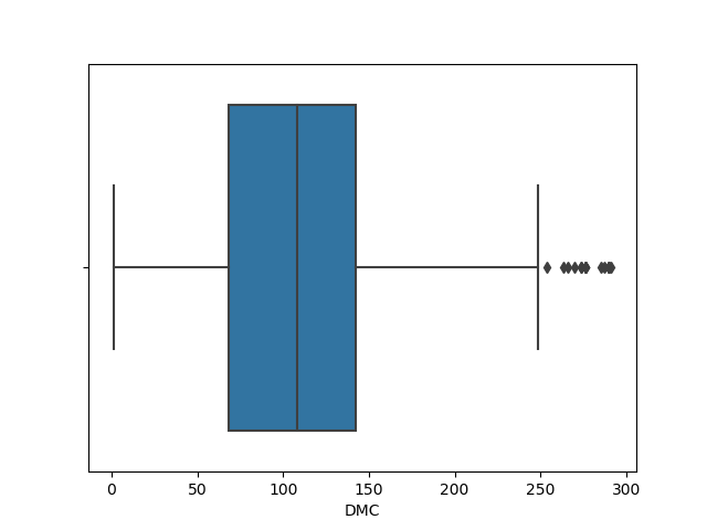
If we want to visualize just the distribution of a categorical variable, we can provide our chosen variable as the x argument. If we do this, Seaborn will calculate the values on the Y-axis automatically, as we can see on the previous image.
However, if there’s a specific distribution that we want to see segmented by type, we can also provide a categorical X-variable and a continuous Y-variable.
day = dataframe["day"]
sns.boxplot(x=DMC, y=day)
plt.show()
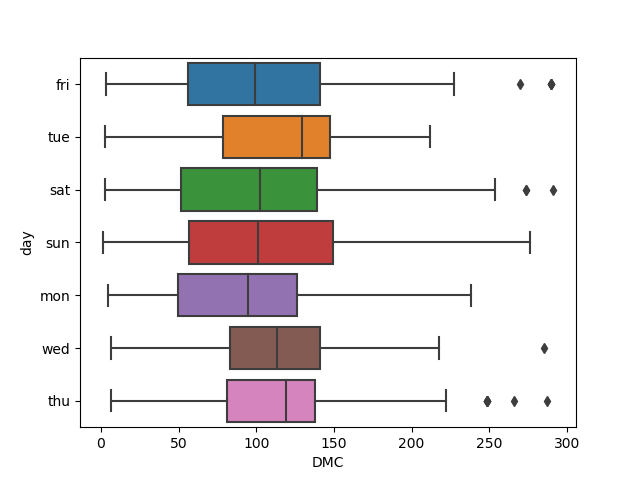
This time around, we can see a boxplot generated for each day in the week, as specified in the dataset.
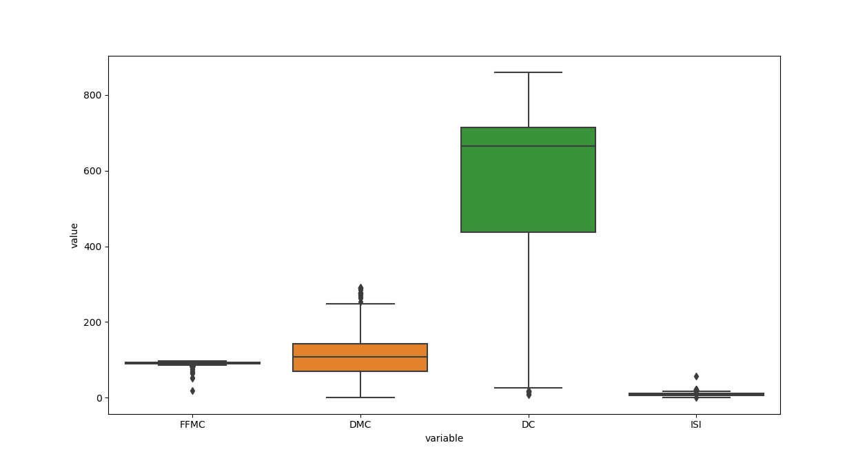
If we want to visualize multiple columns at the same time, what do we provide to the x and y arguments? Well, we provide the labels for the data we want, and provide the actual data using the data argument.
We can create a new DataFrame containing just the data we want to visualize, and melt() it into the data argument, providing labels such as x='variable' and y='value':
df = pd.DataFrame(data=dataframe, columns=["FFMC", "DMC", "DC", "ISI"])
sns.boxplot(x="variable", y="value", data=pd.melt(df))
plt.show()
Check out our hands-on, practical guide to learning Git, with best-practices, industry-accepted standards, and included cheat sheet. Stop Googling Git commands and actually learn it!
Customize a Seaborn Boxplot
Change Boxplot Colors
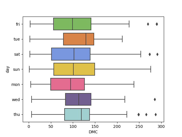
Seaborn will automatically assign the different colors to different variables so we can easily visually differentiate them. Though, we can also supply a list of colors to be used if we'd like to specify them.
After choosing a list of colors with hex values (or any valid Matplotlib color), we can pass them into the palette argument:
day = dataframe["day"]
colors = ['#78C850', '#F08030', '#6890F0','#F8D030', '#F85888', '#705898', '#98D8D8']
sns.boxplot(x=DMC, y=day, palette=colors)
plt.show()
Customize Axis Labels
We can adjust the X-axis and Y-axis labels easily using Seaborn, such as changing the font size, changing the labels, or rotating them to make the ticks easier to read:
df = pd.DataFrame(data=dataframe, columns=["FFMC", "DMC", "DC", "ISI"])
boxplot = sns.boxplot(x="variable", y="value", data=pd.melt(df))
boxplot.axes.set_title("Distribution of Forest Fire Conditions", fontsize=16)
boxplot.set_xlabel("Conditions", fontsize=14)
boxplot.set_ylabel("Values", fontsize=14)
plt.show()

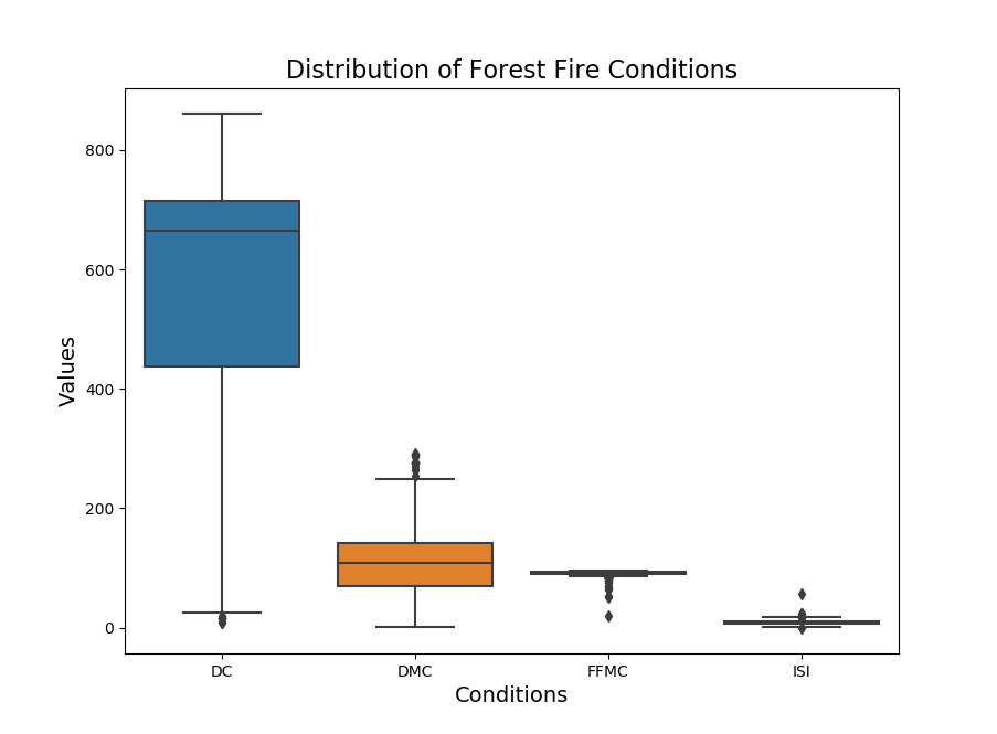
Ordering Boxplots
If we want to view the boxes in a specific order, we can do that by making use of the order argument, and supplying the column names in the order you want to see them in:
df = pd.DataFrame(data=dataframe, columns=["FFMC", "DMC", "DC", "ISI"])
boxplot = sns.boxplot(x="variable", y="value", data=pd.melt(df), order=["DC", "DMC", "FFMC", "ISI"])
boxplot.axes.set_title("Distribution of Forest Fire Conditions", fontsize=16)
boxplot.set_xlabel("Conditions", fontsize=14)
boxplot.set_ylabel("Values", fontsize=14)
plt.show()
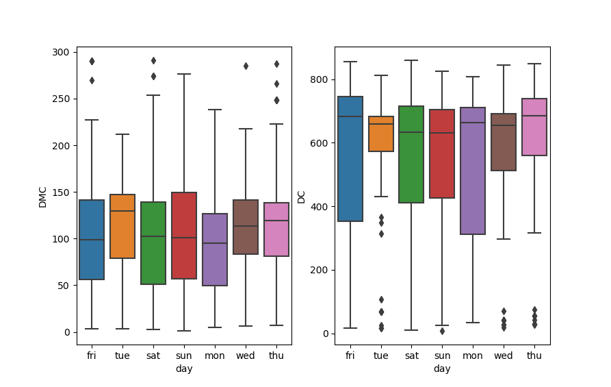
Creating Subplots
If we wanted to separate out the plots for the individual features into their own subplots, we could do that by creating a figure and axes with the subplots function from Matplotlib. Then, we use the axes object and access them via their index. The boxplot() function accepts an ax argument, specifying on which axes it should be plotted on:
fig, axes = plt.subplots(1, 2)
sns.boxplot(x=day, y=DMC, orient='v', ax=axes[0])
sns.boxplot(x=day, y=DC, orient='v', ax=axes[1])
plt.show()
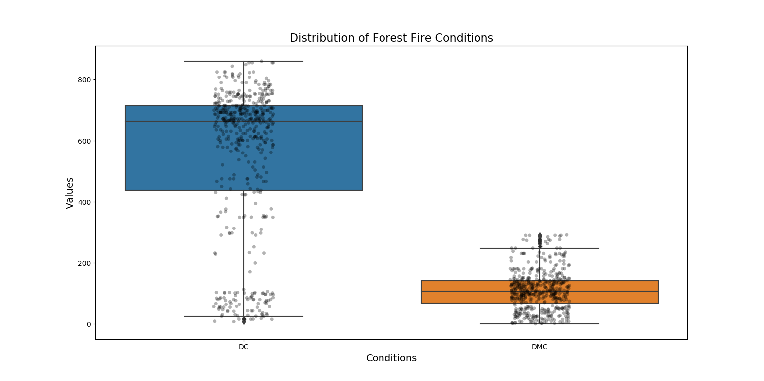
Boxplot with Data Points
We could even overlay a swarmplot onto the boxplot in order to see the distribution and samples of the points comprising that distribution, with a bit more detail.
In order to do this, we just create a single figure object and then create two different plots. The stripplot() will be overlaid over the boxplot(), since they're on the same axes/figure:
df = pd.DataFrame(data=dataframe, columns=["FFMC", "DMC", "DC", "ISI"])
boxplot = sns.boxplot(x="variable", y="value", data=pd.melt(df), order=["DC", "DMC", "FFMC", "ISI"])
boxplot = sns.stripplot(x="variable", y="value", data=pd.melt(df), marker="o", alpha=0.3, color="black", order=["DC", "DMC", "FFMC", "ISI"])
boxplot.axes.set_title("Distribution of Forest Fire Conditions", fontsize=16)
boxplot.set_xlabel("Conditions", fontsize=14)
boxplot.set_ylabel("Values", fontsize=14)
plt.show()
Conclusion
In this tutorial, we've gone over several ways to plot a boxplot using Seaborn and Python. We've also covered how to customize the colors, labels, ordering, as well as overlay swarmplots and subplot multiple boxplots.
If you're interested in Data Visualization and don't know where to start, make sure to check out our bundle of books on Data Visualization in Python:

Data Visualization in Python with Matplotlib and Pandas is a book designed to take absolute beginners to Pandas and Matplotlib, with basic Python knowledge, and allow them to build a strong foundation for advanced work with these libraries - from simple plots to animated 3D plots with interactive buttons.
It serves as an in-depth guide that'll teach you everything you need to know about Pandas and Matplotlib, including how to construct plot types that aren't built into the library itself.
Data Visualization in Python, a book for beginner to intermediate Python developers, guides you through simple data manipulation with Pandas, covers core plotting libraries like Matplotlib and Seaborn, and shows you how to take advantage of declarative and experimental libraries like Altair. More specifically, over the span of 11 chapters this book covers 9 Python libraries: Pandas, Matplotlib, Seaborn, Bokeh, Altair, Plotly, GGPlot, GeoPandas, and VisPy.
It serves as a unique, practical guide to Data Visualization, in a plethora of tools you might use in your career.

