
If you had studied longer, would your overall scores get any better?
One way of answering this question is by having data on how long you studied for and what scores you got. We can then try to see if there is a pattern in that data, and if in that pattern, when you add to the hours, it also ends up adding to the scores percentage.
For instance, say you have an hour-score dataset, which contains entries such as 1.5h and 87.5% score. It could also contain 1.61h, 2.32h and 78%, 97% scores. The kind of data type that can have any intermediate value (or any level of 'granularity') is known as continuous data.
Another scenario is that you have an hour-score dataset which contains letter-based grades instead of number-based grades, such as A, B or C. Grades are clear values that can be isolated, since you can't have an A.23, A+++++++++++ (and to infinity) or A * e^12. The kind of data type that cannot be partitioned or defined more granularly is known as discrete data.
Based on the modality (form) of your data - to figure out what score you'd get based on your study time - you'll perform regression or classification.
Regression is performed on continuous data, while classification is performed on discrete data. Regression can be anything from predicting someone's age, the house of a price, or value of any variable. Classification includes predicting what class something belongs to (such as whether a tumor is benign or malignant).
Note: Predicting house prices and whether a cancer is present is no small task, and both typically include non-linear relationships. Linear relationships are fairly simple to model, as you'll see in a moment.
If you want to learn through real-world, example-led, practical projects, check out our "Hands-On House Price Prediction - Machine Learning in Python" and our research-grade "Breast Cancer Classification with Deep Learning - Keras and TensorFlow"!
For both regression and classification - we'll use data to predict labels (umbrella-term for the target variables). Labels can be anything from "B" (class) for classification tasks to 123 (number) for regression tasks. Because we're also supplying the labels - these are supervised learning algorithms.
In this beginner-oriented guide - we'll be performing linear regression in Python, utilizing the Scikit-Learn library. We'll go through an end-to-end machine learning pipeline. We'll first load the data we'll be learning from and visualizing it, at the same time performing Exploratory Data Analysis. Then, we'll preprocess the data and build models to fit it (like a glove). This model is then evaluated, and if favorable, used to predict new values based on new input.
Note: You can download the notebook containing all of the code in this guide here.
Exploratory Data Analysis
Note: You can download the hour-score dataset here.
Let's start with exploratory data analysis. You want to get to know your data first - this includes loading it in, visualizing features, exploring their relationships and making hypotheses based on your observations. The dataset is a CSV (comma-separated values) file, which contains the hours studied and the scores obtained based on those hours. We'll load the data into a DataFrame using Pandas:
import pandas as pd
If you're new to Pandas and
DataFrames, read our "Guide to Python with Pandas: DataFrame Tutorial with Examples"!
Let's read the CSV file and package it into a DataFrame:
# Substitute the path_to_file content by the path to your student_scores.csv file
path_to_file = 'home/projects/datasets/student_scores.csv'
df = pd.read_csv(path_to_file)
Once the data is loaded in, let's take a quick peek at the first 5 values using the head() method:
df.head()
This results in:
   Hours  Scores
0    2.5      21
1    5.1      47
2    3.2      27
3    8.5      75
4    3.5      30
We can also check the shape of our dataset via the shape property:
df.shape
Knowing the shape of your data is generally pretty crucial to being able to both analyze it and build models around it:
(25, 2)
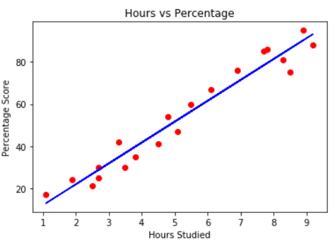
We have 25 rows and 2 columns - that's 25 entries containing a pair of an hour and a score. Our initial question was whether we'd score a higher score if we'd studied longer. In essence, we're asking for the relationship between Hours and Scores. So, what's the relationship between these variables? A great way to explore relationships between variables is through Scatter plots. We'll plot the hours on the X-axis and scores on the Y-axis, and for each pair, a marker will be positioned based on their values:
df.plot.scatter(x='Hours', y='Scores', title='Scatter Plot of hours and scores percentages');
If you're new to Scatter Plots - read our "Matplotlib Scatter Plot - Tutorial and Examples"!
This results in:

As the hours increase, so do the scores. There's a fairly high positive correlation here! Since the shape of the line the points are making appears to be straight - we say that there's a positive linear correlation between the Hours and Scores variables. How correlated are they? The corr() method calculates and displays the correlations between numerical variables in a DataFrame:
print(df.corr())
           Hours    Scores
Hours   1.000000  0.976191
Scores  0.976191  1.000000
In this table, Hours and Hours have a 1.0 (100%) correlation, just as Scores have a 100% correlation to Scores, naturally. Any variable will have a 1:1 mapping with itself! However, the correlation between Scores and Hours is 0.97. Anything above 0.8 is considered to be a strong positive correlation.
If you'd like to read more about correlation between linear variables in detail, as well as different correlation coefficients, read our "Calculating Pearson Correlation Coefficient in Python with Numpy"!
Having a high linear correlation means that we'll generally be able to tell the value of one feature, based on the other. Even without calculation, you can tell that if someone studies for 5 hours, they'll get around 50% as their score. Since this relationship is really strong - we'll be able to build a simple yet accurate linear regression algorithm to predict the score based on the study time, on this dataset.
When we have a linear relationship between two variables, we will be looking at a line. When there is a linear relationship between three, four, five (or more) variables, we will be looking at an intersection of planes. In every case, this kind of quality is defined in algebra as linearity.
Pandas also ships with a great helper method for statistical summaries, and we can describe() the dataset to get an idea of the mean, maximum, minimum, etc. values of our columns:
print(df.describe())
           Hours     Scores
count  25.000000  25.000000
mean    5.012000  51.480000
std     2.525094  25.286887
min     1.100000  17.000000
25%     2.700000  30.000000
50%     4.800000  47.000000
75%     7.400000  75.000000
max     9.200000  95.000000
Linear Regression Theory
Our variables express a linear relationship. We can intuitively guesstimate the score percentage based on the number of hours studied. However, can we define a more formal way to do this? We could trace a line in between our points and read the value of "Score" if we trace a vertical line from a given value of "Hours":
The equation that describes any straight line is:
$$
y = a*x+b
$$
In this equation, y represents the score percentage, x represents the hours studied. b is where the line starts at the Y-axis, also called the Y-axis intercept and a defines if the line is going to be more towards the upper or lower part of the graph (the angle of the line), so it is called the slope of the line.
By adjusting the slope and intercept of the line, we can move it in any direction. Thus - by figuring out the slope and intercept values, we can adjust a line to fit our data!
That's it! That's the heart of linear regression and an algorithm really only figures out the values of the slope and intercept. It uses the values of x and y that we already have and varies the values of a and b. By doing that, it fits multiple lines to the data points and returns the line that is closer to all the data points, or the best fitting line. By modeling that linear relationship, our regression algorithm is also called a model. In this process, when we try to determine, or predict the percentage based on the hours, it means that our y variable depends on the values of our x variable.
Note: In Statistics, it is customary to call y the dependent variable, and x the independent variable. In Computer Science, y is usually called target, label, and x feature, or attribute. You will see that the names interchange, keep in mind that there is usually a variable that we want to predict and another used to find it's value. It's also a convention to use capitalized X instead of lower case, in both Statistics and CS.
Linear Regression with Python's Scikit-Learn
With the theory under our belts - let's get to implementing a Linear Regression algorithm with Python and the Scikit-Learn library! We'll start with a simpler linear regression and then expand onto multiple linear regression with a new dataset.
Data Preprocessing
In the previous section, we have already imported Pandas, loaded our file into a DataFrame and plotted a graph to see if there was an indication of a linear relationship. Now, we can divide our data in two arrays - one for the dependent feature and one for the independent, or target feature. Since we want to predict the score percentage depending on the hours studied, our y will be the "Score" column and our X will the "Hours" column.
To separate the target and features, we can attribute the dataframe column values to our y and X variables:
y = df['Scores'].values.reshape(-1, 1)
X = df['Hours'].values.reshape(-1, 1)
Note: df['Column_Name'] returns a pandas Series. Some libraries can work on a Series just as they would on a NumPy array, but not all libraries have this awareness. In some cases, you'll want to extract the underlying NumPy array that describes your data. This is easily done via the values field of the Series.
Scikit-Learn's linear regression model expects a 2D input, and we're really offering a 1D array if we just extract the values:
print(df['Hours'].values) # [2.5 5.1 3.2 8.5 3.5 1.5 9.2 ... ]
print(df['Hours'].values.shape) # (25,)
It expects a 2D input because the LinearRegression() class (more on it later) expects entries that may contain more than a single value (but can also be a single value). In either case - it has to be a 2D array, where each element (hour) is actually a 1-element array:
print(X.shape) # (25, 1)
print(X)      # [[2.5] [5.1]  [3.2] ... ]
We could already feed our X and y data directly to our linear regression model, but if we use all of our data at once, how can we know if our results are any good? Just like in learning, what we will do, is use a part of the data to train our model and another part of it, to test it.
If you'd like to read more about the rules of thumb, importance of splitting sets, validation sets and the
train_test_split()helper method, read our detailed guide on "Scikit-Learn's train_test_split() - Training, Testing and Validation Sets"!
This is easily achieved through the helper train_test_split() method, which accepts our X and y arrays (also works on DataFrames and splits a single DataFrame into training and testing sets), and a test_size. The test_size is the percentage of the overall data we'll be using for testing:
from sklearn.model_selection import train_test_split
X_train, X_test, y_train, y_test = train_test_split(X, y, test_size = 0.2)
The method randomly takes samples respecting the percentage we've defined, but respects the X-y pairs, lest the sampling would totally mix up the relationship. Some common train-test splits are 80/20 and 70/30.
Since the sampling process is inherently random, we will always have different results when running the method. To be able to have the same results, or reproducible results, we can define a constant called SEED that has the value of the meaning of life (42):
SEED = 42
Note: The seed can be any integer, and is used as the seed for the random sampler. The seed is usually random, netting different results. However, if you set it manually, the sampler will return the same results. It's convention to use 42 as the seed as a reference to the popular novel series "The Hitchhiker’s Guide to the Galaxy".
We can then pass that SEEDto the random_state parameter of our train_test_split method:
X_train, X_test, y_train, y_test = train_test_split(X, y, test_size = 0.2, random_state = SEED)
Now, if you print your X_train array - you'll find the study hours, and y_train contains the score percentages:
print(X_train) # [[2.7] [3.3] [5.1] [3.8] ... ]
print(y_train) # [[25] [42] [47] [35] ... ]
Training a Linear Regression Model
We have our train and test sets ready. Scikit-Learn has a plethora of model types we can easily import and train, LinearRegression being one of them:
from sklearn.linear_model import LinearRegression
regressor = LinearRegression()
Now, we need to fit the line to our data, we will do that by using the .fit() method along with our X_train and y_train data:
regressor.fit(X_train, y_train)
If no errors are thrown - the regressor found the best fitting line! The line is defined by our features and the intercept/slope. In fact, we can inspect the intercept and slope by printing the regressor.intecept_ and regressor.coef_ attributes, respectively:
print(regressor.intercept_)
2.82689235
For retrieving the slope (which is also the coefficient of x):
print(regressor.coef_)
The result should be:
[9.68207815]
This can quite literally be plugged in into our formula from before:
$$
score = 9.68207815*hours+2.82689235
$$
Let's check real quick whether this aligns with our guesstimation:
With 5 hours of study, you can expect around 51% as a score! Another way to interpret the intercept value is - if a student studies one hour more than they previously studied for an exam, they can expect to have an increase of 9.68% considering the score percentage that they had previously achieved.
In other words, the slope value shows what happens to the dependent variable whenever there is an increase (or decrease) of one unit of the independent variable.
Making Predictions
To avoid running calculations ourselves, we could write our own formula that calculates the value:
def calc(slope, intercept, hours):
    return slope*hours+intercept

score = calc(regressor.coef_, regressor.intercept_, 9.5)
print(score) # [[94.80663482]]
However - a much handier way to predict new values using our model is to call on the predict() function:
# Passing 9.5 in double brackets to have a 2 dimensional array
score = regressor.predict([[9.5]])
print(score) # 94.80663482
Our result is 94.80663482, or approximately 95%. Now we have a score percentage estimate for each and every hour we can think of. But can we trust those estimates? In the answer to that question is the reason why we split the data into train and test in the first place. Now we can predict using our test data and compare the predicted with our actual results - the ground truth results.
To make predictions on the test data, we pass the X_test values to the predict() method. We can assign the results to the variable y_pred:
y_pred = regressor.predict(X_test)
The y_pred variable now contains all the predicted values for the input values in the X_test. We can now compare the actual output values for X_test with the predicted values, by arranging them side by side in a dataframe structure:
df_preds = pd.DataFrame({'Actual': y_test.squeeze(), 'Predicted': y_pred.squeeze()})
print(df_preds
The output looks like this:
   Actual  Predicted
0      81  83.188141
1      30  27.032088
2      21  27.032088
3      76  69.633232
4      62  59.951153
Though our model seems not to be very precise, the predicted percentages are close to the actual ones. Let's quantify the difference between the actual and predicted values to gain an objective view of how it's actually performing.
Evaluating the Model
After looking at the data, seeing a linear relationship, training and testing our model, we can understand how well it predicts by using some metrics. For regression models, three evaluation metrics are mainly used:
- Mean Absolute Error (MAE): When we subtract the predicted values from the actual values, obtaining the errors, sum the absolute values of those errors and get their mean. This metric gives a notion of the overall error for each prediction of the model, the smaller (closer to 0) the better.
$$
mae = (\frac{1}{n})\sum_{i=1}^{n}\left | Actual - Predicted \right |
$$
Note: You may also encounter the y and ŷ notation in the equations. The y refers to the actual values and the ŷ to the predicted values.
- Mean Squared Error (MSE): It is similar to the MAE metric, but it squares the absolute values of the errors. Also, as with MAE, the smaller, or closer to 0, the better. The MSE value is squared so as to make large errors even larger. One thing to pay close attention to, it that it is usually a hard metric to interpret due to the size of its values and of the fact that they aren't in the same scale of the data.
$$
mse = \sum_{i=1}^{D}(Actual - Predicted)^2
$$
- Root Mean Squared Error (RMSE): Tries to solve the interpretation problem raised with the MSE by getting the square root of its final value, so as to scale it back to the same units of the data. It is easier to interpret and good when we need to display or show the actual value of the data with the error. It shows how much the data may vary, so, if we have an RMSE of 4.35, our model can make an error either because it added 4.35 to the actual value, or needed 4.35 to get to the actual value. The closer to 0, the better as well.
$$
rmse = \sqrt{ \sum_{i=1}^{D}(Actual - Predicted)^2}
$$
We can use any of those three metrics to compare models (if we need to choose one). We can also compare the same regression model with different argument values or with different data and then consider the evaluation metrics. This is known as hyperparameter tuning - tuning the hyperparameters that influence a learning algorithm and observing the results.
When choosing between models, the ones with the smallest errors usually perform better. When monitoring models, if the metrics got worse, then a previous version of the model was better, or there was some significant alteration in the data for the model to perform worse than it was performing.
Luckily, we don't have to do any of the metrics calculations manually. The Scikit-Learn package already comes with functions that can be used to find out the values of these metrics for us. Let's find the values for these metrics using our test data. First, we will import the necessary modules for calculating the MAE and MSE errors. Respectively, the mean_absolute_error and mean_squared_error:
from sklearn.metrics import mean_absolute_error, mean_squared_error
Now, we can calculate the MAE and MSE by passing the y_test (actual) and y_pred (predicted) to the methods. The RMSE can be calculated by taking the square root of the MSE, to to that, we will use NumPy's sqrt() method:
import numpy as np
For the metrics calculations:
mae = mean_absolute_error(y_test, y_pred)
mse = mean_squared_error(y_test, y_pred)
rmse = np.sqrt(mse)
We will also print the metrics results using the f string and the 2 digit precision after the comma with :.2f:
print(f'Mean absolute error: {mae:.2f}')
print(f'Mean squared error: {mse:.2f}')
print(f'Root mean squared error: {rmse:.2f}')
The results of the metrics will look like this:
Mean absolute error: 3.92
Mean squared error: 18.94
Root mean squared error: 4.35
All of our errors are low - and we're missing the actual value by 4.35 at most (lower or higher), which is a pretty small range considering the data we have.
Multiple Linear Regression
Until this point, we have predicted a value with linear regression using only one variable. There is a different scenario that we can consider, where we can predict using many variables instead of one, and this is also a much more common scenario in real life, where many things can affect some result.
For instance, if we want to predict the gas consumption in US states, it would be limiting to use only one variable, for instance, gas taxes to do it, since more than just gas taxes affects consumption. There are more things involved in the gas consumption than only gas taxes, such as the per capita income of the people in a certain area, the extension of paved highways, the proportion of the population that has a driver's license, and many other factors. Some factors affect the consumption more than others - and here's where correlation coefficients really help!
In a case like this, when it makes sense to use multiple variables, linear regression becomes a multiple linear regression.
Note: Another nomenclature for the linear regression with one independent variable is univariate linear regression. And for the multiple linear regression, with many independent variables, is multivariate linear regression.
Usually, real world data, by having much more variables with greater values range, or more variability, and also complex relationships between variables - will involve multiple linear regression instead of a simple linear regression.
That is to say, on a day-to-day basis, if there is linearity in your data, you will probably be applying a multiple linear regression to your data.
Exploratory Data Analysis
To get a practical sense of multiple linear regression, let's keep working with our gas consumption example, and use a dataset that has gas consumption data on 48 US States.
Following what we did with the linear regression, we will also want to know our data before applying multiple linear regression. First, we can import the data with pandas read_csv() method:
path_to_file = 'home/projects/datasets/petrol_consumption.csv'
df = pd.read_csv(path_to_file)
We can now take a look at the first five rows with df.head():
df.head()
This results in:
Check out our hands-on, practical guide to learning Git, with best-practices, industry-accepted standards, and included cheat sheet. Stop Googling Git commands and actually learn it!
    Petrol_tax	Average_income	Paved_Highways	Population_Driver_licence(%)  Petrol_Consumption
0	9.0			3571			1976			0.525						  541
1	9.0			4092			1250			0.572						  524
2	9.0			3865			1586			0.580						  561
3	7.5			4870			2351			0.529						  414
4	8.0			4399			431				0.544						  410
We can see the how many rows and columns our data has with shape:
df.shape
Which displays:
(48, 5)
In this dataset, we have 48 rows and 5 columns. When classifying the size of a dataset, there are also differences between Statistics and Computer Science.
In Statistics, a dataset with more than 30 or with more than 100 rows (or observations) is already considered big, whereas in Computer Science, a dataset usually has to have at least 1,000-3,000 rows to be considered "big". "Big" is also very subjective - some consider 3,000 big, while some consider 3,000,000 big.
There is no consensus on the size of our dataset. Let's keep exploring it and take a look at the descriptive statistics of this new data. This time, we will facilitate the comparison of the statistics by rounding up the values to two decimals with the round() method, and transposing the table with the T property:
print(df.describe().round(2).T)
Our table is now column-wide instead of being row-wide:
                             count mean	   std	   min	   25%	   50%	   75%	   max
Petrol_tax					 48.0  7.67	   0.95	   5.00	   7.00	   7.50	   8.12	   10.00
Average_income				 48.0  4241.83 573.62  3063.00 3739.00 4298.00 4578.75 5342.00
Paved_Highways				 48.0  5565.42 3491.51 431.00  3110.25 4735.50 7156.00 17782.00
Population_Driver_licence(%) 48.0  0.57	   0.06	   0.45	   0.53	   0.56	   0.60	   0.72
Petrol_Consumption			 48.0  576.77  111.89  344.00  509.50  568.50  632.75  968.00
Note: The transposed table is better if we want to compare between statistics, and the original table is better if we want to compare between variables.
By looking at the min and max columns of the describe table, we see that the minimum value in our data is 0.45, and the maximum value is 17,782. This means that our data range is 17,781.55 (17,782 - 0.45 = 17,781.55), very wide - which implies our data variability is also high.
Also, by comparing the values of the mean and std columns, such as 7.67 and 0.95, 4241.83 and 573.62, etc., we can see that the means are really far from the standard deviations. That implies our data is far from the mean, decentralized - which also adds to the variability.
We already have two indications that our data is spread out, which is not in our favor, since it makes it more difficult to have a line that can fit from 0.45 to 17,782 - in statistical terms, to explain that variability.
Either way, it is always important that we plot the data. Data with different shapes (relationships) can have the same descriptive statistics. So, let's keep going and look at our points in a graph.
Note: The problem of having data with different shapes that have the same descriptive statistics is defined as Anscombe's Quartet. You can see examples of it here.
Another example of a coefficient being the same between differing relationships is Pearson Correlation (which checks for linear correlation):
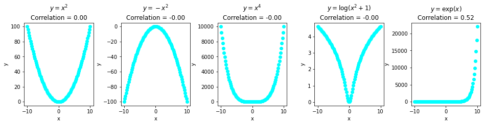
This data clearly has a pattern! Though, it's non-linear, and the data doesn't have linear correlation, thus, Pearson's Coefficient is 0 for most of them. It would be 0 for random noise as well.
Again, if you're interested in reading more about Pearson's Coefficient, read out in-depth "Calculating Pearson Correlation Coefficient in Python with Numpy"!
In our simple regression scenario, we've used a scatterplot of the dependent and independent variables to see if the shape of the points was close to a line. In our current scenario, we have four independent variables and one dependent variable. To do a scatter plot with all the variables would require one dimension per variable, resulting in a 5D plot.
We could create a 5D plot with all the variables, which would take a while and be a little hard to read - or we could plot one scatterplot for each of our independent variables and dependent variables to see if there's a linear relationship between them.
Following Ockham's razor (also known as Occam's razor) and Python's PEP20 - "simple is better than complex" - we will create a for loop with a plot for each variable.
Note: Ockham's/Occam's razor is a philosophical and scientific principle that states that the simplest theory or explanation is to be preferred in regard to complex theories or explanations.
This time, we will use Seaborn, an extension of Matplotlib which Pandas uses under the hood when plotting:
import seaborn as sns # Convention alias for Seaborn

variables = ['Petrol_tax', 'Average_income', 'Paved_Highways','Population_Driver_licence(%)']

for var in variables:
    plt.figure() # Creating a rectangle (figure) for each plot
    # Regression Plot also by default includes
    # best-fitting regression line
    # which can be turned off via `fit_reg=False`
    sns.regplot(x=var, y='Petrol_Consumption', data=df).set(title=f'Regression plot of {var} and Petrol Consumption');
Notice in the above code, that we are importing Seaborn, creating a list of the variables we want to plot, and looping through that list to plot each independent variable with our dependent variable.
The Seaborn plot we are using is regplot, which is short from regression plot. It is a scatterplot that already plots the scattered data along with the regression line. If you'd rather look at a scatterplot without the regression line, use sns.scatteplot instead.
These are our four plots:

When looking at the reg plots, it seems the Petrol_tax and Average_income have a weak negative linear relationship with Petrol_Consumption. It also seems that the Population_Driver_license(%) has a strong positive linear relationship with Petrol_Consumption, and that the Paved_Highways variable has no relationship with Petrol_Consumption.
We can also calculate the correlation of the new variables, this time using Seaborn's heatmap() to help us spot the strongest and weaker correlations based on warmer (reds) and cooler (blues) tones:
correlations = df.corr()
# annot=True displays the correlation values
sns.heatmap(correlations, annot=True).set(title='Heat map of Consumption Data - Pearson Correlations');

It seems that the heat map corroborates our previous analysis! Petrol_tax and Average_income have a weak negative linear relationship of, respectively, -0.45 and -0.24 with Petrol_Consumption. Population_Driver_license(%) has a strong positive linear relationship of 0.7 with Petrol_Consumption, and Paved_Highways correlation is of 0.019 - which indicates no relationship with Petrol_Consumption.
The correlation doesn't imply causation, but we might find causation if we can successfully explain the phenomena with our regression model.
Another important thing to notice in the reg plots is that there are some points really far off from where most points concentrate, we were already expecting something like that after the big difference between the mean and std columns - those points might be data outliers and extreme values.
Note: Outliers and extreme values have different definitions. While outliers don't follow the natural direction of the data, and drift away from the shape it makes - extreme values are in the same direction as other points but are either too high or too low in that direction, far off to the extremes in the graph.

A linear regression model, either uni or multivariate, will take these outlier and extreme values into account when determining the slope and coefficients of the regression line. Considering what the already know of the linear regression formula:
$$
score = 9.68207815*hours+2.82689235
$$
If we have an outlier point of 200 hours, that might have been a typing error - it will still be used to calculate the final score:
Just one outlier can make our slope value 200 times bigger. The same holds for multiple linear regression. The multiple linear regression formula is basically an extension of the linear regression formula with more slope values:
$$
y = b_0 + b_1 * x_1 + b_2 * x_2 + b_3 * x_3 + \ldots + b_n * x_n
$$
The main difference between this formula from our previous one, is that it describes as plane, instead of describing a line. We know have bn * xn coefficients instead of just a * x.
Note: There is an error added to the end of the multiple linear regression formula, which is an error between predicted and actual values - or residual error. This error usually is so small, it is omitted from most formulas:
$$
y = b_0 + b_1 * x_1 + b_2 * x_2 + b_3 * x_3 + \ldots + b_n * x_n + \epsilon
$$
In the same way, if we have an extreme value of 17,000, it will end up making our slope 17,000 bigger:
$$
y = b_0 + 17,000 * x_1 + b_2 * x_2 + b_3 * x_3 + \ldots + b_n * x_n
$$
In other words, univariate and multivariate linear models are sensitive to outliers and extreme data values.
Note: It is beyond the scope of this guide, but you can go further in the data analysis and data preparation for the model by looking at boxplots, treating outliers and extreme values.
If you'd like to learn more about Violin Plots and Box Plots - read our Box Plot and Violin Plot guides!
We have learned a lot about linear models and exploratory data analysis, now it's time to use the Average_income, Paved_Highways, Population_Driver_license(%) and Petrol_tax as independent variables of our model and see what happens.
Preparing the Data
Following what has been done with the simple linear regression, after loading and exploring the data, we can divide it into features and targets. The main difference is that now our features have 4 columns instead of one.
We can use double brackets [[ ]] to select them from the dataframe:
y = df['Petrol_Consumption']
X = df[['Average_income', 'Paved_Highways',
       'Population_Driver_licence(%)', 'Petrol_tax']]
After setting our X and y sets, we can divide our data into train and test sets. We will be using the same seed and 20% of our data for training:
X_train, X_test, y_train, y_test = train_test_split(X, y,
                                                    test_size=0.2,
                                                    random_state=SEED)
Training the Multivariate Model
After splitting the data, we can train our multiple regression model. Notice that now there is no need to reshape our X data, once it already has more than one dimension:
X.shape # (48, 4)
To train our model we can execute the same code as before, and use the fit() method of the LinearRegression class:
regressor = LinearRegression()
regressor.fit(X_train, y_train)
After fitting the model and finding our optimal solution, we can also look at the intercept:
regressor.intercept_
361.45087906668397
And at the coefficients of the features
regressor.coef_
[-5.65355145e-02, -4.38217137e-03, 1.34686930e+03, -3.69937459e+01]
Those four values are the coefficients for each of our features in the same order as we have them in our X data. To see a list with their names, we can use the dataframe columns attribute:
feature_names = X.columns
That code will output:
['Average_income', 'Paved_Highways', 'Population_Driver_licence(%)', 'Petrol_tax']
Considering it is a little hard to see both features and coefficients together like this, we can better organize them in a table format.
To do that, we can assign our column names to a feature_names variable, and our coefficients to a model_coefficients variable. After that, we can create a dataframe with our features as an index and our coefficients as column values called coefficients_df:
feature_names = X.columns
model_coefficients = regressor.coef_

coefficients_df = pd.DataFrame(data = model_coefficients,
                              index = feature_names,
                              columns = ['Coefficient value'])
print(coefficients_df)
The final DataFrame should look like this:
                              Coefficient value
Average_income                        -0.056536
Paved_Highways                        -0.004382
Population_Driver_licence(%)        1346.869298
Petrol_tax                           -36.993746
If in the linear regression model, we had 1 variable and 1 coefficient, now in the multiple linear regression model, we have 4 variables and 4 coefficients. What can those coefficients mean? Following the same interpretation of the coefficients of the linear regression, this means that for a unit increase in the average income, there is a decrease of 0.06 dollars in gas consumption.
Similarly, for a unit increase in paved highways, there is a 0.004 decrease in miles of gas consumption; and for a unit increase in the proportion of population with a driver's license, there is an increase of 1,346 billion gallons of gas consumption.
And, lastly, for a unit increase in petrol tax, there is a decrease of 36,993 million gallons in gas consumption.
By looking at the coefficients dataframe, we can also see that, according to our model, the Average_income and Paved_Highways features are the ones that are closer to 0, which means they have have the least impact on the gas consumption. While the Population_Driver_license(%) and Petrol_tax, with the coefficients of 1,346.86 and -36.99, respectively, have the biggest impact on our target prediction.
In other words, the gas consumption is mostly explained by the percentage of the population with driver's license and the petrol tax amount, surprisingly (or unsurprisingly) enough.
We can see how this result has a connection to what we had seen in the correlation heatmap. The driver's license percentual had the strongest correlation, so it was expected that it could help explain the gas consumption, and the petrol tax had a weak negative correlation - but, when compared to the average income that also had a weak negative correlation - it was the negative correlation which was closest to -1 and ended up explaining the model.
When all the values were added to the multiple regression formula, the paved highways and average income slopes ended up becoming closer to 0, while the driver's license percentual and the tax income got further away from 0. So those variables were taken more into consideration when finding the best fitted line.
Note: In data science we deal mostly with hypotheses and uncertainties. The is no 100% certainty and there's always an error. If you have 0 errors or 100% scores, get suspicious. We have trained only one model with a sample of data, it is too soon to assume that we have a final result. To go further, you can perform residual analysis, train the model with different samples using a cross validation technique. You could also get more data and more variables to explore and plug in the model to compare results.
It seems our analysis is making sense so far. Now it is time to determine if our current model is prone to errors.
Making Predictions with the Multivariate Regression Model
To understand if and how our model is making mistakes, we can predict the gas consumption using our test data and then look at our metrics to be able to tell how well our model is behaving.
In the same way we had done for the simple regression model, let's predict with the test data:
y_pred = regressor.predict(X_test)
Now, that we have our test predictions, we can better compare them with the actual output values for X_test by organizing them in a DataFrameformat:
results = pd.DataFrame({'Actual': y_test, 'Predicted': y_pred})
print(results)
The output should look like this:
    Actual   Predicted
27     631  606.692665
40     587  673.779442
26     577  584.991490
43     591  563.536910
24     460  519.058672
37     704  643.461003
12     525  572.897614
19     640  687.077036
4      410  547.609366
25     566  530.037630
Here, we have the index of the row of each test data, a column for its actual value and another for its predicted values. When we look at the difference between the actual and predicted values, such as between 631 and 607, which is 24, or between 587 and 674, that is -87 it seems there is some distance between both values, but is that distance too much?
Evaluating the Multivariate Model
After exploring, training and looking at our model predictions - our final step is to evaluate the performance of our multiple linear regression. We want to understand if our predicted values are too far from our actual values. We'll do this in the same way we had previously done, by calculating the MAE, MSE and RMSE metrics.
So, let's execute the following code:
mae = mean_absolute_error(y_test, y_pred)
mse = mean_squared_error(y_test, y_pred)
rmse = np.sqrt(mse)

print(f'Mean absolute error: {mae:.2f}')
print(f'Mean squared error: {mse:.2f}')
print(f'Root mean squared error: {rmse:.2f}')
The output of our metrics should be:
Mean absolute error: 53.47
Mean squared error: 4083.26
Root mean squared error: 63.90
We can see that the value of the RMSE is 63.90, which means that our model might get its prediction wrong by adding or subtracting 63.90 from the actual value. It would be better to have this error closer to 0, and 63.90 is a big number - this indicates that our model might not be predicting very well.
Our MAE is also distant from 0. We can see a significant difference in magnitude when compared to our previous simple regression where we had a better result.
To dig further into what is happening to our model, we can look at a metric that measures the model in a different way, it doesn't consider our individual data values such as MSE, RMSE and MAE, but takes a more general approach to the error, the R2:
$$
R^2 = 1 - \frac{\sum(Actual - Predicted)^2}{\sum(Actual - Actual \ Mean)^2}
$$
The R2 doesn't tell us about how far or close each predicted value is from the real data - it tells us how much of our target is being captured by our model.
In other words, R2 quantifies how much of the variance of the dependent variable is being explained by the model.
The R2 metric varies from 0% to 100%. The closer to 100%, the better. If the R2 value is negative, it means it doesn't explain the target at all.
We can calculate R2 in Python to get a better understanding of how it works:
actual_minus_predicted = sum((y_test - y_pred)**2)
actual_minus_actual_mean = sum((y_test - y_test.mean())**2)
r2 = 1 - actual_minus_predicted/actual_minus_actual_mean
print('R²:', r2)
R²: 0.39136640014305457
R2 also comes implemented by default into the score method of Scikit-Learn's linear regressor class. We can calculate it like this:
regressor.score(X_test, y_test)
This results in:
0.39136640014305457
So far, it seems that our current model explains only 39% of our test data which is not a good result, it means it leaves 61% of the test data unexplained.
Let's also understand how much our model explains of our train data:
regressor.score(X_train, y_train)
Which outputs:
0.7068781342155135
We have found an issue with our model. It explains 70% of the train data, but only 39% of our test data, which is more important to get right than our train data. It is fitting the train data really well, and not being able to fit the test data - which means, we have an overfitted multiple linear regression model.
There are many factors that may have contributed to this, a few of them could be:
- Need for more data: we have only one year worth of data (and only 48 rows), which isn't that much, whereas having multiple years of data could have helped improve the prediction results quite a bit.
- Overcome overfitting: we can use a cross validation that will fit our model to different shuffled samples of our dataset to try to end overfitting.
- Assumptions that don't hold: we have made the assumption that the data had a linear relationship, but that might not be the case. Visualizing the data using boxplots, understanding the data distribution, treating the outliers, and normalizing it may help with that.
- Poor features: we might need other or more features that have stronger relationships with values we are trying to predict.
Conclusion
In this article we have studied one of the most fundamental machine learning algorithms i.e. linear regression. We implemented both simple linear regression and multiple linear regression with the help of the Scikit-Learn machine learning library.

