
Introduction
There are many data visualization libraries in Python, yet Matplotlib is the most popular library out of all of them. Matplotlib’s popularity is due to its reliability and utility - it's able to create both simple and complex plots with little code. You can also customize the plots in a variety of ways.
In this tutorial, we'll cover how to plot Stack Plots in Matplotlib.
Stack Plots are used to plot linear data, in a vertical order, stacking each linear plot on another. Typically, they're used to generate cumulative plots.
Importing Data
We'll be using a dataset on Covid-19 vaccinations, from Our World in Data, specifically, the dataset that contains the cumulative vaccinations per country.
We’ll begin by importing all the libraries that we need. We’ll import Pandas to read and parse the dataset, NumPy to generate values for the X-axis, and we’ll of course need to import the PyPlot module from Matplotlib:
import pandas as pd
import matplotlib.pyplot as plt
import numpy as np
Let's take a peek at the DataFrame we'll be using:
dataframe = pd.read_csv("cumulative-covid-vaccinations.csv")
print(dataframe.head(25))
We're interested in the Entity and total_vaccinations. While we could use the Date feature as well, to gain a better grasp of how the vaccinations are going day-by-day, we'll treat the first entry as Day 0 and the last entry as Day N:
     Entity Code        Date  total_vaccinations
0   Albania  ALB  2021-01-10                   0
1   Albania  ALB  2021-01-12                 128
2   Albania  ALB  2021-01-13                 188
3   Albania  ALB  2021-01-14                 266
4   Albania  ALB  2021-01-15                 308
5   Albania  ALB  2021-01-16                 369
...
16  Albania  ALB  2021-02-22                6728
17  Albania  ALB  2021-02-25               10135
18  Albania  ALB  2021-03-01               14295
19  Albania  ALB  2021-03-03               15793
20  Albania  ALB  2021-03-10               21613
21  Algeria  DZA  2021-01-29                   0
22  Algeria  DZA  2021-01-30                  30
23  Algeria  DZA  2021-02-19               75000
24  Andorra  AND  2021-01-25                 576
This dataset will require some preprocessing, since this is a specific use-case. Though, before preprocessing it, let's get acquainted with how Stack Plots are generally plotted.
Plot a Stack Plot in Matplotlib
Stack Plots are used to visualize multiple linear plots, stacked on top of each other. With a regular line plot, you'd plot the relationship between X and Y. Here, we're plotting multiple Y features on a shared X-axis, one on top of the other:
import matplotlib.pyplot as plt
x = [1, 2, 3, 4, 5]
y1 = [5, 6, 4, 5, 7]
y2 = [1, 6, 4, 5, 6]
y3 = [1, 1, 2, 3, 2]

fig, ax = plt.subplots()
ax.stackplot(x, y1, y2, y3)
plt.show()
This results in:

Since it's a bit unwieldy to deal with multiple lists like this, you can simply use a dictionary, where each yn feature is an entry:
import matplotlib.pyplot as plt
x = [1, 2, 3, 4, 5]

y_values = {
    "y1": [5, 6, 4, 5, 7],
    "y2": [1, 6, 4, 5, 6],
    "y3" : [1, 1, 2, 3, 2]
}

fig, ax = plt.subplots()
ax.stackplot(x, y_values.values())
plt.show()
This results in:
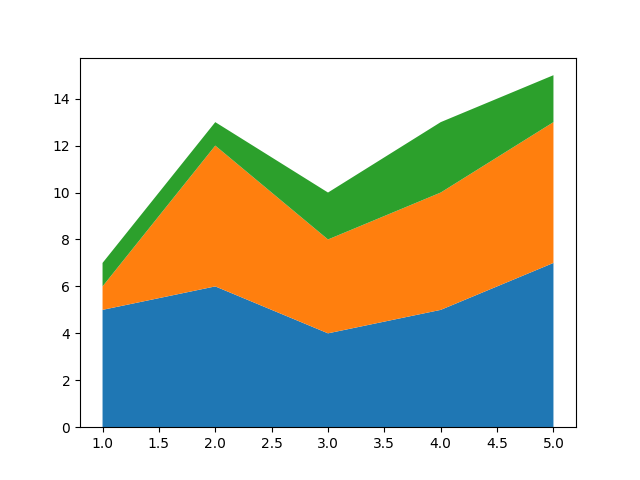
Since this type of plot can easily get you lost in the stacks, it's really helpful to add labels attached to the colors, by setting the keys() from the y_values dictionary as the labels argument, and adding a legend to the plot:
import matplotlib.pyplot as plt
x = [1, 2, 3, 4, 5]

y_values = {
    "y1": [5, 6, 4, 5, 7],
    "y2": [1, 6, 4, 5, 6],
    "y3" : [1, 1, 2, 3, 2]
}

fig, ax = plt.subplots()
ax.stackplot(x, y_values.values(), labels=y_values.keys())
ax.legend(loc='upper left')
plt.show()
Now, this results in:

Note: The length of these lists has to be the same. You can't plot y1 with 3 values, and y2 with 5 values.
This brings us to our Covid-19 vaccination dataset. We'll preprocess the dataset to take the form of a dictionary like this, and plot the cumulative vaccines given to the general population.
Let's start off by grouping the dataset by Entity and total_vaccinations, since each Entity currently has numerous entries. Also, we'll want to drop the entities named World and European Union, since they're convenience entities, added for cases where you might want to plot just a single cumulative line.
Check out our hands-on, practical guide to learning Git, with best-practices, industry-accepted standards, and included cheat sheet. Stop Googling Git commands and actually learn it!
In our case, it'll effectively more than double the total_vaccination count, since they include already plotted values of each country, as single entities:
dataframe = pd.read_csv("cumulative-covid-vaccinations.csv")
indices = dataframe[(dataframe['Entity'] == 'World') | (dataframe['Entity'] == 'European Union')].index
dataframe.drop(indices, inplace=True)

countries_vaccinations = dataframe.groupby('Entity')['total_vaccinations'].apply(list)
This results in a completely different shape of the dataset - instead of each entry having their own Entity/total_vaccinations entry, each Entity will have a list of their total vaccinations through the days:
Entity
Albania           [0, 128, 188, 266, 308, 369, 405, 447, 483, 51...
Algeria                                              [0, 30, 75000]
Andorra           [576, 1036, 1291, 1622, 2141, 2390, 2526, 3611...
...
Croatia           [7864, 12285, 13798, 20603, 24985, 30000, 3455...
Cyprus            [3901, 6035, 10226, 17739, 25519, 32837, 44429...
Czechia           [1261, 3560, 7017, 10496, 11813, 12077, 13335,...
Now, let's convert this Series into a dictionary and see what it looks like:
cv_dict = countries_vaccinations.to_dict()
print(cv_dict)
This results in:
{
'Albania': [0, 128, 188, 266, 308, 369, 405, 447, 483, 519, 549, 550, 1127, 1701, 3049, 4177, 6728, 10135, 14295, 15793, 21613],
'Algeria': [0, 30, 75000],
'Andorra': [576, 1036, 1291, 1622, 2141, 2390, 2526, 3611, 4914],
...
}
However, there's a problem here. We can't plot these entries if their shapes aren't the same. Algeria has 3 entries, while Andorra has 9, for example. To combat this, we'll want to find the key with the most values, and how many values there are.
Then, construct a new dictionary (inadvisable to modify original dictionary while iterating through it) and insert 0s for each missing day in the past, since there were 0 total vaccinations at those days:
max_key, max_value = max(cv_dict.items(), key = lambda x: len(set(x[1])))

cv_dict_full = {}
for k,v in cv_dict.items():
    if len(v) < len(max_value):
        trailing_zeros = [0]*(len(max_value)-len(v))
        cv_dict_full[k] = trailing_zeros+v
    else:
        cv_dict_full[k] = v

print(cv_dict_full)
Here, we simply check if the length of the list in each entry is shorter than the length of the list with the maximum length. If it is, we add the difference between those, in zeros, and append that value to the original list of values.
Now, if we print this new dictionary, we'll see something along the lines of:
{
'Albania': [0, 0, 0, 0, 0, 0, 0, 0, 0, 0, 0, 0, 0, 0, 0, 0, 0, 0, 0, 0, 0, 0, 0, 0, 0, 0, 0, 0, 0, 0, 0, 0, 0, 0, 0, 0, 0, 0, 0, 0, 0, 0, 0, 0, 0, 0, 0, 0, 0, 0, 0, 0, 0, 0, 0, 0, 0, 0, 0, 0, 0, 0, 0, 0, 0, 0, 0, 0, 0, 0, 128, 188, 266, 308, 369, 405, 447, 483, 519, 549, 550, 1127, 1701, 3049, 4177, 6728, 10135, 14295, 15793, 21613],
'Algeria': [0, 0, 0, 0, 0, 0, 0, 0, 0, 0, 0, 0, 0, 0, 0, 0, 0, 0, 0, 0, 0, 0, 0, 0, 0, 0, 0, 0, 0, 0, 0, 0, 0, 0, 0, 0, 0, 0, 0, 0, 0, 0, 0, 0, 0, 0, 0, 0, 0, 0, 0, 0, 0, 0, 0, 0, 0, 0, 0, 0, 0, 0, 0, 0, 0, 0, 0, 0, 0, 0, 0, 0, 0, 0, 0, 0, 0, 0, 0, 0, 0, 0, 0, 0, 0, 0, 0, 0, 30, 75000],
'Andorra': [0, 0, 0, 0, 0, 0, 0, 0, 0, 0, 0, 0, 0, 0, 0, 0, 0, 0, 0, 0, 0, 0, 0, 0, 0, 0, 0, 0, 0, 0, 0, 0, 0, 0, 0, 0, 0, 0, 0, 0, 0, 0, 0, 0, 0, 0, 0, 0, 0, 0, 0, 0, 0, 0, 0, 0, 0, 0, 0, 0, 0, 0, 0, 0, 0, 0, 0, 0, 0, 0, 0, 0, 0, 0, 0, 0, 0, 0, 0, 0, 0, 576, 1036, 1291, 1622, 2141, 2390, 2526, 3611, 4914],
...
}
The country with the most input values is:
print(max_key, len(max_value)) # Canada 90
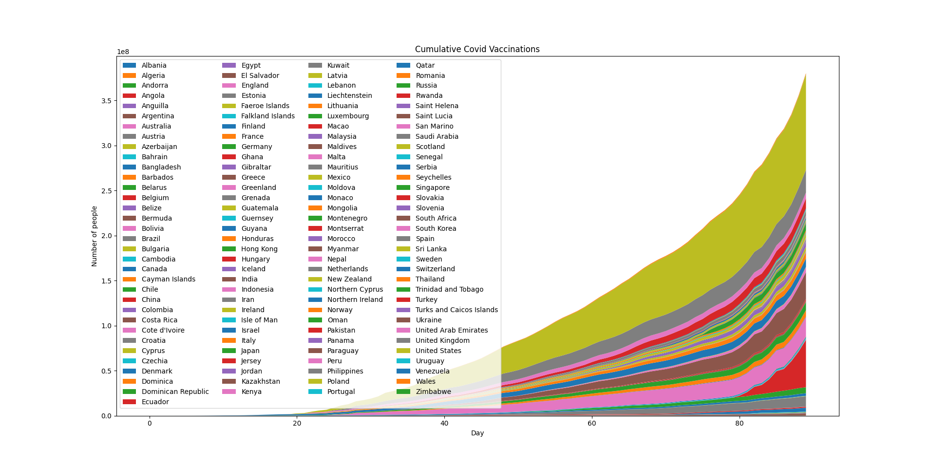
Now that we've fully prepared our dataset, and we can plot it as we've plotted the Stack Plots before it, let's generate the days and plot:
dates = np.arange(0, len(max_value))

fig, ax = plt.subplots()
ax.stackplot(dates, cv_dict_full.values(), labels=cv_dict_full.keys())
ax.legend(loc='upper left', ncol=4)
ax.set_title('Cumulative Covid Vaccinations')
ax.set_xlabel('Day')
ax.set_ylabel('Number of people')

plt.show()
Since there's a lot of countries in the world, the legend will be fairly crammed, so we've put it into 4 columns to at least fit in the plot:
Conclusion
In this tutorial, we've gone over how to plot simple Stack Plots, as well as how to preprocess datasets and shape data to fit Stack Plots, using Python's Pandas and Matplotlib frameworks.
If you're interested in Data Visualization and don't know where to start, make sure to check out our bundle of books on Data Visualization in Python:

Data Visualization in Python with Matplotlib and Pandas is a book designed to take absolute beginners to Pandas and Matplotlib, with basic Python knowledge, and allow them to build a strong foundation for advanced work with these libraries - from simple plots to animated 3D plots with interactive buttons.
It serves as an in-depth guide that'll teach you everything you need to know about Pandas and Matplotlib, including how to construct plot types that aren't built into the library itself.
Data Visualization in Python, a book for beginner to intermediate Python developers, guides you through simple data manipulation with Pandas, covers core plotting libraries like Matplotlib and Seaborn, and shows you how to take advantage of declarative and experimental libraries like Altair. More specifically, over the span of 11 chapters this book covers 9 Python libraries: Pandas, Matplotlib, Seaborn, Bokeh, Altair, Plotly, GGPlot, GeoPandas, and VisPy.
It serves as a unique, practical guide to Data Visualization, in a plethora of tools you might use in your career.

