
Introduction
There are many data visualization libraries in Python, yet Matplotlib is the most popular library out of all of them. Matplotlib’s popularity is due to its reliability and utility - it's able to create both simple and complex plots with little code. You can also customize the plots in a variety of ways.
In this tutorial, we'll cover how to plot Violin Plots in Matplotlib.
Violin plots are used to visualize data distributions, displaying the range, median, and distribution of the data.
Violin plots show the same summary statistics as box plots, but they also include Kernel Density Estimations that represent the shape/distribution of the data.
Importing Data
Before we can create a Violin plot, we will need some data to plot. We’ll be using the Gapminder dataset.
We’ll start by importing the libraries we need, which include Pandas and Matplotlib:
import pandas as pd
import matplotlib.pyplot as plt
We’ll check to make sure that there are no missing data entries and print out the head of the dataset to ensure that the data has been loaded correctly. Be sure to set the encoding type to ISO-8859-1:
dataframe = pd.read_csv("gapminder_full.csv", error_bad_lines=False, encoding="ISO-8859-1")
print(dataframe.head())
print(dataframe.isnull().values.any())
       country  year  population continent  life_exp     gdp_cap
0  Afghanistan  1952     8425333      Asia    28.801  779.445314
1  Afghanistan  1957     9240934      Asia    30.332  820.853030
2  Afghanistan  1962    10267083      Asia    31.997  853.100710
3  Afghanistan  1967    11537966      Asia    34.020  836.197138
4  Afghanistan  1972    13079460      Asia    36.088  739.981106
Plotting a Violin Plot in Matplotlib
To create a Violin Plot in Matplotlib, we call the violinplot() function on either the Axes instance, or the PyPlot instance itself:
import pandas as pd
import matplotlib.pyplot as plt

dataframe = pd.read_csv("gapminder_full.csv", error_bad_lines=False, encoding="ISO-8859-1")

population = dataframe.population
life_exp = dataframe.life_exp
gdp_cap = dataframe.gdp_cap

# Extract Figure and Axes instance
fig, ax = plt.subplots()

# Create a plot
ax.violinplot([population, life_exp, gdp_cap])

# Add title
ax.set_title('Violin Plot')
plt.show()
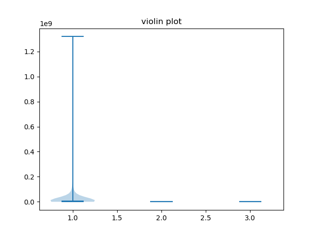
When we create the first plot, we can see the distribution of our data, but we will also notice some problems. Because the scale of the features are so different, it’s practically impossible the distribution of the Life expectancy and GDP columns.
For this reason, we want to plot each column on its own subplot.
We'll do a little sorting and slicing of the dataframe to make comparing the dataset columns easier. We'll group the dataframe by "country", and select just the most recent/last entries for each of the countries.
We'll then sort by population and drop the entries with the largest populations (the large population outliers), so that the rest of the dataframe is in a more similar range and comparisons are easier:
dataframe = dataframe.groupby("country").last()
dataframe = dataframe.sort_values(by=["population"], ascending=False)
dataframe = dataframe.iloc[10:]
print(dataframe)
Now, the dataframe looks something like:
                       year  population continent  life_exp       gdp_cap
country
Philippines            2007    91077287      Asia    71.688   3190.481016
Vietnam                2007    85262356      Asia    74.249   2441.576404
Germany                2007    82400996    Europe    79.406  32170.374420
Egypt                  2007    80264543    Africa    71.338   5581.180998
Ethiopia               2007    76511887    Africa    52.947    690.805576
...                     ...         ...       ...       ...           ...
Montenegro             2007      684736    Europe    74.543   9253.896111
Equatorial Guinea      2007      551201    Africa    51.579  12154.089750
Djibouti               2007      496374    Africa    54.791   2082.481567
Iceland                2007      301931    Europe    81.757  36180.789190
Sao Tome and Principe  2007      199579    Africa    65.528   1598.435089
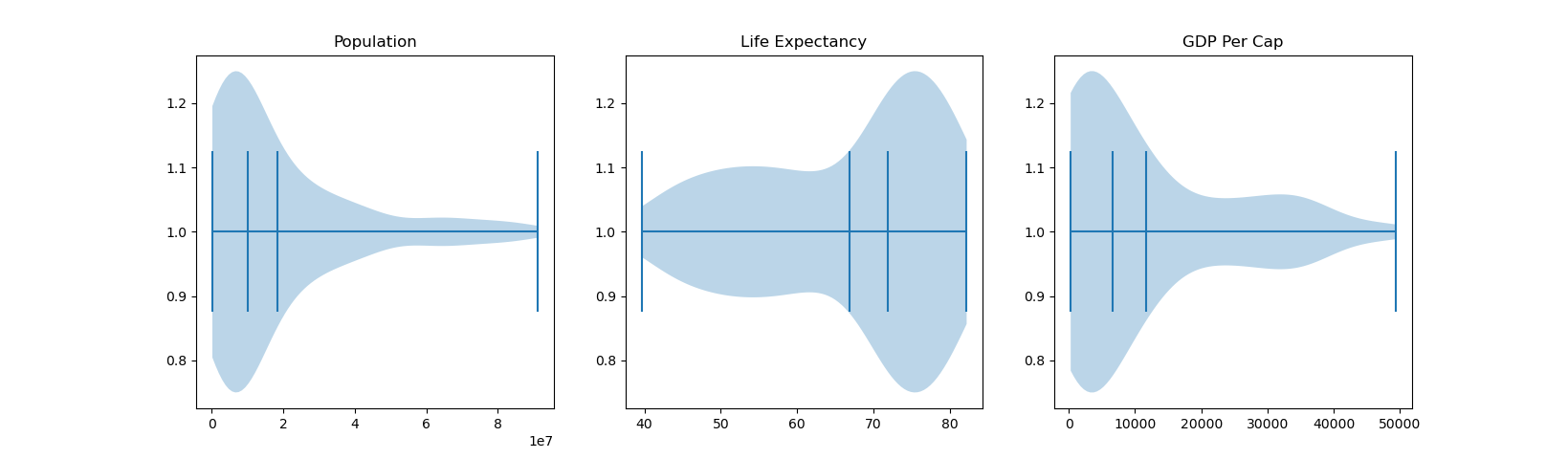
Great! Now we can create a figure and three axes objects with the subplots() function. Each of these axes will have a violin plot. Since we're working on a much more manageable scale now, let's also turn on the showmedians argument by setting it to True.
This will strike a horizontal line in the median of our violin plots:
# Create figure with three axes
fig, (ax1, ax2, ax3) = plt.subplots(nrows=1, ncols=3)

# Plot violin plot on axes 1
ax1.violinplot(dataframe.population, showmedians=True)
ax1.set_title('Population')

# Plot violin plot on axes 2
ax2.violinplot(life_exp, showmedians=True)
ax2.set_title('Life Expectancy')

# Plot violin plot on axes 3
ax3.violinplot(gdp_cap, showmedians=True)
ax3.set_title('GDP Per Cap')

plt.show()
Running this code now yields us:
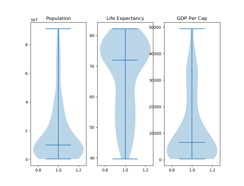
Now we can get a good idea of the distribution of our data. The central horizontal line in the Violins is where the median of our data is located, and minimum and maximum values are indicated by the line positions on the Y-axis.
Customizing Violin Plots in Matplotlib
Now, let's take a look at how we can customize Violin Plots.
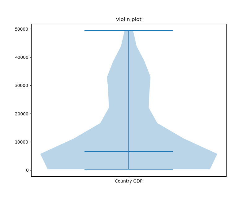
Adding X and Y Ticks
As you can see, while the plots have successfully been generated, without tick labels on the X and Y-axis it can get difficult to interpret the graph. Humans interpret categorical values much more easily than numerical values.
We can customize the plot and add labels to the X-axis by using the set_xticks() function:
fig, ax = plt.subplots()
ax.violinplot(gdp_cap, showmedians=True)
ax.set_title('violin plot')
ax.set_xticks([1])
ax.set_xticklabels(["Country GDP",])
plt.show()
This results in:
Check out our hands-on, practical guide to learning Git, with best-practices, industry-accepted standards, and included cheat sheet. Stop Googling Git commands and actually learn it!
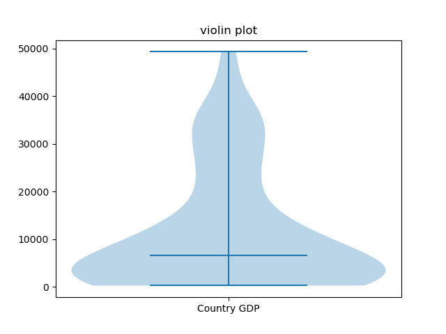
Here, we've set the X-ticks from a range to a single one, in the middle, and added a label that's easy to interpret.
Plotting Horizontal Violin Plot in Matplotlib
If we wanted to we could also change the orientation of the plot by altering the vert parameter. vert controls whether or not the plot is rendered vertically and it is set to True by default:
fig, ax = plt.subplots()
ax.violinplot(gdp_cap, showmedians=True, vert=False)
ax.set_title('violin plot')
ax.set_yticks([1])
ax.set_yticklabels(["Country GDP",])
ax.tick_params(axis='y', labelrotation = 90)
plt.show()
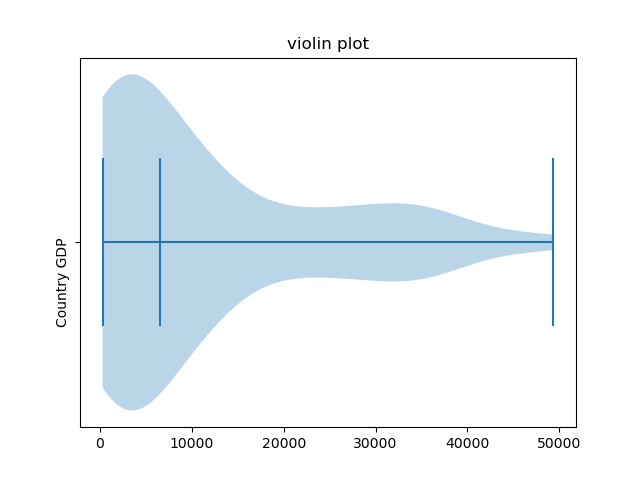
Here, we've set the Y-axis tick labels and their frequency, instead of the X-axis. We've also rotated the labels by 90 degrees
Showing Dataset Means in Violin Plots
We have some other customization parameters available to us as well. We can choose to show means, in addition to medians, by using the showmean parameter.
Let’s try visualizing the means in addition to the medians:
fig, (ax1, ax2, ax3) = plt.subplots(nrows=1, ncols=3)
ax1.violinplot(population, showmedians=True, showmeans=True, vert=False)
ax1.set_title('Population')

ax2.violinplot(life_exp, showmedians=True, showmeans=True, vert=False)
ax2.set_title('Life Expectancy')

ax3.violinplot(gdp_cap, showmedians=True, showmeans=True, vert=False)
ax3.set_title('GDP Per Cap')
plt.show()
Though, please note that since the medians and means essentially look the same, it may become unclear which vertical line here refers to a median, and which to a mean.
Customizing Kernel Density Estimation for Violin Plots
We can also alter how many data points the model considers when creating the Gaussian Kernel Density Estimations, by altering the points parameter.
The number of points considered is 100 by default. By providing the function with fewer data points to estimate from, we may get a less representative data distribution.
Let's change this number to, say, 10:
fig, ax = plt.subplots()
ax.violinplot(gdp_cap, showmedians=True, points=10)
ax.set_title('violin plot')
ax.set_xticks([1])
ax.set_xticklabels(["Country GDP",])
plt.show()
Notice that the shape of the violin is less smooth since fewer points have been sampled.
Typically, you would want to increase the number of points used to get a better sense of the distribution. This might not always be the case, if 100 is simply enough. Lets plot a 10-point, 100-point and 500-point sampled Violin Plot:
fig, (ax1, ax2, ax3) = plt.subplots(nrows=1, ncols=3)
ax1.violinplot(gdp_cap, showmedians=True, points=10)
ax1.set_title('GDP Per Cap, 10p')

ax2.violinplot(gdp_cap, showmedians=True, points=100)
ax2.set_title('GDP Per Cap, 100p')

ax3.violinplot(gdp_cap, showmedians=True, points=500)
ax3.set_title('GDP Per Cap, 500p')
plt.show()
This results in:
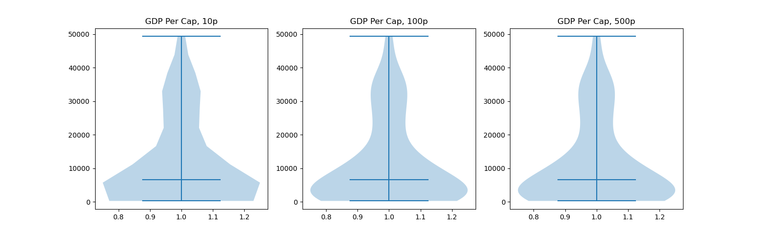
There isn't any obvious difference between the second and third plot, though, there's a significant one between the first and second.
Conclusion
In this tutorial, we've gone over several ways to plot a Violin Plot using Matplotlib and Python. We've also covered how to customize them by adding X and Y ticks, plotting horizontally, showing dataset means as well as altering the KDE point sampling.
If you're interested in Data Visualization and don't know where to start, make sure to check out our bundle of books on Data Visualization in Python:

Data Visualization in Python with Matplotlib and Pandas is a book designed to take absolute beginners to Pandas and Matplotlib, with basic Python knowledge, and allow them to build a strong foundation for advanced work with these libraries - from simple plots to animated 3D plots with interactive buttons.
It serves as an in-depth guide that'll teach you everything you need to know about Pandas and Matplotlib, including how to construct plot types that aren't built into the library itself.
Data Visualization in Python, a book for beginner to intermediate Python developers, guides you through simple data manipulation with Pandas, covers core plotting libraries like Matplotlib and Seaborn, and shows you how to take advantage of declarative and experimental libraries like Altair. More specifically, over the span of 11 chapters this book covers 9 Python libraries: Pandas, Matplotlib, Seaborn, Bokeh, Altair, Plotly, GGPlot, GeoPandas, and VisPy.
It serves as a unique, practical guide to Data Visualization, in a plethora of tools you might use in your career.

