
Introduction
There are many data visualization libraries in Python, yet Matplotlib is the most popular library out of all of them. Matplotlib’s popularity is due to its reliability and utility - it's able to create both simple and complex plots with little code. You can also customize the plots in a variety of ways.
In this tutorial, we'll cover how to plot Box Plots in Matplotlib.
Box plots are used to visualize summary statistics of a dataset, displaying attributes of the distribution like the data’s range and distribution.
Importing Data
To create a Box Plot, we'll need some data to plot. We'll need to choose a dataset that contains continuous variables as features, since Box Plots visualize continuous variable distribution. We'll be working with the Wine Quality dataset.
We’ll begin by importing all the libraries that we need. We’ll import Pandas to read and parse the dataset, and we’ll of course need to import Matplotlib as well, or more accurately, the PyPlot module:
import pandas as pd
from matplotlib import pyplot as plt
Let’s check to make sure that our dataset is ready to use. We’ll print out the head of the dataset to make sure the data has been loaded properly, and we’ll also check to ensure that there are no missing data entries:
dataframe = pd.read_csv("winequality-red.csv")
print(dataframe.head())
print(dataframe.isnull().values.any())
   fixed acidity  volatile acidity  citric acid  ...  sulphates  alcohol  quality
0            7.4              0.70         0.00  ...       0.56      9.4        5
1            7.8              0.88         0.00  ...       0.68      9.8        5
2            7.8              0.76         0.04  ...       0.65      9.8        5
3           11.2              0.28         0.56  ...       0.58      9.8        6
4            7.4              0.70         0.00  ...       0.56      9.4        5

[5 rows x 12 columns]
False
The second print statement returns False, which means that there isn't any missing data. If there were, we'd have to handle missing DataFrame values.
Plot a Box Plot in Matplotlib
Let’s select some features of the dataset and visualize those features with the boxplot() function. We’ll make use of Pandas to extract the feature columns we want, and save them as variables for convenience:
fixed_acidity = dataframe["fixed acidity"]
free_sulfur_dioxide = dataframe['free sulfur dioxide']
total_sulfur_dioxide = dataframe['total sulfur dioxide']
alcohol = dataframe['alcohol']
As usual, we can call plotting functions on the PyPlot instance (plt), the Figure instance or Axes instance:
import pandas as pd
import matplotlib.pyplot as plt

dataframe = pd.read_csv("winequality-red.csv")

fixed_acidity = dataframe["fixed acidity"]
free_sulfur_dioxide = dataframe['free sulfur dioxide']
total_sulfur_dioxide = dataframe['total sulfur dioxide']
alcohol = dataframe['alcohol']

fig, ax = plt.subplots()
ax.boxplot(fixed_acidity)
plt.show()
Here, we've extracted the fig and ax objects from the return of the subplots() function, so we can use either of them to call the boxplot() function. Alternatively, we could've just called plt.boxplot().
In any case, this results in:
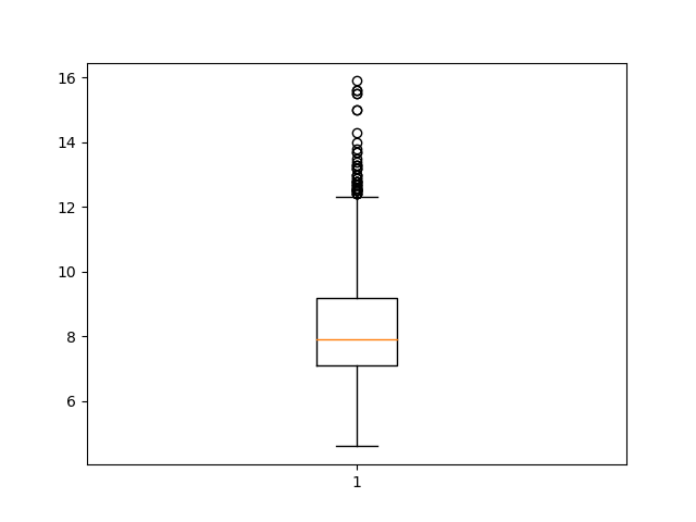
After creating the plot, we can see some of the summary statistics for our data. The Box Plot shows the median of the dataset (the vertical line in the middle), as well as the interquartile ranges (the ends of the boxes) and the minimum and maximum values of the chosen dataset feature (the far end of the “whiskers”).
We can also plot multiple columns on one figure, simply by providing more columns. This again, can be done on either the plt instance, the fig object or the ax object:
import pandas as pd
import matplotlib.pyplot as plt

dataframe = pd.read_csv("winequality-red.csv")

fixed_acidity = dataframe["fixed acidity"]
free_sulfur_dioxide = dataframe['free sulfur dioxide']
total_sulfur_dioxide = dataframe['total sulfur dioxide']
alcohol = dataframe['alcohol']

columns = [fixed_acidity, free_sulfur_dioxide, total_sulfur_dioxide, alcohol]

fig, ax = plt.subplots()
ax.boxplot(columns)
plt.show()
This results in:
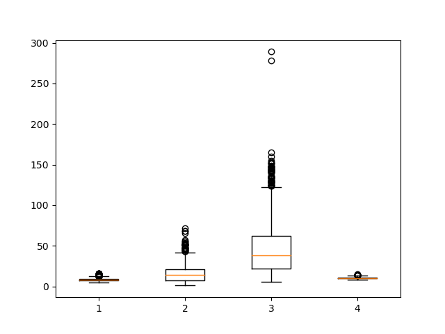
Now, we've got a lot more going on, since we've decided to plot multiple columns.
Customizing the Plot
As you can see, while the plots have successfully been generated, without tick labels on the X and Y-axis, it is difficult to interpret the graph.
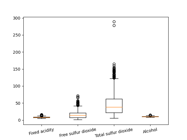
We can customize the plot and add labels to the X-axis by using the xticks function. Let's pass in the number of labels we want to add and then the labels for each of those columns:
fig, ax = plt.subplots()
ax.boxplot(columns)
plt.xticks([1, 2, 3, 4], ["Fixed acidity", "Free sulfur dioxide", "Total sulfur dioxide", "Alcohol"], rotation=10)
plt.show()
Check out our hands-on, practical guide to learning Git, with best-practices, industry-accepted standards, and included cheat sheet. Stop Googling Git commands and actually learn it!
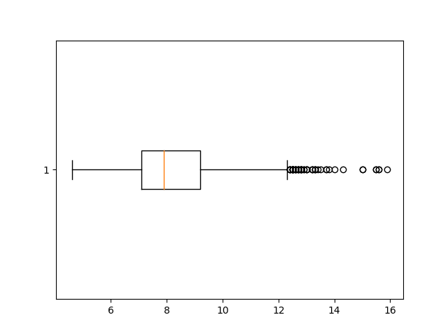
If we wanted to we could also change the orientation of the plot by altering the vert parameter. vert controls whether or not the plot is rendered vertically and it is set to 1 by default:
fig, ax = plt.subplots()
ax.boxplot(fixed_acidity, vert=0)
plt.show()
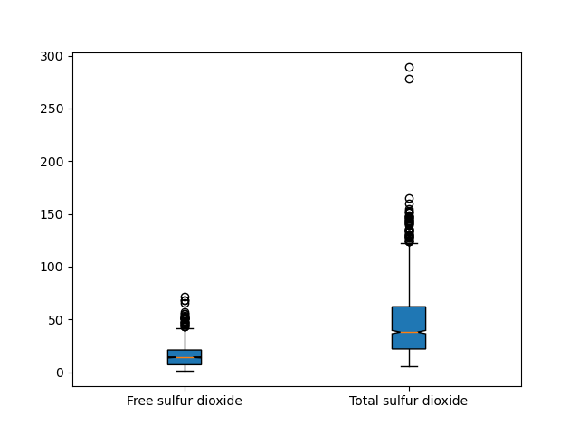
The notch=True attribute creates the notch format to the box plot, patch_artist=True fills the boxplot with colors:
fig, ax = plt.subplots()
columns = [free_sulfur_dioxide, total_sulfur_dioxide]
ax.boxplot(columns, notch=True, patch_artist=True)
plt.xticks([1, 2], ["Free sulfur dioxide", "Total sulfur dioxide"])
plt.show()
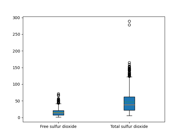
We can make use of the meanline argument to render the mean on the box, although this should be avoided if we are also showing notches, since they can conflict.
This must be combined with the showmean parameter. If possible, the mean will be visualized as a line that runs all the way across the box. If not possible, the mean will be shown as points:
fig, ax = plt.subplots()
columns = [free_sulfur_dioxide, total_sulfur_dioxide]
ax.boxplot(columns, patch_artist=True, meanline=True, showmeans=True)
plt.xticks([1, 2], ["Free sulfur dioxide", "Total sulfur dioxide"])
plt.show()
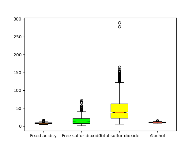
We can color the different feature columns by creating a list of hex color values and using the set_facecolor argument. In the below example, we zip the boxes element of the box variable together with the colors we want to use and then set the face color for each of those boxes.
columns = [fixed_acidity, free_sulfur_dioxide, total_sulfur_dioxide, alcohol]
fig, ax = plt.subplots()
box = ax.boxplot(columns, notch=True, patch_artist=True)
plt.xticks([1, 2, 3, 4], ["Fixed acidity", "Free sulfur dioxide", "Total sulfur dioxide", "Alcohol"])

colors = ['#0000FF', '#00FF00',
          '#FFFF00', '#FF00FF']

for patch, color in zip(box['boxes'], colors):
    patch.set_facecolor(color)

plt.show()
Conclusion
In this tutorial, we learned how to create a Box Plot in Matplotlib and Python. Then, we took a look at how you can customize it using arguments like vert, meanline, and set_facecolor.
If you're interested in Data Visualization and don't know where to start, make sure to check out our bundle of books on Data Visualization in Python:

Data Visualization in Python with Matplotlib and Pandas is a book designed to take absolute beginners to Pandas and Matplotlib, with basic Python knowledge, and allow them to build a strong foundation for advanced work with these libraries - from simple plots to animated 3D plots with interactive buttons.
It serves as an in-depth guide that'll teach you everything you need to know about Pandas and Matplotlib, including how to construct plot types that aren't built into the library itself.
Data Visualization in Python, a book for beginner to intermediate Python developers, guides you through simple data manipulation with Pandas, covers core plotting libraries like Matplotlib and Seaborn, and shows you how to take advantage of declarative and experimental libraries like Altair. More specifically, over the span of 11 chapters this book covers 9 Python libraries: Pandas, Matplotlib, Seaborn, Bokeh, Altair, Plotly, GGPlot, GeoPandas, and VisPy.
It serves as a unique, practical guide to Data Visualization, in a plethora of tools you might use in your career.

