Introduction
People can rarely look at a raw data and immediately deduce a data-oriented observation like:
People in stores tend to buy diapers and beer in conjunction!
Or even if you as a data scientist can indeed sight read raw data, your investor or boss most likely can't.
In order for us to properly analyze our data, we need to represent it in a tangible, comprehensive way. Which is exactly why we use data visualization!
The pandas library offers a large array of tools that will help you accomplish this. In this article, we'll go step by step and cover everything you'll need to get started with pandas visualization tools, including bar charts, histograms, area plots, density plots, scatter matrices, and bootstrap plots.
Importing Data
First, we'll need a small dataset to work with and test things out.
I'll use an Indian food dataset since frankly, Indian food is delicious. You can download it for free from Kaggle.com. To import it, we'll use the read_csv() method which returns a DataFrame. Here's a small code snippet, which prints out the first five and the last five entries in our dataset. Let's give it a try:
import pandas as pd
menu = pd.read_csv('indian_food.csv')
print(menu)
Running this code will output:
               name            state      region ...  course
0        Balu shahi      West Bengal        East ... dessert
1            Boondi        Rajasthan        West ... dessert
2    Gajar ka halwa           Punjab       North ... dessert
3            Ghevar        Rajasthan        West ... dessert
4       Gulab jamun      West Bengal        East ... dessert
..              ...              ...         ... ...     ...
250       Til Pitha            Assam  North East ... dessert
251         Bebinca              Goa        West ... dessert
252          Shufta  Jammu & Kashmir       North ... dessert
253       Mawa Bati   Madhya Pradesh     Central ... dessert
254          Pinaca              Goa        West ... dessert
If you want to load data from another file format, pandas offers similar read methods like read_json(). The view is slightly truncated due to the long-form of the ingredients variable.
To extract only a few selected columns, we'll can subset the dataset via square brackets and list column names that we'd like to focus on:
import pandas as pd

menu = pd.read_csv('indian_food.csv')
recipes = menu[['name', 'ingredients']]
print(recipes)
This yields:
               name                                        ingredients
0        Balu shahi                    Maida flour, yogurt, oil, sugar
1            Boondi                            Gram flour, ghee, sugar
2    Gajar ka halwa       Carrots, milk, sugar, ghee, cashews, raisins
3            Ghevar  Flour, ghee, kewra, milk, clarified butter, su...
4       Gulab jamun  Milk powder, plain flour, baking powder, ghee,...
..              ...                                                ...
250       Til Pitha            Glutinous rice, black sesame seeds, gur
251         Bebinca  Coconut milk, egg yolks, clarified butter, all...
252          Shufta  Cottage cheese, dry dates, dried rose petals, ...
253       Mawa Bati  Milk powder, dry fruits, arrowroot powder, all...
254          Pinaca  Brown rice, fennel seeds, grated coconut, blac...

[255 rows x 2 columns]
Plotting Bar Charts with Pandas
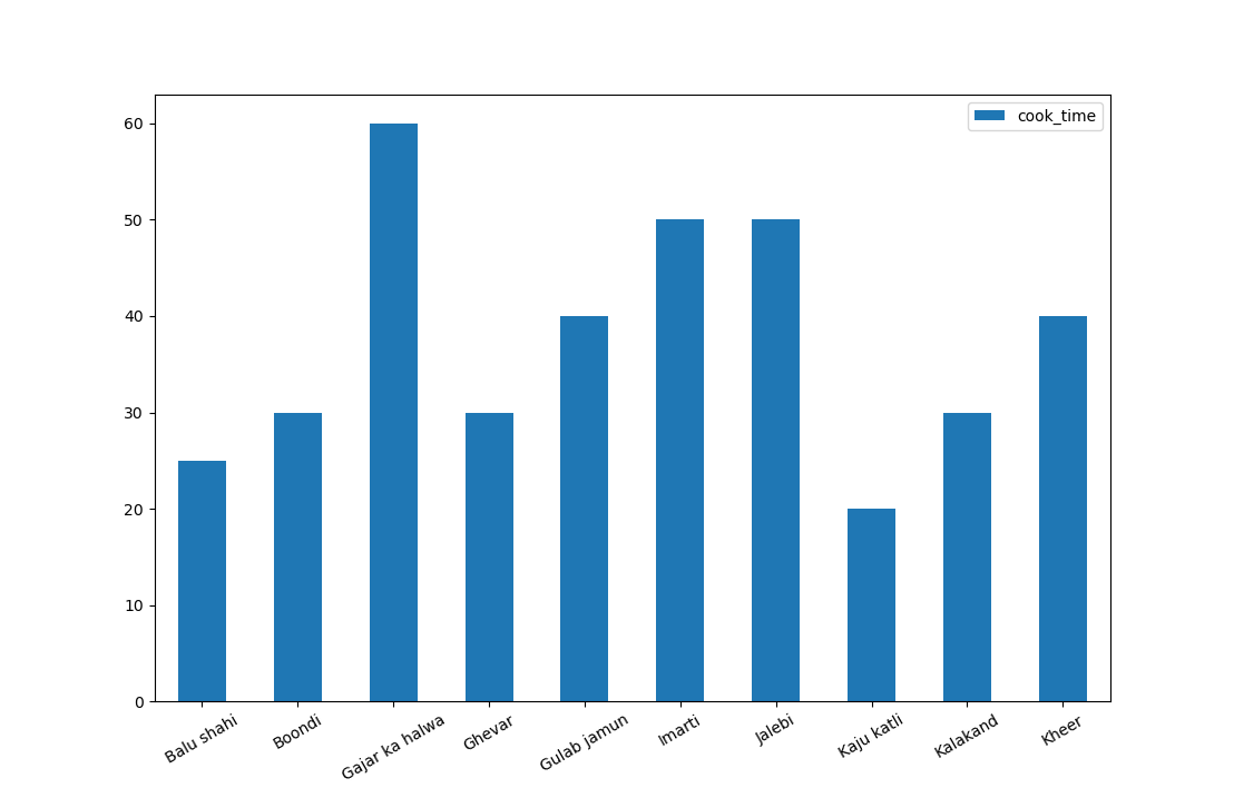
The classic bar chart is easy to read and a good place to start - let's visualize how long it takes to cook each dish.
Pandas relies on the Matplotlib engine to display generated plots. So we'll have to import Matplotlib's PyPlot module to call plt.show() after the plots are generated.
First, let's import our data. There's a lot of dishes in our data set - 255 to be exact. This won't really fit into a single figure while staying readable.
We'll use the head() method to extract the first 10 dishes, and extract the variables relevant to our plot. Namely, we'll want to extract the name and cook_time for each dish into a new DataFrame called name_and_time, and truncate that to the first 10 dishes:
import pandas as pd
import matplotlib.pyplot as plt

menu = pd.read_csv('indian_food.csv')

name_and_time = menu[['name', 'cook_time']].head(10)
Now we'll use the bar() method to plot our data:
DataFrame.plot.bar(x=None, y=None, **kwargs)
- The
xandyparameters correspond with the X and Y axis kwargscorresponds to additional keyword arguments which are documented inDataFrame.plot().
Many additional parameters can be passed to further customize the plot, such as rot for label rotation, legend to add a legend, style, etc...
Many of these arguments have default values, most of which are turned off. Since the rot argument defaults to 90, our labels will be rotated by 90 degrees. Let's change that to 30 while constructing the plot:
name_and_time.plot.bar(x='name',y='cook_time', rot=30)
And finally, we'll call the show() method from the PyPlot instance to display our graph:
plt.show()
This will output our desired bar chart:
Plotting Multiple Columns on Bar Plot's X-Axis in Pandas
Oftentimes, we might want to compare two variables in a Bar Plot, such as the cook_time and prep_time. These are both variables corresponding to each dish and are directly comparable.
Let's change the name_and_time DataFrame to also include prep_time:
name_and_time = menu[['name', 'prep_time', 'cook_time']].head(10)
name_and_time.plot.bar(x='name', rot=30)
Pandas automatically assumed that the two numerical values alongside name are tied to it, so it's enough to just define the X-axis. When dealing with other DataFrames, this might not be the case.
If you need to explicitly define which other variables should be plotted, you can simply pass in a list:
name_and_time.plot.bar(x='name', y=['prep_time', 'cook_time'], rot=30)
Running either of these two codes will yield:
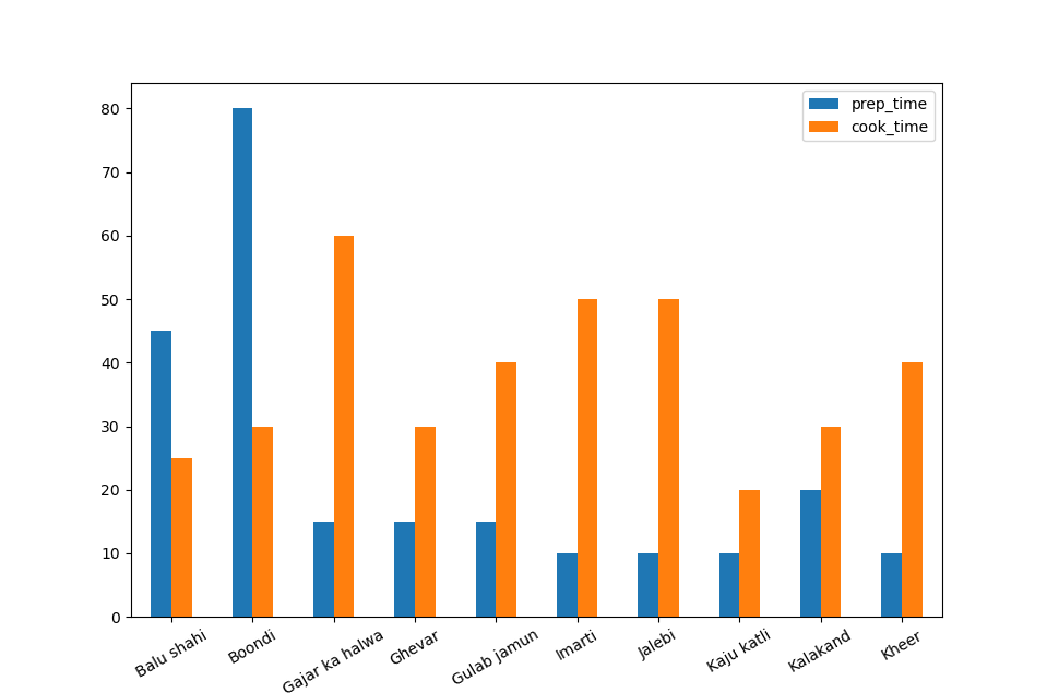
That's interesting. It seems that the food that's faster to cook takes more prep time and vice versa. Though, this does come from a fairly limited subset of data and this assumption might be wrong for other subsets.
Plotting Stacked Bar Graphs with Pandas
Let's see which dish takes the longest time to make overall. Since we want to factor in both the prep time and cook time, we'll stack them on top of each other.
To do that, we'll set the stacked parameter to True:
name_and_time.plot.bar(x='name', stacked=True)
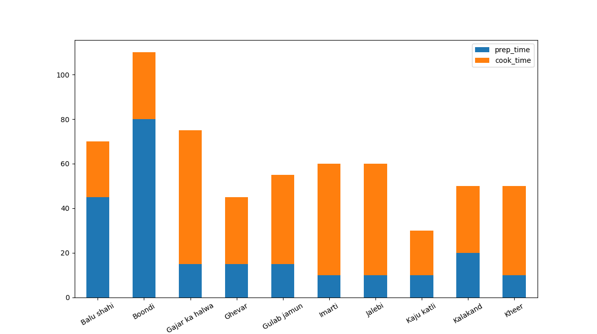
Now, we can easily see which dishes take the longest to prepare, factoring in both the prep time and cooking time.
Customizing Bar Plots in Pandas
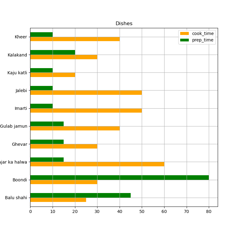
If we want to make the plots look a bit nicer, we can pass some additional arguments to the bar() method, such as:
color: Which defines a color for each of theDataFrame's attributes. It can be a string such as'orange',rgbor rgb-code like#faa005.title: A string or list which signifies the title of the plot .grid: A boolean value that indicates if grid lines are visible.figsize: A tuple which indicates the size of the plot in inches .legend: Boolean which indicates if the legend is shown.
If we want a horizontal bar chart, we can use the barh() method which takes the same arguments.
For example, let's plot a horizontal orange and green Bar Plot, with the title "Dishes", with a grid, of size 5 by 6 inches, and a legend:
import pandas as pd
import matplotlib.pyplot as plt

menu = pd.read_csv('indian_food.csv')
name_and_time = menu[['name', 'cook_time', 'prep_time']].head()

name_and_time.plot.barh(x='name',color =['orange', 'green'], title = "Dishes", grid = True, figsize=(5,6), legend = True)
plt.show()
Plotting Histograms with Pandas
Histograms are useful for showing data distribution. Looking at one recipe, we have no idea if the cooking time is close to the mean cooking time, or if it takes a really long amount of time. Means can help us with this, to a degree, but can be misleading or prone to huge error bars.
To get an idea of the distribution, which gives us a lot of information on the cooking time, we'll want to plot a histogram.
With Pandas, we can call the hist() function on a DataFrame to generate its histogram:
DataFrame.hist(column=None, by=None, grid=True, xlabelsize=None, xrot=None, ylabelsize=None, yrot=None, ax=None, sharex=False, sharey=False, fcigsize=None, layout=None, bins=10, backend=None, legend=False,**kwargs)
The bins parameter indicates the number of bins to be used.
A big part of working with any dataset is data cleaning and preprocessing. In our case, some foods don't have proper cook and prep times listed (and have a -1 value listed instead).
Let's filter them out of our menu, before visualizing the histogram. This is the most basic type of data preprocessing. In some cases, you might want to change data types (currency formatted strings into floats, for example) or even construct new data points based on some other variable.
Let's filter out invalid values and plot a histogram with 50 bins on the X-axis:
import pandas as pd
import matplotlib.pyplot as plt

menu = pd.read_csv('indian_food.csv')
menu = menu[menu.cook_time != -1] # Filtering
cook_time = menu['cook_time']

cook_time.plot.hist(bins = 50)

plt.legend()
plt.show()
This results in:
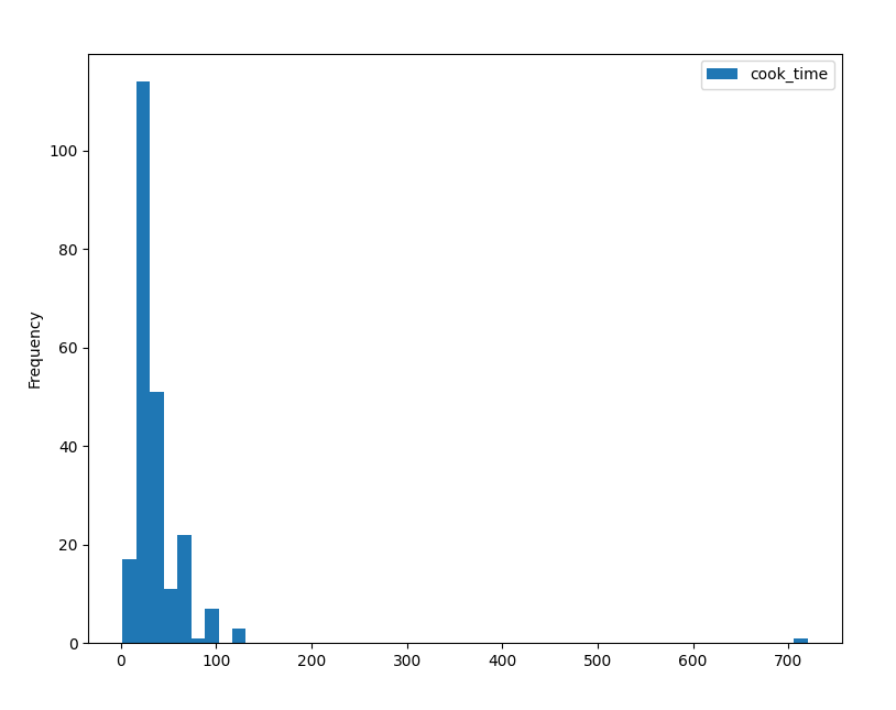
On the Y-axis, we can see the frequency of the dishes, while on the X-axis, we can see how long they take to cook.
The higher the bar is, the higher the frequency. According to this histogram, most dishes take between 0..80 minutes to cook. The highest number of them is in the really high bar, though, we can't really make out which number this is exactly because the frequency of our ticks is low (one each 100 minutes).
For now, let's try changing the number of bins to see how that affects our histogram. After that, we can change the frequency of the ticks.
Emphasizing Data with Bin Sizes
Let's try plotting this histogram with 10 bins instead:
import pandas as pd
import matplotlib.pyplot as plt

menu = pd.read_csv('indian_food.csv')
menu = menu[menu.cook_time != -1] # Filtering
cook_time = menu['cook_time']

cook_time.plot.hist(bins = 10)

plt.legend()
plt.show()
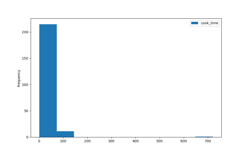
Now, we've got 10 bins in the entire X-axis. Note that only 3 bins have some data frequency while the rest is empty.
Now, let's perhaps increase the number of bins:
import pandas as pd
import matplotlib.pyplot as plt

menu = pd.read_csv('indian_food.csv')
menu = menu[menu.cook_time != -1] # Filtering
cook_time = menu['cook_time']

cook_time.plot.hist(bins = 100)

plt.legend()
plt.show()
Now, the bins are awkwardly placed far apart, and we've again lost some information due to this. You'll always want to experiment with the bin sizes and adjust until the data you want to explore is shown nicely.
The default settings (bin number defaults to 10) would've resulted in an odd bin number in this case.
Change Tick Frequency for Pandas Histogram
Since we're using Matplotlib as the engine to show these plots, we can also use any Matplotlib customization techniques.
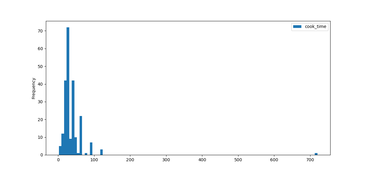
Since our X-axis ticks are a bit infrequent, we'll make an array of integers, in 20-step increments, between 0 and the cook_time.max(), which returns the entry with the highest number.
Also, since we'll have a lot of ticks in our plot, we'll rotate them by 45-degrees to make sure they fit well:
Check out our hands-on, practical guide to learning Git, with best-practices, industry-accepted standards, and included cheat sheet. Stop Googling Git commands and actually learn it!
import pandas as pd
import matplotlib.pyplot as plt
import numpy as np

# Clean data and extract what we're looking for
menu = pd.read_csv('indian_food.csv')
menu = menu[menu.cook_time != -1] # Filtering
cook_time = menu['cook_time']

# Construct histogram plot with 50 bins
cook_time.plot.hist(bins=50)

# Modify X-Axis ticks
plt.xticks(np.arange(0, cook_time.max(), 20))
plt.xticks(rotation = 45)

plt.legend()
plt.show()
This results in:
Plotting Multiple Histograms
Now let's add the prep time into the mix. To add this histogram, we'll plot it as a separate histogram setting both at 60% opacity.
They will share both the Y-axis and the X-axis, so they'll overlap. Without setting them to be a bit transparent, we might not see the histogram under the second one we plot:
import pandas as pd
import matplotlib.pyplot as plt
import numpy as np

# Filtering and cleaning
menu = pd.read_csv('indian_food.csv')
menu = menu[(menu.cook_time!=-1) & (menu.prep_time!=-1)]

# Extracting relevant data
cook_time = menu['cook_time']
prep_time = menu['prep_time']

# Alpha indicates the opacity from 0..1
prep_time.plot.hist(alpha = 0.6 , bins = 50)
cook_time.plot.hist(alpha = 0.6, bins = 50)

plt.xticks(np.arange(0, cook_time.max(), 20))
plt.xticks(rotation = 45)
plt.legend()
plt.show()
This results in:
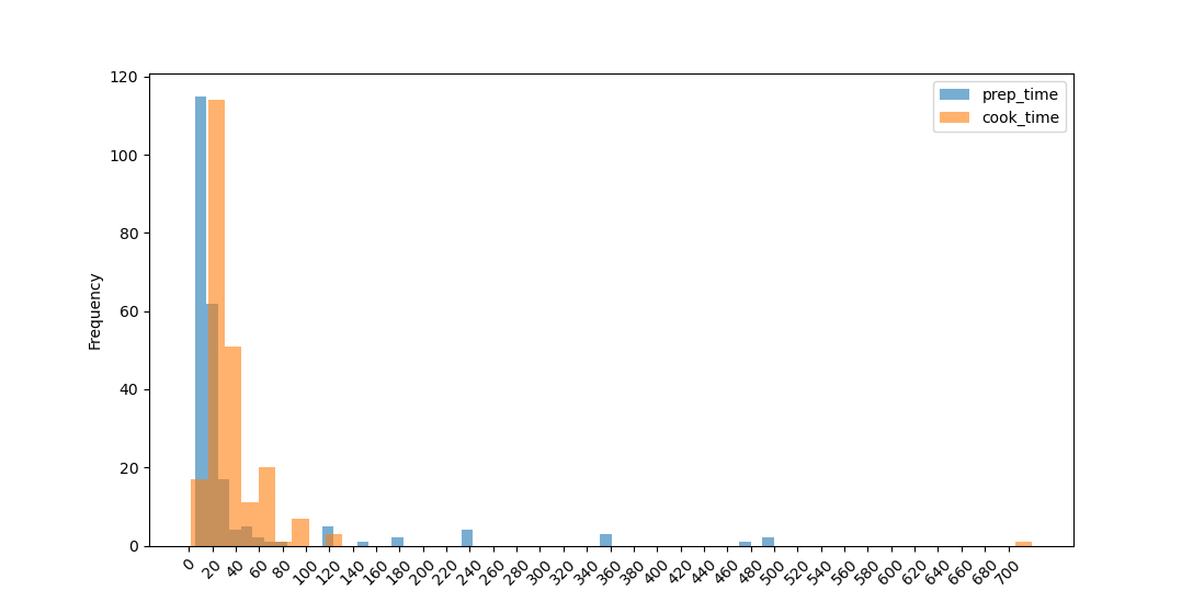
We can conclude that most dishes can be made in under an hour, or in about an hour. However, there are a few that take a couple of days to prepare, with 10 hour prep times and long cook times.
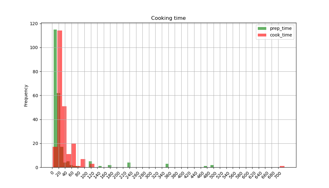
Customizing Histograms Plots
To customize histograms, we can use the same keyword arguments which we used with the bar plot.
For example, let's make a green and red histogram, with a title, a grid, a legend - the size of 7x7 inches:
import pandas as pd
import matplotlib.pyplot as plt
import numpy as np

menu = pd.read_csv('indian_food.csv')
menu = menu[(menu.cook_time!=-1) & (menu.prep_time!=-1)] # filtering

cook_time = menu['cook_time']
prep_time = menu['prep_time']

prep_time.plot.hist(alpha = 0.6 , color = 'green', title = 'Cooking time', grid = True, bins = 50)
cook_time.plot.hist(alpha = 0.6, color = 'red', figsize = (7,7), grid = True, bins = 50)

plt.xticks(np.arange(0, cook_time.max(), 20))
plt.xticks(rotation = 45)

plt.legend()
plt.show()
And here's our Christmas-colored histogram:
Plotting Area Plots with Pandas
Area Plots are handy when looking at the correlation of two parameters. For example, from the histogram plots, it would be valid to lean towards the idea that food that takes longer to prep, takes less time to cook.
To test this, we'll plot this relationship using the area() function:
DataFrame.plot.area(x=None, y=None, **kwargs)
Let's use the mean of cook times, grouped by prep times to simplify this graph:
time = menu.groupby('prep_time').mean()
This results in a new DataFrame:
prep_time
5           20.937500
10          40.918367
12          40.000000
15          36.909091
20          36.500000
...
495         40.000000
500        120.000000
Now, we'll plot an area-plot with the resulting time DataFrame:
import pandas as pd
import matplotlib.pyplot as plt

menu = pd.read_csv('indian_food.csv')
menu = menu[(menu.cook_time!=-1) & (menu.prep_time!=-1)]

# Simplifying the graph
time = menu.groupby('prep_time').mean()
time.plot.area()

plt.legend()
plt.show()
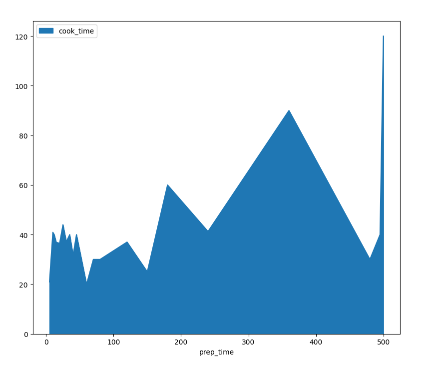
Here, our notion of the original correlation between prep-time and cook-time has been shattered. Even though other graph types might lead us to some conclusions - there is a sort of correlation implying that with higher prep times, we'll also have higher cook times. Which is the opposite of what we hypothesized.
This is a great reason not to stick only to one graph-type, but rather, explore your dataset with multiple approaches.
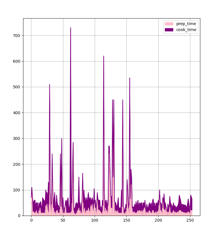
Plotting Stacked Area Plots
Area Plots have a very similar set of keyword arguments as bar plots and histograms. One of the notable exceptions would be:
stacked: Boolean value which indicates if two or more plots will be stacked or not
Let's plot out the cooking and prep times so that they are stacked, pink and purple, with a grid, 8x9 inches in size, with a legend:
import pandas as pd
import matplotlib.pyplot as plt

menu = pd.read_csv('indian_food.csv')
menu = menu[(menu.cook_time!=-1) & (menu.prep_time!=-1)]

menu.plot.area()

plt.legend()
plt.show()
Plotting Pie Charts with Pandas
Pie charts are useful when we have a small number of categorical values which we need to compare. They are very clear and to the point, however, be careful. The readability of pie charts goes way down with the slightest increase in the number of categorical values.
To plot pie charts, we'll use the pie() function which has the following syntax:
DataFrame.plot.pie(**kwargs)
Plotting out the flavor profiles:
import pandas as pd
import matplotlib.pyplot as plt

menu = pd.read_csv('indian_food.csv')

flavors = menu[menu.flavor_profile != '-1']
flavors['flavor_profile'].value_counts().plot.pie()

plt.legend()
plt.show()
This results in:
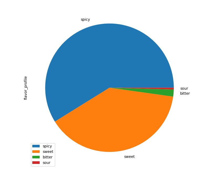
By far, most dishes are spicy and sweet.
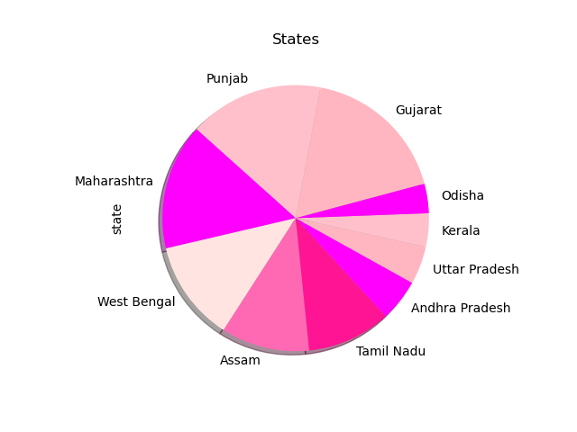
Customizing Pie Charts
To make our pie chart more appealing, we can tweak it with the same keyword arguments we used in all the previous chart alternative, with some novelties being:
shadow: Boolean which indicates if the pie chart slices have a shadowstartangle: Starting angle of the pie chart
To show how this works, let's plot the regions from which the dishes originate. We'll use head() to take only the first 10, so as to not have too many slices.
Let's make the pie pink, with the title "States", give it a shadow and a legend and make it start at the angle of 15 :
import pandas as pd
import matplotlib.pyplot as plt

menu = pd.read_csv('indian_food.csv')
states = (menu[menu.state != '-1'])['state'].value_counts().head(10)

# Colors to circle through
colors = ['lightpink', 'pink', 'fuchsia', 'mistyrose', 'hotpink', 'deeppink', 'magenta']

states.plot.pie(colors = colors, shadow = True, startangle = 15, title = "States")

plt.show()
Plotting Density Plots with Pandas
If you have any experience with statistics, you've probably seen a Density Plot. Density Plots are a visual representation of probability density across a range of values.
A Histogram is a Density Plot, which bins together data points into categories. The second most popular density plot is the KDE (Kernel Density Estimation) plot - in simple terms, it's like a very smooth histogram with an infinite number of bins.
To plot one, we'll use the kde() function:
DataFrame.plot.kde(bw_method=None, ind=None, **kwargs)
For example, we'll plot the cooking time:
import pandas as pd
import matplotlib.pyplot as plt
import scipy

menu = pd.read_csv('indian_food.csv')

time = (menu[menu.cook_time != -1])['cook_time']
time.value_counts().plot.kde()
plt.show()
This distribution looks like this:
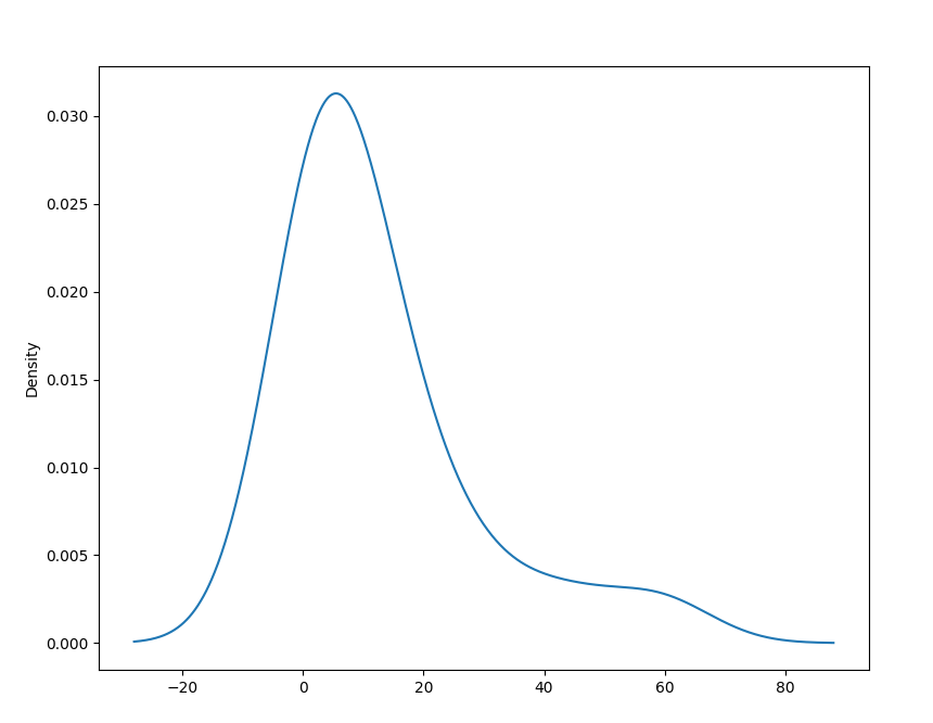
In the Histogram section, we've struggled to capture all the relevant information and data using bins, because every time we generalize and bin data together - we lose some accuracy.
With KDE plots, we've got the benefit of using an, effectively, infinite number of bins. No data is truncated or lost this way.
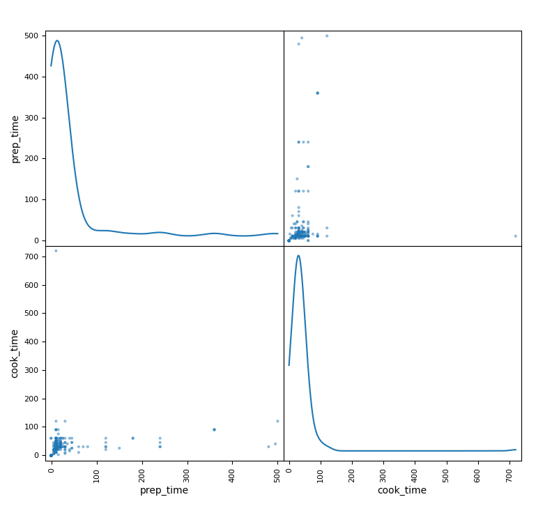
Plotting a Scatter Matrix (Pair Plot) in Pandas
A bit more complex way to interpret data is using Scatter Matrices. Which are a way of taking into account the relationship of every pair of parameters. If you've worked with other libraries, this type of plot might be familiar to you as a pair plot.
To plot Scatter Matrix, we'll need to import the scatter_matrix() function from the pandas.plotting module.
The syntax for the scatter_matrix() function is:
pandas.plotting.scatter_matrix(frame, alpha=0.5, figsize=None, ax=None, grid=False, diagonal='hist', marker='.', density_kwds=None, hist_kwds=None, range_padding=0.05, **kwargs)
Since we're plotting pairwise relationships for multiple classes, on a grid - all the diagonal lines in the grid will be obsolete since it compares the entry with itself. Since this would be dead space, diagonals are replaced with a univariate distribution plot for that class.
The diagonal parameter can be either 'kde' or 'hist' for either Kernel Density Estimation or Histogram plots.
Let's make a Scatter Matrix plot:
import pandas as pd
import matplotlib.pyplot as plt
import scipy
from pandas.plotting import scatter_matrix

menu = pd.read_csv('indian_food.csv')

scatter_matrix(menu,diagonal='kde')

plt.show()
The plot should look like this:
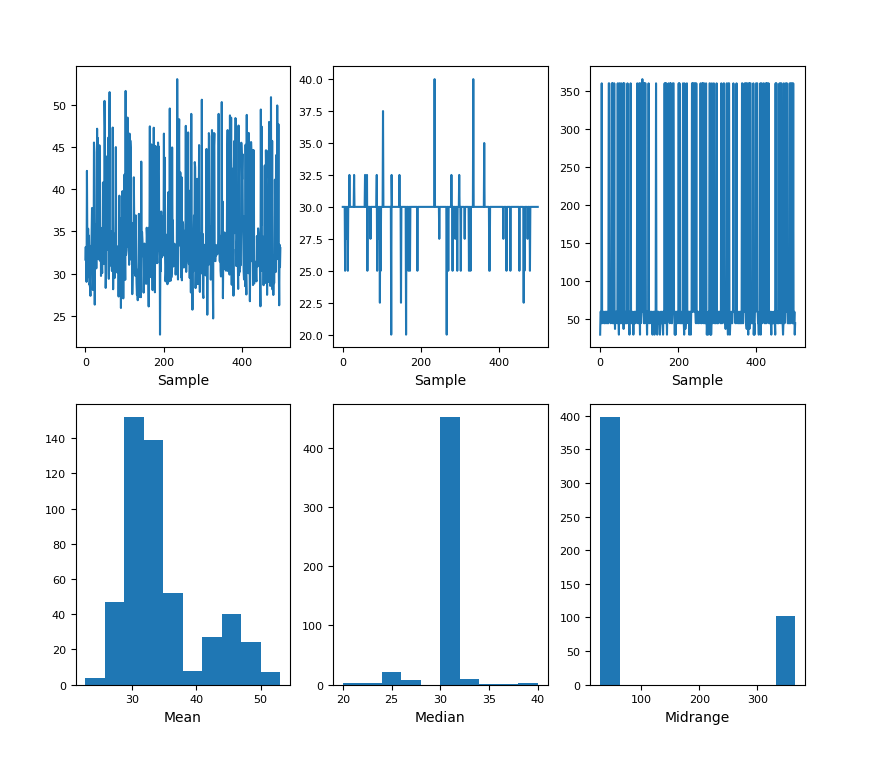
Plotting a Bootstrap Plot in Pandas
Pandas also offers a Bootstrap Plot for your plotting needs. A Bootstrap Plot is a plot that calculates a few different statistics with different subsample sizes. Then with the accumulated data on the statistics, it generates the distribution of the statistics themselves.
Using it is as simple as importing the bootstrap_plot() method from the pandas.plotting module. The bootstrap_plot() syntax is:
pandas.plotting.bootstrap_plot(series, fig=None, size=50, samples=500, **kwds)
And finally, let's plot a Bootstrap Plot:
import pandas as pd
import matplotlib.pyplot as plt
import scipy
from pandas.plotting import bootstrap_plot

menu = pd.read_csv('indian_food.csv')

bootstrap_plot(menu['cook_time'])
plt.show()
The bootstrap plot will look something like this:
Conclusion
In this guide, we've gone over the introduction to Data Visualization in Python with Pandas. We've covered basic plots like Pie Charts, Bar Plots, progressed to Density Plots such as Histograms and KDE Plots.
Finally, we've covered Scatter Matrices and Bootstrap Plots.
If you're interested in Data Visualization and don't know where to start, make sure to check out our book on Data Visualization in Python.
Data Visualization in Python, a book for beginner to intermediate Python developers, will guide you through simple data manipulation with Pandas, cover core plotting libraries like Matplotlib and Seaborn, and show you how to take advantage of declarative and experimental libraries like Altair.


