Introduction
In this tutorial, we're going to learn how to use Bokeh library in Python. Most of you would have heard of Matplotlib, NumPy, Seaborn, etc. as they are very popular python libraries for graphics and visualizations. What distinguishes Bokeh from these libraries is that it allows dynamic visualization, which is supported by modern browsers (because it renders graphics using JS and HTML), and hence can be used for web applications with a very high level of interactivity.
Bokeh is available in R and Scala language as well; however, its Python counterpart is more commonly used than others.
Installation
The easiest way to install Bokeh using Python is through pip package manager. If you have pip installed in your system, run the following command to download and install Bokeh:
$ pip install bokeh
Note: If you choose this method of installation, you need to have NumPy installed in your system already
Another method to install Bokeh is through Anaconda distribution. Simply go to your terminal or command prompt and run this command:
$ conda install bokeh
After completing this step, run the following command to ensure that your installation was successful:
$ bokeh --version
If the above command runs successfully i.e. the version gets printed, then you can go ahead and use bokeh library in your programs.
Coding Exercises
In this part, we will be doing some hands-on examples by calling Bokeh library's functions to create interactive visualizations. Let's start by trying to make a square.
Note: Comments in the codes throughout this article are very important; they will not only explain the code but also convey other meaningful information. Furthermore, there might be 'alternative' or additional functionality that would be commented out, but you can try running it by uncommenting those lines.
Plotting Basic Shapes
Here we specify the x and y coordinates for points, which will be followed in sequence when the line is being drawn. The figure function instantiates a figure object, which stores the configurations of the graph you wish to plot. Here we can specify both the X range and Y range of the graph, which we set from 0 to 4, which covers the range of our data. The line method then draws a line between our coordinates, which is in the shape of a square.
from bokeh.io import output_file, output_notebook
from bokeh.plotting import figure, show

x = [1, 3, 3, 1, 1]
y = [1, 1, 3, 3, 1]

# Display the output in a separate HTML file
output_file('Square.html', title='Square in Bokeh')
#output_notebook() # Uncomment this line to use iPython notebook

square = figure(title='Square Shape',
             plot_height=300, plot_width=300,
             x_range=(0, 4), y_range=(0, 4))

# Draw a line using our data
square.line(x, y)
#square.circle(x, y) # Uncomment this line to add a circle mark on each coordinate

# Show plot
show(square)
You may have noticed in the code that there is an alternative to the output_file function, which would instead show the result in a Jupyter notebook by using the output_notebook function. If you'd prefer to use a notebook then replace the output_file function with output_notebook in the code throughout this article.
When you run the above script, you should see the following square opening in a new tab of your default browser.
Output:
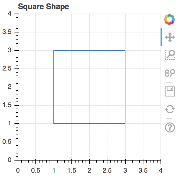
In the image above, you can see the tools on the right side (pan, box zoom, wheel zoom, save, reset, help - from top to bottom); these tools enable you to interact with the graph.
Another important thing which will come in handy is that after every call to the "show" function if you create a new "figure" object, a subsequent call to the "show" function with the new figure passed as an argument would generate an error. To resolve that error, run the following code:
from bokeh.plotting import reset_output

reset_output()
The reset_output method resets the figure ID that the show function currently holds so that a new one can be assigned to it.
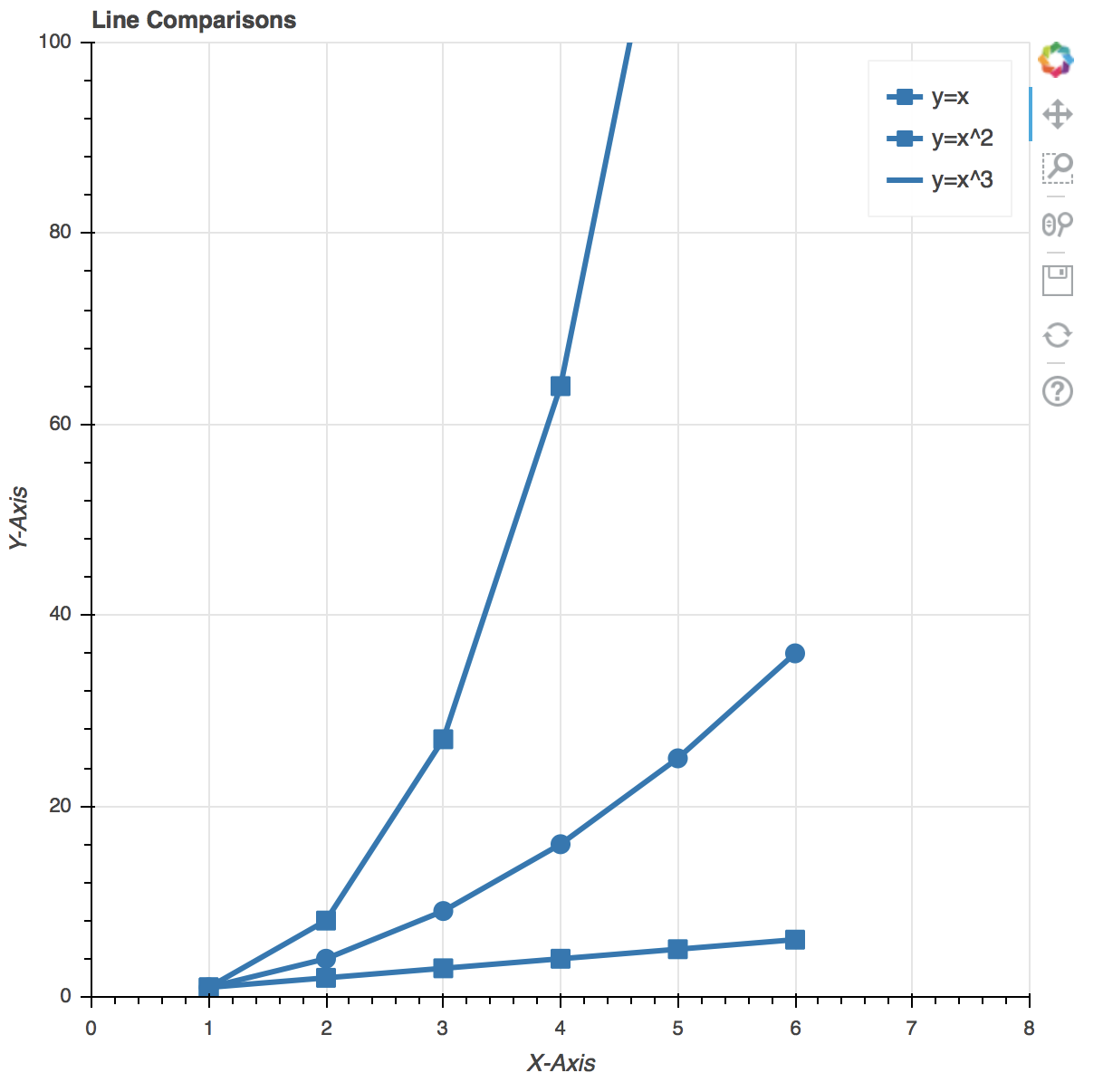
What we've done so far is rather basic, let's now try to make multiple lines/map equations in a single graph. The most basic example for that would be to try and draw lines for the equations y = x, y = x^2, and y = x^3. So let's see how we can make a graph to display them all at once using Bokeh:
from bokeh.plotting import figure, output_file, show

# Declare data for our three lines
x = [1, 2, 3, 4, 5, 6]
x_square = [i**2 for i in x]
x_cube = [i**3 for i in x]

# Declare HTML file as output for when show is called
output_file("Eqs.html")

lines = figure(title='Line Comparisons', x_range=(0, 8), y_range=(0,100),
   x_axis_label='X-Axis', y_axis_label='Y-Axis')

lines.line(x, x, legend="y = x", line_width=3) # Line for the equation y=x
lines.square(x, x, legend="y = x", size=10) # Add square boxes on each point on the line

lines.line(x, x_square, legend="y = x^2", line_width=3) #Line for the equation y=x^2
lines.circle(x, x_square, legend="y = x^2", size=10) # Add circles to points since it partially overlaps with y=x

lines.line(x, x_cube, legend="y = x^3", line_width=3) # Line for the equation y=x^3
lines.square(x, x_cube, legend="y = x^2", size=10) # Add square boxes on each point of the line

# Display the graph
show(lines)
Output:
Check out our hands-on, practical guide to learning Git, with best-practices, industry-accepted standards, and included cheat sheet. Stop Googling Git commands and actually learn it!
Before we continue to plot a few more graphics, let's first learn a few cool tricks to make your graphics more interactive, as well as aesthetic. For that we'll first of all learn about the different tools that the Bokeh Library uses apart from the ones that are displayed alongside (either on top or on the right side) the graph. The explanations will be provided in the comments of the code below:
# Use the same plot data as above
x = [1, 2, 3, 4, 5, 6]
x_square = [i**2 for i in x]
x_cube = [i**3 for i in x]

#Now let's make the necessary imports. Note that, in addition to the imports we made in the previous code, we'll be importing a few other things as well, which will be used to add more options in the 'toolset'.

# Same imports as before
from bokeh.plotting import figure, output_file, show

# New imports to add more interactivity in our figures
# Check out Bokeh's documentation for more tools (these are just two examples)
from bokeh.models import HoverTool, BoxSelectTool

output_file("Eqs.html")

# Add the tools to this list
tool_list = [HoverTool(), BoxSelectTool()]

# Use the tools keyword arg, otherwise the same
lines = figure(title='Line Comparisons', x_range=(0, 8), y_range=(0, 100),
   x_axis_label='X-Axis', y_axis_label='Y-Axis', tools=tool_list)

# The rest of the code below is the same as above
lines.line(x, x, legend="y = x", line_width=3)
lines.square(x, x, legend="y = x", size=10)

lines.line(x, x_square, legend="y = x^2", line_width=3)
lines.circle(x, x_square, legend="y = x^2", size=10)

lines.line(x, x_cube, legend="y = x^3", line_width=3)
lines.square(x, x_cube, legend="y = x^2", size=10)

# Display the graph
show(lines)
Output:
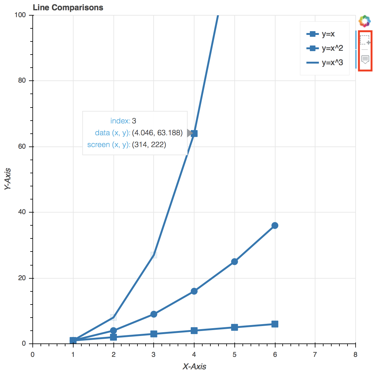
In the above picture, you can see the two extra options added to the previously available tools. You can now also hover over any data point and its details will be shown, and you can also select a certain group of data points to highlight them.
Handling Categorical Data with Bokeh
Next thing that we'll learn to do using the Bokeh library is handling categorical data. For that, we'll try and make a bar chart first. To make it interesting, let's try and create a chart which represents the number of world cups won by Argentina, Brazil, Spain, and Portugal. Sounds interesting? Let's code it.
from bokeh.io import show, output_file
from bokeh. plotting import figure

output_file("cups.html")

# List of teams to be included in the chart. Add or
# remove teams (and their World Cups won below) to
# see how it affects the chart
teams = ['Argentina', 'Brazil', 'Spain', 'Portugal']

# Activity: We experimented with the Hover Tool and the
# Box Select tool in the previous example, try to
# include those tools in this graph

# Number of world cups that the team has won
wc_won = [5, 3, 4, 2]

# Setting toolbar_location=None and tools="" essentially
# hides the toolbar from the graph
barchart = figure(x_range=teams, plot_height=250, title="WC Counts",
           toolbar_location=None, tools="")

barchart.vbar(x=teams, top=wc_won, width=0.5)

# Activity: Play with the width variable and see what
# happens. In particular, try to set a value above 1 for
# it

barchart.xgrid.grid_line_color = 'red'
barchart.y_range.start = 0

show(barchart)
Output:
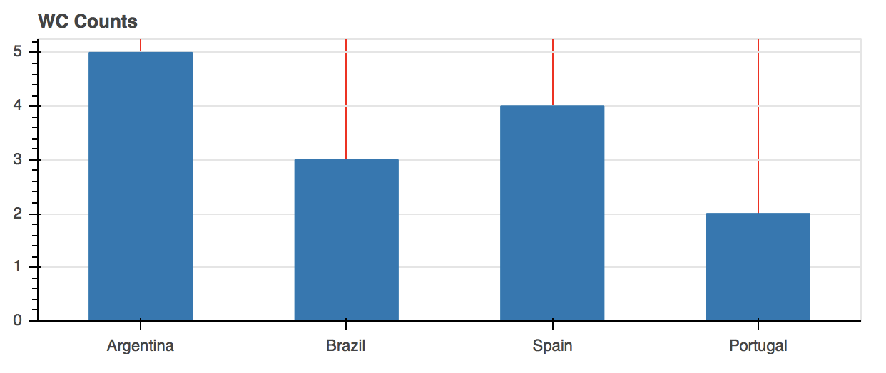
Do you notice something in the graph above? It's quite simple, and unimpressive, no? Let's make some changes in the above code, and make it a bit more colorful and aesthetic. Bokeh has a lot of options to help us with that. Let's see what we can do with it:
# Mostly the same code as above, except with a few
# additions to add more color to our currently dry graph

from bokeh.io import show, output_file
from bokeh.plotting import figure

# New imports below
from bokeh.models import ColumnDataSource

# A was added 4 to the end of Spectral because we have 4
# teams. If you had more or less you would have used that
# number instead
from bokeh.palettes import Spectral4

from bokeh.transform import factor_cmap

output_file("cups.html")

teams = ['Argentina', 'Brazil', 'Spain', 'Portugal']
wc_won = [5, 3, 4, 2]

source = ColumnDataSource(data=dict(teams=teams, wc_won=wc_won, color=Spectral4))

barchart = figure(x_range=teams, y_range=(0,8), plot_height=250, title="World Cups Won",
           toolbar_location=None, tools="")

barchart.vbar(x='teams', top='wc_won', width=0.5, color='color', legend='teams', source=source)

# Here we change the position of the legend in the graph
# Normally it is displayed as a vertical list on the top
# right. These settings change that to a horizontal list
# instead, and display it at the top center of the graph
barchart.legend.orientation = "horizontal"
barchart.legend.location = "top_center"

show(barchart)
Output:
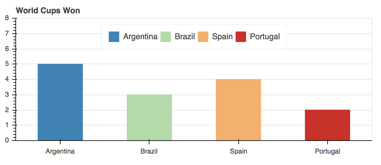
Evidently, the new graph looks a lot better than before, with added interactivity.
Before concluding this article, I'd like to let you all know that this was just a glimpse of the functionality that Bokeh offers. There are tons of other cool things that you can do with it, and you should try them out by referring to Bokeh's documentation and following the available examples.
Although, there are a lot of other great resources out there other than the documentation, like Data Visualization in Python. Here you'll get an even more in-depth guide to Bokeh, as well as 8 other visualization libraries in Python.
Conclusion
To sum it up, in this tutorial we learned about the Bokeh library's Python variant. We saw how to download and install it using the pip or anaconda distribution. We used Bokeh library programs to make interactive and dynamic visualizations of different types and using different data types as well. We also learned, by seeing practical examples, the reason why Bokeh is needed even though there are other more popular visualization libraries like Matplotlib and Seaborn available. In short, Bokeh is very resourceful and can pretty much do all kinds of interactive visualizations that you may want.

