
Introduction
Matplotlib is one of the most widely used data visualization libraries in Python. From simple to complex visualizations, it's the go-to library for most.
In this tutorial, we'll take a look at how to change the background of a plot in Matplotlib.
Importing Data and Libraries
Let's import the required libraries first. We'll obviously need Matplotlib, and we'll use Pandas to read the data:
import matplotlib.pyplot as plt
import pandas as pd
Specifically, we'll be using the Seattle Weather Dataset:
weather_data = pd.read_csv("seattleWeather.csv")
print(weather_data.head())
         DATE  PRCP  TMAX  TMIN  RAIN
0  1948-01-01  0.47    51    42  True
1  1948-01-02  0.59    45    36  True
2  1948-01-03  0.42    45    35  True
3  1948-01-04  0.31    45    34  True
4  1948-01-05  0.17    45    32  True
Creating a Plot
Now, let's create a simple Matplotlib Scatter Plot, with a few different variables we want to visualize:
PRCP = weather_data['PRCP']
TMAX = weather_data['TMAX']
TMIN = weather_data['TMIN']
Now, we'll construct a scatter plot between the minimum temperature and precipitation and show() it using Matplotlib's PyPlot:
plt.scatter(TMIN, PRCP)
plt.show()
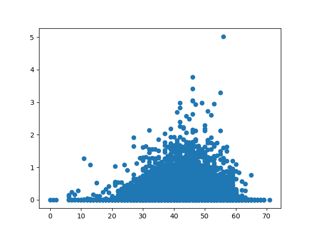
The graph that we have produced is interpretable, but it is looking a little plain. Let's try customizing it. We want to customize the background of our plot using a couple of different methods.
Change Plot Background in Matplotlib
Now, let's go ahead and change the background of this plot. We can do this with two different approaches. We can change the color of the face, which is currently set to white. Or, we can input a picture using imshow().
Change Axes Background in Matplotlib
Let's first change the color of the face. This can either be done with the set() function, passing in the face argument and its new value, or via the dedicated set_facecolor() function:
ax = plt.axes()
ax.set_facecolor("orange")
# OR
ax.set(facecolor = "orange")

plt.scatter(TMIN, PRCP)
plt.show()
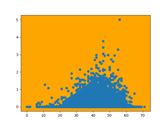
Either of these approaches produces the same result, as they both call on the same function under the hood.
Change Figure Background in Matplotlib
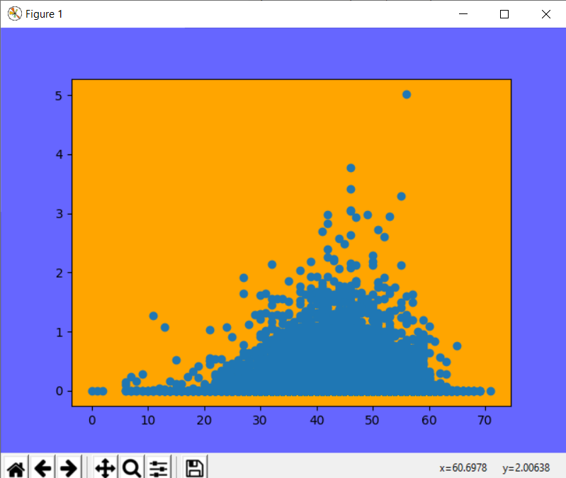
If you would like to set the background for the figure and need the axes to be transparent, this can be done with the set_alpha() argument when you create the figure. Let's create a figure and an axes object. Of course, you can also use the set() function, and pass the alpha attribute instead.
The color of the entire figure will be blue and we will initially set the alpha of the axes object to 1.0, meaning fully opaque. We color the axes object orange, giving us an orange background within the blue figure:
fig = plt.figure()
fig.patch.set_facecolor('blue')
fig.patch.set_alpha(0.6)

ax = fig.add_subplot(111)
ax.patch.set_facecolor('orange')
ax.patch.set_alpha(1.0)

plt.scatter(TMIN, PRCP)
plt.show()
Now let's see what happens when we adjust the alpha of the axes subplot down to 0.0:
fig = plt.figure()
fig.patch.set_facecolor('blue')
fig.patch.set_alpha(0.6)

ax = fig.add_subplot(111)
ax.patch.set_facecolor('orange')
ax.patch.set_alpha(0.0)

plt.scatter(TMIN, PRCP)
plt.show()
Check out our hands-on, practical guide to learning Git, with best-practices, industry-accepted standards, and included cheat sheet. Stop Googling Git commands and actually learn it!
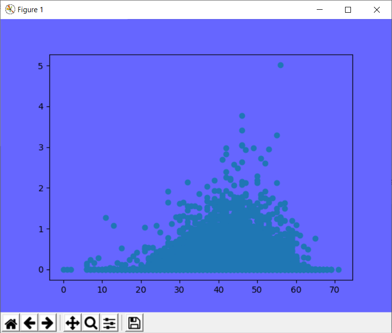
Notice that the background of the plot itself is transparent now.
Add Image to Plot Background in Matplotlib
If you would like to use an image as the background for a plot, this can be done by using PyPlot's imread() function. This function loads an image into Matplotlib, which can be displayed with the function imshow().
In order to plot on top of the image, the extent of the image has to be specified. By default, Matplotlib uses the upper left corner of the image as the image's origin. We can give a list of points to the imshow() function, specifying what region of the image should be displayed. When combined with subplots, another plot can be inserted on top of the image.
Let's use an image of rain as the background for our plot:
img = plt.imread("rain.jpg")
fig, ax = plt.subplots()
ax.imshow(img, extent=[-5, 80, -5, 30])
ax.scatter(TMIN, PRCP, color="#ebb734")
plt.show()
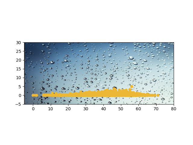
The extent argument takes in additional arguments in this order: horizontal_min, horizontal_max, vertical_min, vertical_max).
Here, we've read the image, cropped it and showed it on the axes using imshow(). Then, we plotted the scatter plot with a different color and showed the plot.
Conclusion
In this tutorial, we've gone over several ways to change the background of a plot using Python and Matplotlib.
If you're interested in Data Visualization and don't know where to start, make sure to check out our bundle of books on Data Visualization in Python:

Data Visualization in Python with Matplotlib and Pandas is a book designed to take absolute beginners to Pandas and Matplotlib, with basic Python knowledge, and allow them to build a strong foundation for advanced work with these libraries - from simple plots to animated 3D plots with interactive buttons.
It serves as an in-depth guide that'll teach you everything you need to know about Pandas and Matplotlib, including how to construct plot types that aren't built into the library itself.
Data Visualization in Python, a book for beginner to intermediate Python developers, guides you through simple data manipulation with Pandas, covers core plotting libraries like Matplotlib and Seaborn, and shows you how to take advantage of declarative and experimental libraries like Altair. More specifically, over the span of 11 chapters this book covers 9 Python libraries: Pandas, Matplotlib, Seaborn, Bokeh, Altair, Plotly, GGPlot, GeoPandas, and VisPy.
It serves as a unique, practical guide to Data Visualization, in a plethora of tools you might use in your career.

